MAPPING CONTEST 2K3
Posts
author=Fallen-Griever
Arcan's map is easily the best thus far.
Just because all the others look the same? :P
I can't even tell if I'm using parts of this tile set correctly. I ignored 50% of what was available because I wasn't sure how to use it (beds and mirrors and shit in what seems suited for an exterior??). I'm pretty sure those are stair tiles... There also seem to be a few missing tiles for the doorways, or I'm just doing it wrong. But it came out decent in the end:

Jude wins.
Basically I'm voting for Jude, I really like it.
Basically I'm voting for Jude, I really like it.
author=dethmetal
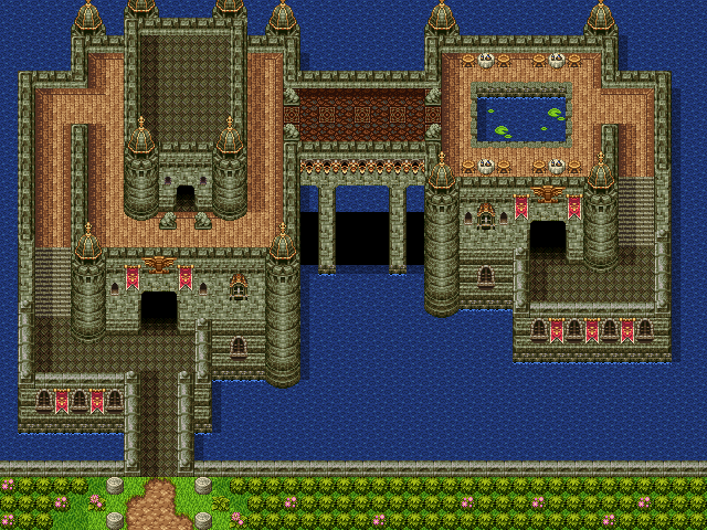
that's a very unusual castle, jude, but I like it. the lilipads in the pool are a nice touch indeed
Eh... I just wanted something asymmetrical, really. It made more sense just to have the lilypads in the pool and not scattered haphazardly in the entire lake. To me, at least.
author=InfectionFilesThanks, but you should probably wait for everybody to post their maps before casting a vote.
Jude wins.
Basically I've voting for Jude, I really like it.
This gives me a good idea but I wish there was a waterfall tile in here.
author=Jude
Thanks, but you should probably wait for everybody to post their maps before casting a vote.
Yeah, that's true.
I just hope people will re-do the ugly grass onto water thing most of the maps have going on. :[
Your map just look genuinely fun to navigate in-game.
But there are still screenshots to be created and judged!
Thanks bro. I like how your castle is more of luxury hotel than a castle.
edit: Haha this chipset not only makes castles but awesome boardwalks as well. Apparently you can get a full color view of the map by clicking the zoom button for easy screenshot taking.

edit: Haha this chipset not only makes castles but awesome boardwalks as well. Apparently you can get a full color view of the map by clicking the zoom button for easy screenshot taking.

Jude = Fantastic! Here's mine:
It was originally designed in The Sims, then recently redone in Minecraft.

It was originally designed in The Sims, then recently redone in Minecraft.

Sorry Mikemc, but events aren't allowed to be in the map. :x
We decided against adding "people" events of any kind to the maps, even RTP.
It's not really about having the map look busy, but the mapping itself.
They discussed it on page 1 briefly if you are curious!
It's not really about having the map look busy, but the mapping itself.
They discussed it on page 1 briefly if you are curious!
Well here goes... Here's my Entry...
I've gone for a symmetrical pattern of building, but have tried to use the shadows created by the sun (which I've positioned off screen to the left) to add asymmetry... I'm hoping that that juxtaposition of symmetry and asymmetry adds a deliciousness to the map...
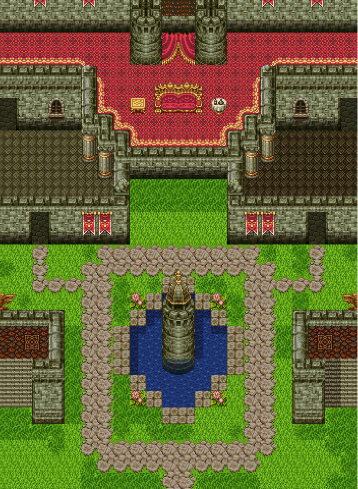
I've gone for a symmetrical pattern of building, but have tried to use the shadows created by the sun (which I've positioned off screen to the left) to add asymmetry... I'm hoping that that juxtaposition of symmetry and asymmetry adds a deliciousness to the map...

author=arcan
Apparently you can get a full color view of the map by clicking the zoom button for easy screenshot taking.
That's how I always do map screenshots. The "Select Map Elements" (second button above the tileset palette, left of the zoom button) has a similar effect and rasters all the layers for an easy screenshot. "Select Map Elements" is probably my favorite button in general since you can select and drag large portions of the map around (or copy/paste parts). It saves a lot of effort if you're trying to figure out your spacing.


