


SCREENSHOT THREAD WITH ONE EYEBROW AND A GOLDEN TOOTH
Posts

@ Felds-a-what-yamaface: Looks really nice, I dunno if I would have put so many drains on a pathway. I have to applaud anyone who uses Narshe (or FF6 for that matter), Those chipset are so diffcult, well to me anyway xD.
@ Ephiam: Coming along nicely from what I can see (its zoomed out far, but I guess you can't help that) You need to post moar DFII screenshots!
@ Ephiam: Coming along nicely from what I can see (its zoomed out far, but I guess you can't help that) You need to post moar DFII screenshots!

I agree! I find the Final Fantasy VI Chipset's hard to use. I don't know WHY, but...they just are. :I
And thanks Little Wing Guy. I'd gladly post some more screenshots, but uh...I don't really have enough to stick up. I mean, yeah, I probably DO, but I can't see any that I really want to post.
And thanks Little Wing Guy. I'd gladly post some more screenshots, but uh...I don't really have enough to stick up. I mean, yeah, I probably DO, but I can't see any that I really want to post.


An easy battle because it's on Level 25 and I'm on Level 50 with all spells/commands/weapons/armors and stuff. Of course I had to cheat to do so... Anyway, this shark is a remake of an older shark sprite:


Agreed. I can't wait to play your game, Ocean. That shot has me hooked.
-

The Diyenn Explorer's Guild.
-
The Diyenn Explorer's Guild.

It. Looks. Awesome. Ocean! I love that whaleshark! So pretty. If sharks looked like that in real life there'd probably be a lot of sales in shark-skin runs. ^.^
Not bad, ariedonus, but perhaps vary the cliffage up a bit. In nature things aren't symmetrical so the four/two cliffs at the front would probably be different heights. But semantics aside - nice job. Well done! ^.^
Not bad, ariedonus, but perhaps vary the cliffage up a bit. In nature things aren't symmetrical so the four/two cliffs at the front would probably be different heights. But semantics aside - nice job. Well done! ^.^

@Ocean: I like that shot. I think I'm starting to get interested in the project.
Keep it up!
It's summer time and I'm sick of staring at the CBS wishing it were completed.
So I've gotten off my ass and fixed a few things.
I left off working on the display of the HP digits and noticed that there wasn't enough
room. So I lengthened the bar on the Character windows. I added the Destiny HUD
on the far right of the screen which I'm wondering if I want to have coded by demo
time or not. I fixed up the ugly enemy box on the top left as well.
I'm just now noticing that to display the max number of stat digits on each character
would take up more than the max amount of pictures available to me. So now
I'm more than likely going to have to rely on charasets. I'll now have to figure
out how to put the numbers on top of the character windows which are pictures.
I have a few ideas, but none of which are too entertaining. And that's another
sleepless night for me. Gah, this is none to fun. But I'll soldier through it.
Here's hoping....
~Sion
Woah, Sion, looks delicious. I'm really digging the character windows, or whatever you want to call them. Only suggestions I have are to change the water in the background, because it looks square and unnatural. Also, I think the windows would look better if the blue was changed to a different color, or if blue was added to the character windows.
But that's just me being nitpicky, haha.
EDIT: @Liberty: I think I know which cliffs you're talking about. I'll try and fix that. ;D
But that's just me being nitpicky, haha.
EDIT: @Liberty: I think I know which cliffs you're talking about. I'll try and fix that. ;D

@Ocean- That looks awesome. I look forward to playing it. :)
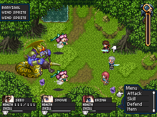
@Sion- Really like the look of that battle system sion. I agree with ariedonus on the character windows, everything seems to have the blue border except that. Otherwise i look forward to play a release of this.
@Sion- Really like the look of that battle system sion. I agree with ariedonus on the character windows, everything seems to have the blue border except that. Otherwise i look forward to play a release of this.
@ Sion - >_< Thats pretty damn slick, looks great, I still hope it flows good, with all those pictures.
@ ariedonus - I love the look Rudra! The cliffs look fine to me, good job.
@ ariedonus - I love the look Rudra! The cliffs look fine to me, good job.
Thanks guys.
One more bit from me and I'm done giving CBS updates until
I work on another one of it's aspects.
I took Skie's advice and completely coded the digit
display for Seeo's HP and MP.
His starting stats will probably be around these
values.

I also added the blue border you guys mentioned.
How's it look?
I'll likely put a symbol next to the Health and MP to indicate they're at max.
Thank you for all of your input. Guess I have to do Player2 and Player3
now... Fuck.
~Sion
One more bit from me and I'm done giving CBS updates until
I work on another one of it's aspects.
I took Skie's advice and completely coded the digit
display for Seeo's HP and MP.
His starting stats will probably be around these
values.
I also added the blue border you guys mentioned.
How's it look?
I'll likely put a symbol next to the Health and MP to indicate they're at max.
Thank you for all of your input. Guess I have to do Player2 and Player3
now... Fuck.
~Sion
Ocean: Whaoh. I gotta say that I definitly like the new Shark sprite better than the old one. Not that there is anything wrong with it, but it's just that it looks so...bright and colorful! It also looks like a Dolphin a tad bit, but eh. >_>
Goota love your style, Ocean! Defintily some of the best I've seen. Can't wait untill you release Paradise Blue.
ariedonus: I like the look of the guild. But then again, I've always been a fan of those types of Chip-Sets. Ha ha.
Anyway, good job with it.
Sion: Holyyyy shit. That just looks stunning. Man, you did some awesome work with that CBS. And I REALLY mean that, too! It all just looks so simple and smooth...yet complex! Now I've always been a fan of similar CBS's, but yours look like one of the best so far! great work with this, and I hope everything works out good for ya!
And it's just as well to reply to your latest post while I'm at it. AHEM. Well...I've gotta say that I like the look of the character display with the blue border. Makes it pop out more.
And here is another screen of DF II.

The entrance to Castle Darklin.
Goota love your style, Ocean! Defintily some of the best I've seen. Can't wait untill you release Paradise Blue.
ariedonus: I like the look of the guild. But then again, I've always been a fan of those types of Chip-Sets. Ha ha.
Anyway, good job with it.
Sion: Holyyyy shit. That just looks stunning. Man, you did some awesome work with that CBS. And I REALLY mean that, too! It all just looks so simple and smooth...yet complex! Now I've always been a fan of similar CBS's, but yours look like one of the best so far! great work with this, and I hope everything works out good for ya!
And it's just as well to reply to your latest post while I'm at it. AHEM. Well...I've gotta say that I like the look of the character display with the blue border. Makes it pop out more.
And here is another screen of DF II.
The entrance to Castle Darklin.
author=Ocean link=topic=965.msg19639#msg19639 date=1213142017
Shark
That shark is badass. Good job man!
My roommate and I are working on a game with all original graphics and music. Here's some stuff he's done:
Interest charsets. Original to say the least. I hope your chipsets will look as good as your charsets.


