Since I resolved towards the beginning of the year to finish this game, I've done a lot of fixing up on this project. Most of the work involved thus far has been re-building the custom battle engine, re-designing most of the game mechanics, squashing a crapload of bugs, revisiting the list of spells/items/etc... all of which has gone pretty damn great so far! But I'll get into that in another blog post.
Alongside all of this, I've spent quite a bit of effort redesigning the bulk of the custom game menus. How about some screenshots?
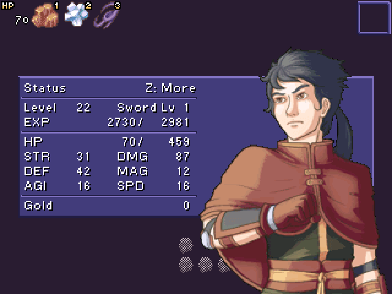
The Status Menu
I decided to throw in the portrait of the main hero, drawn by the great
alterego (whom I cannot get a hold of for the life of me... looks like he was last active on RMN nearly three years ago, ah well). It looks good, I think!
Something worth noting, the previous status menu from before was cobbled together many years ago, back before the PicPointer patch was even in existence, or if it did exist, I sure as hell didn't know about it, because holy cow it was a massive massive event. With the official english translation of RM2k3, the PicPointer stuff is now baked right into the engine, as well as what might as well be no limit on the number of pictures that you can display on the screen (
and lots of other insanely useful features to be sure, praise Cherry!). These limitations being lifted made making menus like this a breeze. Kinda insane to think about how much time I'd spent making the old menus comparatively.
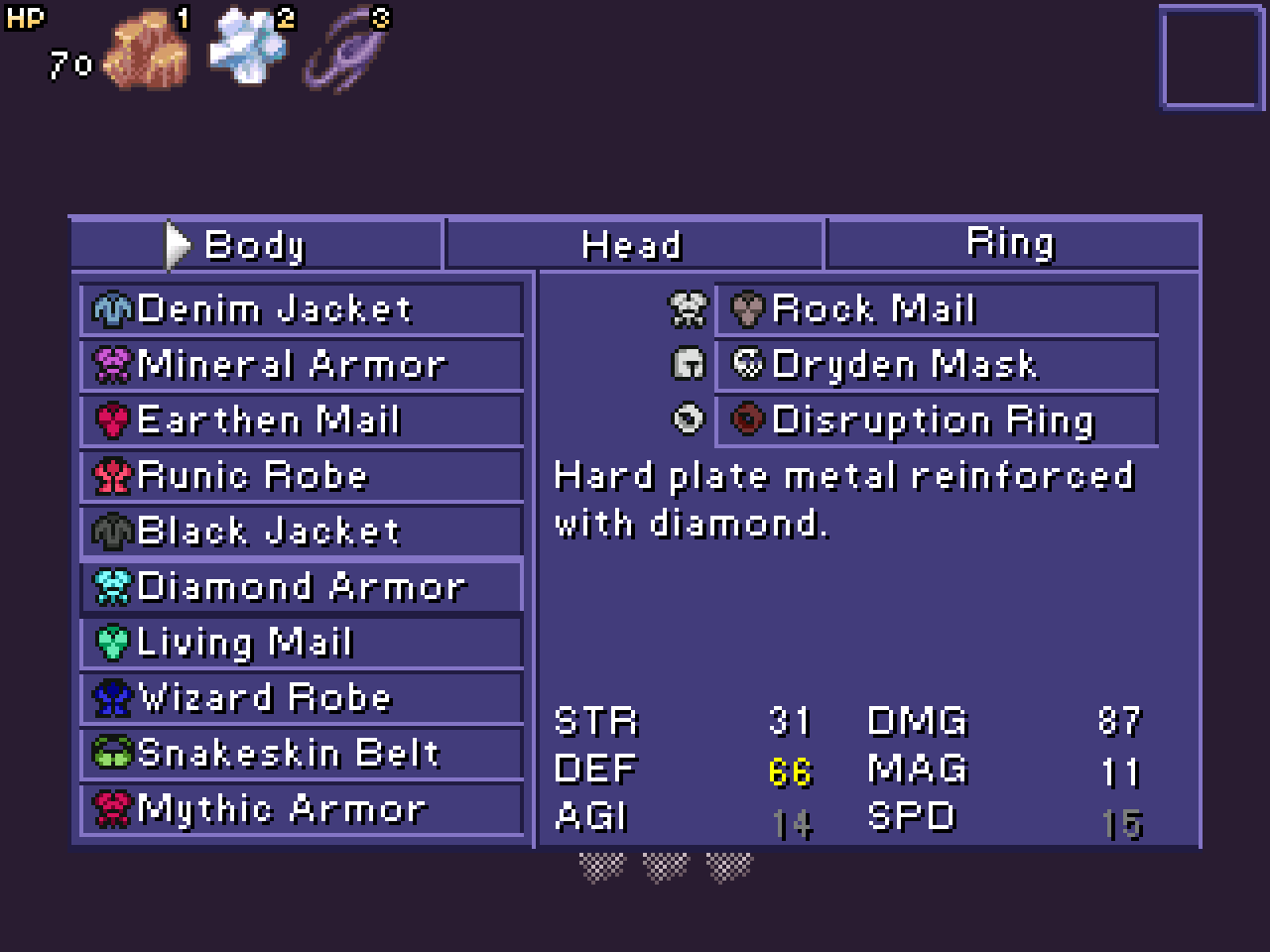
The Equipment Menu
I took the time to draw up a bunch of little icons for this one. Using the
Picture Text Creator utility, getting all the icons in line with the names was a snap. In fact, that utility has been indispensable in making these menus. (Previously I was drawing all the wording and lettering by HAND, what was I thinking?)
In any case, it's functional and looks pretty neat! Also all the equipment have descriptions right there on the screen, so there's no doubt as to what things do anymore. I might touch up a few things here and there, but I'm pretty darn happy with the way it is now.
The Rune Menu
This time around, the Rune menu makes a whole lot better use of pointers. It moves blazingly fast, where before switching between runes (which in turn, changes the list of spells you can see) noticeably lagged quite a bit. Once again, you can see some straight up
cute little icons denoting what runes are required to cast a given spell. Pressing Z opens up a little sub-menu so you can choose what slot to occupy with the highlighted rune.
That's enough blog for now. Still got a few more menus to tidy up, but after that it's on to implementing the status effects, and remaining spells & relics.
Cheers everyone!


 Add Review
 Subscribe
 Nominate
 Submit Media
 RSS
RSS narcodis