


 Add Review
 Subscribe
 Nominate
 Submit Media
 RSS
RSS
Thukerin' Thukertath!
 Liberty
- 10/31/2011 09:59 PM
- 22016 views
Maps, Manors and Madness #2
A Progress Report
A Progress Report
Submissions
All maps are now in! I've still a few of my own to finish, and have one or two that have been harder to join with the others (looking back, I really should have given more instructions when it came to doors. ^.^; )
I have had to edit a few maps - slightly - for story purposes. Speaking of, I was very surprised at how those maps with cutscenes fit so well together, story-wise. It made adding the story a lot easier, but I ended up having another set-back thanks to the last map I received which came with a very juicy story built in. This story also fits with the rest but I've had to do some quick thinking to match it all up. All told, the story should be interesting... :D
Release
Now, the release date will be off by a few days - I've had a few setbacks with my time thanks to the dreaded Real Life. Things like dog-sitting, persistent headaches and visitors have eaten it up like no-ones' business, so it may take a few more days to finish.
Then there'll be a few days for the beta testing. If all goes well, a day of fixing errors and finally, a release by weeks' end.
Your Help
To make the job a tad easier on me I've a few things I'd like to ask you all for. The first is patience. The rest are a bit more specific. Currently the project is in need of:
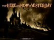
- A title screen: It should have 'The Here and Now of Yesterday' prominent, but also a small 'MaMaMa 2011' somewhere. Preferably with a manor of some sort, and rather dark, but it's up to whomever decides to make it.
- A title image for the Game Page - again with the title prominent and MaMaMa 2011 somewhere small.
- A picture with the credits included. This includes the list in the spoiler. If anyone can think of any credits I've left off, please mention it!
Mappers:
ae
arcan
chana
Deckiller
Demicrusaius
Faenon
Gibmaker
Happy
Julev
Liberty
Marrend
Max McGee
Merlinman
psy_wombats
SGCN
sillydan
Zephyr
Zyntax
Graphics:
Mack and Blue
Celianna
Enterbrain
Sounds:
Freesound.org
Music:
Matrix Software
~~~~~~~~~~
Thank you all so much for your patience!
Thank you all so much for your patience!
Posts 


I would turn up my nose at Real Life, except for the dogs. Dogs are worth Real Life.

I'm pretty sure the credit for the music that was used in my submission is not listed. If it was changed, moot point. If it wasn't, I can PM you with some details.

How is this? I know it's not the fanciest in the world, and is rather low key.
Also anti-aliasing issues is my biggest complaint, but I am limited to irfanview and MS Paint. And 2k3 uses a shitty resolution, anyway.
I must say, I do like the bird departing, though. It's subtle.

Also anti-aliasing issues is my biggest complaint, but I am limited to irfanview and MS Paint. And 2k3 uses a shitty resolution, anyway.
I must say, I do like the bird departing, though. It's subtle.

I really like it, quite a beautiful old time picture, not videogame at all though, but why not, might be interesting.
If I could get some time I would LOVE to draw some title screens :D
I have my school to do, but I'll try to find time to make some :)
I have my school to do, but I'll try to find time to make some :)

[]
How's this? A bit clashing, I guess, but... Any suggestions?
Also, the music I used and some pics I ripped where from Castlevania. But I guess we're safe if we just thank Konami. Heh;
How's this? A bit clashing, I guess, but... Any suggestions?
Also, the music I used and some pics I ripped where from Castlevania. But I guess we're safe if we just thank Konami. Heh;
Not bad, not bad at all, the light and clouds are ominous enough, the little girl coming up the alley is great, I quite like it, less the title though, could be much better, imo. Also the lawned garden looks too actual, it breaks the atmosphere.
author=alteregoHow's this? A bit clashing, I guess, but... Any suggestions?
Also, the music I used and some pics I ripped where from Castlevania. But I guess we're safe if we just thank Konami. Heh;

This seems almost cute to me, which strikes me as rather counterintuitive.
Other people seem to like it so...*shrug*.
I like how it has the protagonist in it. It has a cuteness, for sure, but I think considering the protagonist it works. I do like the sepia color scheme. Maybe the more recent could get an "old photo" or "filmstrip" filter?
I also like how the size of the mansion (and perhaps the task at hand) seems overwhelming to her.
I also like how the size of the mansion (and perhaps the task at hand) seems overwhelming to her.
I do like how it has the protagonist in it, but the shot overall and the font chosen seem too cheerful to me.
That's precisely what caught me, when you know how it's going to be in there, also the light and clouds are somewhat ominous, imo. This said, I insist, I really don't like the garden in front.

I prefer the first title. The style of the protagonist in the second one doesn't go well with the photograph. Plus the clouds and sky kind of indicate it's daytime...
Fixered it a bit... Made it darker, added some 'mist' and some other minor adjustings.
About the font. Yes, it is a bit ornamental, but the difference in size, level, angle, etc. of each letter gives it a certain feel of uncertainty. Look at the fonts used in titles such as 'Alice in Wonderland' and you'll notice these characteristics more often than not. Then again, if you guys spot a font better suited for the title just let me know.
The garden is there mostly because one the screens shows a maze garden and this is the closest I could get to it. Also, I thought this was about a fancy Manor and not just some abandoned house she barged in. (I could be wrong though) So all in all I found this picture to be rather well suited. But of course, I can always change it. =P

Chana, that's actually pretty neat but it's not the correct size/resolution.
Also, the text is poorly (anti-)aliased and badly centered, and the font is kind of bland.
Other than that I like it.
Also, the text is poorly (anti-)aliased and badly centered, and the font is kind of bland.
Other than that I like it.


