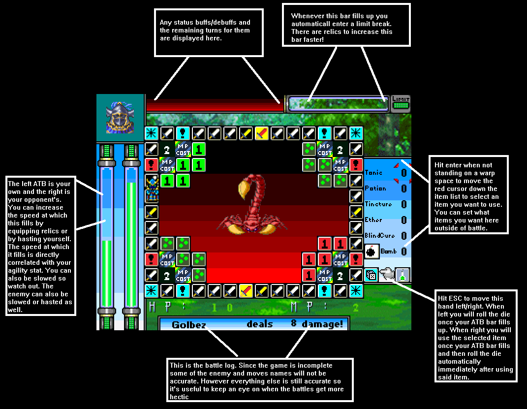
ATBs that look exactly the same = really bad idea. Especially when the hero's face spans over both of them. Separate them or add some text or a face and change their color (green for the hero, red for the enemy for instance).
The color gradients don't look so good too. Making a better gradient by adding more tones would look better.
HP and MP digits will be hard to see in certain backgrounds (they're already hard to see here). I suggest making them brighter and adding a darker outline. Example: click here

 Add Review
 Subscribe
 Nominate
 Submit Media
 RSS
RSS