


0 reviews
 Add Review
 Subscribe
 Nominate
 Submit Media
 RSS
RSS
Posts 

Pages:
1

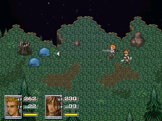
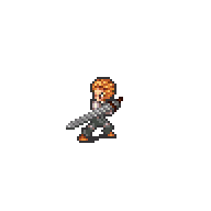
Is that a sword Eric is holding? For a second, I thought the MC was holding a sniper rifle, and I was like :D
Finally, a battle scene!
Looks great as always.
edit : Where're those faces from, anyway? Or are they Tau originals?
Looks great as always.
edit : Where're those faces from, anyway? Or are they Tau originals?

Psh, Eric is a real man - he gets into the action up close and personal, now cowers from a distance behind a scope... is what I would say if that was true. :P
Nice looking combat, though. While I like the HP and MP text overlapping the faces, if you do change them later, I would suggest try not to make that text cover their eye or something like the female character face :)
Nice looking combat, though. While I like the HP and MP text overlapping the faces, if you do change them later, I would suggest try not to make that text cover their eye or something like the female character face :)

Slight update. I had no idea what this Mami thing was people were mentioning but I figured it had something to do with the character set, so I've changed it as well as the faces. Turns out Mami is from an anime or manga. Seriously I had no idea, I don't watch/read the stuff, not really my thing.
Quick shout out to LWG for giving me the faces which I have edited. You might also notice the bars underneath the faces, they to have just been added but aren't functional properly just yet, limit break :D
Quick shout out to LWG for giving me the faces which I have edited. You might also notice the bars underneath the faces, they to have just been added but aren't functional properly just yet, limit break :D
I know where the new faces came from >:3
edit : Personally, I think the guy 4th column, 3rd row in would make a better Eric. He seems a little more snarky, whereas this fellow is more stoic. Just need to recolor.
edit : Personally, I think the guy 4th column, 3rd row in would make a better Eric. He seems a little more snarky, whereas this fellow is more stoic. Just need to recolor.

Great, I'm glad you did go with them! I'm not being biased, I honestly do think they look a bit better, plus the faces are more zoomed out, so you haven't got the HP/SP distracting you from their faces. Good choice, and nice re-colours too. =)
Something nitpicky I forgot to mention. I do think it would look better if you moved the numbers on your system set 2 up by a few pixels, that way the player can easily make out both the numbers, and the percentage of the bar, because right they interfere with each other a tad. Try it, see what you think.
Something nitpicky I forgot to mention. I do think it would look better if you moved the numbers on your system set 2 up by a few pixels, that way the player can easily make out both the numbers, and the percentage of the bar, because right they interfere with each other a tad. Try it, see what you think.

I really like the male face set there, even if the hair doesn't match the sprite at all. Simple edit could fix that. But again, nice face sets!
@WCouillard - Nah yeah I still have to recolor his hair.
@LWG - Yeah I could see how that's a problem, consider it done :D & yeah I actually prefer them as well, easier to edit to.
@Dyhalto - I was considering him, but I just prefer the current one, has the look closest to what I wanted.
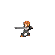
Oh and guys, which pose is better?
New = Left Old/Current = Right
@LWG - Yeah I could see how that's a problem, consider it done :D & yeah I actually prefer them as well, easier to edit to.
@Dyhalto - I was considering him, but I just prefer the current one, has the look closest to what I wanted.
Oh and guys, which pose is better?
New = Left Old/Current = Right
@Galv - I'm thinking the left one as well but is the animation alright, maybe one more movement?
@Chris - You mean the sword or something else that's less detailed?
Also it seems I have regulars :D
@Chris - You mean the sword or something else that's less detailed?
Also it seems I have regulars :D
Regulars? We don't like that term, we prefer 'stalkers'. (joking of course)
Well, I think the animation looks fine as long as it matches other animated characters. Adding more frames would make anything better.
60 frames of movement per second please :P
Well, I think the animation looks fine as long as it matches other animated characters. Adding more frames would make anything better.
60 frames of movement per second please :P
I agree that the right sword is better. The left's sword looks... blurry to me. The outline style isn't as good.
I don't love the girl's sprite though. Her pose is a bit awkward, like she is tilting forward (which I guess makes sense since she looks so cartoonishly top-heavy))
I don't love the girl's sprite though. Her pose is a bit awkward, like she is tilting forward (which I guess makes sense since she looks so cartoonishly top-heavy))
@fredo - Yeah I'm still working on her sprite.
I'm really leaning more towards the left one but it seems everyone likes the right one.. Maybe I'll just fix up the sword and see what people think.
I'm really leaning more towards the left one but it seems everyone likes the right one.. Maybe I'll just fix up the sword and see what people think.
Pages:
1

