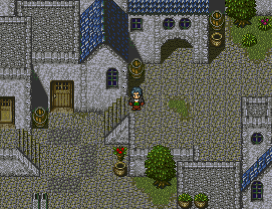
I feel like the back part of the stairs needs some contrast. The one by the character looks okay because it has the white wall, but the one in the bottom-left looks really bad since it mixes with the ground. Also, I'm not sure what's going on here but it's not pretty:
Should be an easy tile fix, though.
Since you're using a maker that doesn't suck, I suggest adding some off-center tiles to the map. Make the flowers snug up against the stairs, for example, and the grass pots on the bottom look more like a cute setup instead of just "POTS GO HERE." It'd help make this look a lot nicer, I think, especially since the grass patches give it an untamed port look that the organized tile-b decorations detract from.

 Feldschlacht IV