 Add Review
 Subscribe
 Nominate
 Submit Media
 RSS
RSS
 Feldschlacht IV
- Added: 06/12/2016 08:59 PM
- Last updated: 01/26/2026 08:23 PM
- 4577 views
Posts 

Pages:
1
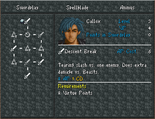
I don't see the point of using 2x fonts if you're using 1px borders on them and have everything have a resolution clash >_>
in your place i'd just use a normal font and normal graphics for menus and icons and such, and have it "clash" with the rest of the world / sprites. Record Keeper has proven it isn't bad at all. But this is. >_>
anyway the game looks awesome tho.
in your place i'd just use a normal font and normal graphics for menus and icons and such, and have it "clash" with the rest of the world / sprites. Record Keeper has proven it isn't bad at all. But this is. >_>
anyway the game looks awesome tho.
Wait, by normal font do you mean along the lines of the default hi-res font for VX Ace? I respect what you mean, but I hate that font. I get pissed off enough when I see it in every other Ace game (including Record Keeper). I honestly think I'd rather gouge my eyes out than work with it in my own game, especially with SNES res sprites.
It can be done well, but I'd rather ditch it entirely.
It can be done well, but I'd rather ditch it entirely.
by normal font i mean any font ever, without upscaling it 2x. Also, record keeper does not by any means use VL Gothic, although I can see the similarities. There are several fonts for you to use without upscaling, Fjord is a great norse-themed one I like using on some projects, but really, the internet isn't lacking in fonts.
Anyway, I don't really see the point of half-trying to go low res. You either do it or you don't. Having a bunch of different-resolution assets clashing together in the same scene (2x fonts with a 1x border on a 1x weird-loop windowskin with 2x facesets) is quiiite glaring. Now, if you do all of your game graphics 2x, and all of your menu stuff 1x, that's a lot better. :PP
Anyway, I don't really see the point of half-trying to go low res. You either do it or you don't. Having a bunch of different-resolution assets clashing together in the same scene (2x fonts with a 1x border on a 1x weird-loop windowskin with 2x facesets) is quiiite glaring. Now, if you do all of your game graphics 2x, and all of your menu stuff 1x, that's a lot better. :PP
Right, I see what you mean. Of course the menu UI is something that's always being improved, so you may see that in the finished product.
Corfaisus

"It's frustrating because - as much as Corf is otherwise an irredeemable person - his 2k/3 mapping is on point." ~ psy_wombats
7874
author=Dyhalto
For what it's worth, I think the font is fine.
Joe's just being a schmoe.
Yeah, I think it's decent. No need to fix what isn't broken.
I see what he's talking about, but I think a more logical fix would be to 2x scale the menu borders, no? That would put the one thing that is at a different resolution into scale and fix all the problems.
MOG, out of curiosity does RMVX have any actual capacity for glyphs or are you just using white icons?
MOG, out of curiosity does RMVX have any actual capacity for glyphs or are you just using white icons?
How about this?
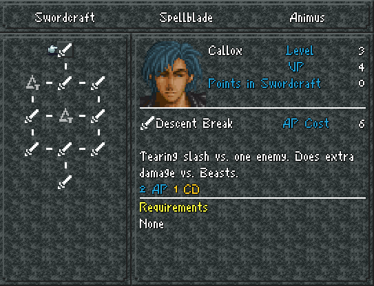
It does!

author=Kaempfer
I see what he's talking about, but I think a more logical fix would be to 2x scale the menu borders, no? That would put the one thing that is at a different resolution into scale and fix all the problems.
MOG, out of curiosity does RMVX have any actual capacity for glyphs or are you just using white icons?
It does!
Pages:
1


