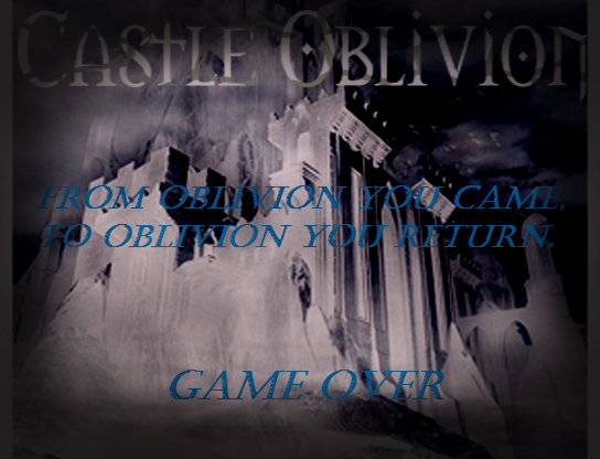
I pimped up the GO screen a little (trying to be a little productive while I'm waiting for my tester to finish).
The text could be a little better, but this will have to do for now at least.
The text is pretty hard to read, I would appreciate if it was a little brighter and something more matching with the rest of the palette instead of random blueness, it's like a blue pixel in the middle of a red background. Other than that, it looks pretty nice ^^
Thanks! I made the edits in regular Paint. I have little to no experience drawing logos/text, which is why it looks so off. I plan to get better with GIMP after this game, so that I'll be able to work my way around things like this.

 Add Review
 Subscribe
 Nominate
 Submit Media
 RSS
RSS