


0 reviews
 Add Review
 Subscribe
 Nominate
 Submit Media
 RSS
RSS
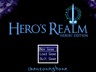
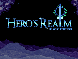
Skills of an artist (Titlescreen)
 kentona
- 03/22/2023 02:06 AM
- 856 views
So I finally sat down and started learning some basic pixel art (purchasing Aseprite, following some tutorials like finalbossblues and saint11 etc.). I do not have a knack for art. I try, but I know that my works are amateurish. But that's not going to stop me (at least, not yet)!
Anyway, after gaining the bare-minimum in proficiency with Aseprite, I tackled a long outstanding item - the actual titlescreen!
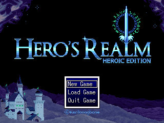
Now, your first impression should be to realize that it bares a shocking resemblance to the mockup that Ocean made for me back in 2018 (omg... 2018... *sigh*)
(comment on it here: https://rpgmaker.net/games/9906/images/81978/)
I mean, I loved it and it was always going to serve as my inspiration. Thanks Ocean!
Shortly after receiving it, in fact, I had created a "composition" in Photoshop using my preferred font (Optimus Princeps).
I had envisioned even back then that the base would be some fantasy-like setting (castles, fields, mountains, or the like), so I cleared out that area. I also LOVED the sword Ocean made (obviously. It is great). You can also see where I was experimenting with a "company" name using a font I made with my own handwriting (yes, my handwriting is that bad). I used one of those handwriting-to-font services. The font name is Gbone btw.
Yesterday (or was it the day before?), I took this base and began in earnest. I flattened the font and neatened up the edges, mocked up some mountains and hills, and a castle.
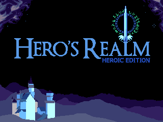
If it looks familiar, then you know about the Bavarian castle in Germany!
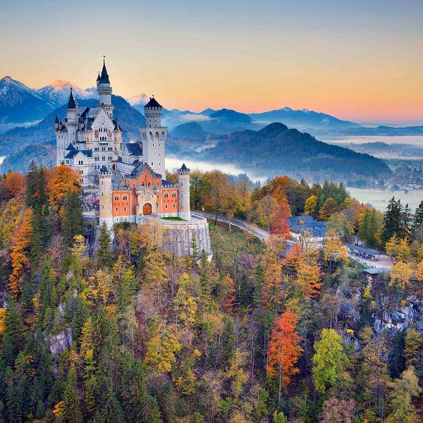
This image formed the basis for my composition and castle layout. I shrunk it down to 320x240 and did a quick trace/freehand on it, and referenced it when I was spriting the details.
Next, I added details to my mockup mountains. I had a lot of fun doing this. Natural scenes at a far distance is my wheelhouse. I also mimicked the style that Ocean made for the font. I think it turned out pretty great, myself. The title really pops.
I then got to work on adding detail to the castle itself. (FYI layers are your friend).
I am not terribly happen with the final result, to be honest. It is quite amateurish. The scale, perspective, colour, balance, lighting, and textures are all off (some a little, some a lot).
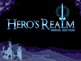
I debated (and am still debating, tbh) removing the castle entirely (despite working for hours on it) - I am that dissatisfied with it. I moved it around, tweak things a bit, tried making some forest/trees in the foreground, shrunk it to half-size to see if that helped, even tinted it to see if muting the colours would help. I just don't have the skill or experience to figure out what I need to do to make it better.
I probably shouldn't have tried to tackle something so complex mere weeks after starting my pixel art journey. Ah well. Perhaps I will revisit this titlescreen in the future.
For now - on to battle animations!
Thanks for reading.
Anyway, after gaining the bare-minimum in proficiency with Aseprite, I tackled a long outstanding item - the actual titlescreen!
Now, your first impression should be to realize that it bares a shocking resemblance to the mockup that Ocean made for me back in 2018 (omg... 2018... *sigh*)
(comment on it here: https://rpgmaker.net/games/9906/images/81978/)
I mean, I loved it and it was always going to serve as my inspiration. Thanks Ocean!
Shortly after receiving it, in fact, I had created a "composition" in Photoshop using my preferred font (Optimus Princeps).
I had envisioned even back then that the base would be some fantasy-like setting (castles, fields, mountains, or the like), so I cleared out that area. I also LOVED the sword Ocean made (obviously. It is great). You can also see where I was experimenting with a "company" name using a font I made with my own handwriting (yes, my handwriting is that bad). I used one of those handwriting-to-font services. The font name is Gbone btw.
Yesterday (or was it the day before?), I took this base and began in earnest. I flattened the font and neatened up the edges, mocked up some mountains and hills, and a castle.
If it looks familiar, then you know about the Bavarian castle in Germany!
This image formed the basis for my composition and castle layout. I shrunk it down to 320x240 and did a quick trace/freehand on it, and referenced it when I was spriting the details.
Next, I added details to my mockup mountains. I had a lot of fun doing this. Natural scenes at a far distance is my wheelhouse. I also mimicked the style that Ocean made for the font. I think it turned out pretty great, myself. The title really pops.
I then got to work on adding detail to the castle itself. (FYI layers are your friend).
I am not terribly happen with the final result, to be honest. It is quite amateurish. The scale, perspective, colour, balance, lighting, and textures are all off (some a little, some a lot).
I debated (and am still debating, tbh) removing the castle entirely (despite working for hours on it) - I am that dissatisfied with it. I moved it around, tweak things a bit, tried making some forest/trees in the foreground, shrunk it to half-size to see if that helped, even tinted it to see if muting the colours would help. I just don't have the skill or experience to figure out what I need to do to make it better.
I probably shouldn't have tried to tackle something so complex mere weeks after starting my pixel art journey. Ah well. Perhaps I will revisit this titlescreen in the future.
For now - on to battle animations!
Thanks for reading.
Posts 

Pages:
1
Welcome to the club :)
That is not bad at all, even though it could be improved in various ways or different styles.
Any amount of practice is never a waste!
Drawing will take you less and less time as you gain experience and repeatedly draw the same things: the brain eventually learns how things should look like without relying on references. And you'll figure out how to improve any image the more art or photos you look at and the more details you pay attention do.

I started with minus art skill. A lot of us who do pixel just force ourselves to understand it.
You say you do not have a knack, but everything you did there shows that you are likely just too hard on yourself.
It looks seriously great.
And EVERYTHING ever can be improved. There's a point to settle. Your title is definitely at that point. Good work.
Edit: I also want to point out, that just the logo and leaves on top would have been enough and fit the SNES vibe well.

The title screen is probably one of the least important parts of the thing overall, so I wouldn't worry about it if you need to just use it temporarily and come back to it with a different perspective later.

author=zDS
I started with minus art skill. A lot of us who do pixel just force ourselves to understand it.
You say you do not have a knack, but everything you did there shows that you are likely just too hard on yourself.
It looks seriously great.
And EVERYTHING ever can be improved. There's a point to settle. Your title is definitely at that point. Good work.
Edit: I also want to point out, that just the logo and leaves on top would have been enough and fit the SNES vibe well.
I might still do that. Thanks!
author=Roden
The title screen is probably one of the least important parts of the thing overall, so I wouldn't worry about it if you need to just use it temporarily and come back to it with a different perspective later.
Yes. But it's been 5 years. This IS me coming back to it.

Pages:
1

