


DEZZ'S PROFILE
Dezz

1252
Hey.
I'm Dezz.
Yeah.
But seriously; I'm Dezz. I've been using RPG Maker since 2007, starting with XP but quickly changing to VX. If you want a map making, send me a PM and I'll try and help.
Thanks!
I'm Dezz.
Yeah.
But seriously; I'm Dezz. I've been using RPG Maker since 2007, starting with XP but quickly changing to VX. If you want a map making, send me a PM and I'll try and help.
Thanks!

Search
Filter
 zackzackzack.png
It'd be awesome if play time was there so we know which file we've done the most on.
Still, this is awesome anyway. ^_^
Still, this is awesome anyway. ^_^
screencontest.png
Have you credited Ashvir Bains and asked his permission to take the ship from his game 'Lost Heaven'?
Towns_Erinna_NewGraphics.png
Far better, however the initial map seems 'square'. The houses seem like they each have a square block in the map with the fences.
Comparison.png
Well, the houses seem too big, especially if you're going to be using RTP-sized character sprites, and the grass doesn't seem to fit in with the path and the water.
However, I do like the grass a lot, and the path seems to look a little weird, so you might wanna change the path to suit the grass more. Just my opinion though.
However, I do like the grass a lot, and the path seems to look a little weird, so you might wanna change the path to suit the grass more. Just my opinion though.
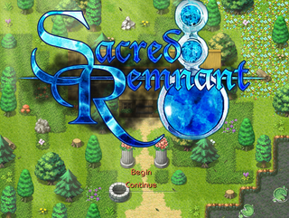
Title.png
Hmm, I'd suggest making the font a bit bigger.
It doesn't seem that 'empty and bland' to me, as the windowskin will take a bit of space up anyway.
And the font looks pretty good, but I think the yellow bits at the top and bottom of this seem weird. I'd suggest either removing them, or adding their other halves.
It doesn't seem that 'empty and bland' to me, as the windowskin will take a bit of space up anyway.
And the font looks pretty good, but I think the yellow bits at the top and bottom of this seem weird. I'd suggest either removing them, or adding their other halves.
feedanim1.jpg
title1.JPG
Uhh, shouldn't that door be in the middle of the house on the left?
Also, you shouldn't mix world map trees and mountains with village tiles. Ever.
And this seems too square, and the buildings look bad imo. Try decreasing the size of the houses down a few tiles (two maybe) and thinner a few (again, 2-4).
Also, you shouldn't mix world map trees and mountains with village tiles. Ever.
And this seems too square, and the buildings look bad imo. Try decreasing the size of the houses down a few tiles (two maybe) and thinner a few (again, 2-4).

