


PULITS'S PROFILE

Search
Filter
 About the maps
author=CashmereCat
you should also dish out $$$ for a new character sprite to fit with your maps style
Otherwise great. Looking forward to playing this and being bedazzled by all this fine art and atmosphere. let's make this happen, let's move move move, soldiers
Thank you, this comment is very supportive. I'll give my best to make this happen.
There is indeed a sprite artist working on the project, too. In the end, I decided to stick with the default 2k3 sprite style, the reason is that I made progress for the game before I discovered Cherry's "any size" sprite. Adding a style that matches for the maps completely is a hard task with such small sprites.
I hope that boss battles are different, which I'll be doing differently.
Again, thank you!
 The Screenshot Topic Returns
author=Blindmind
I've said this on your gamepage as well, but I ADORE what your artist is doing with the backdrops. ;D They provide such a painterly aesthetic to the project, yet still adhering to the grid structure of Rm2k3. We really haven't seen this level of detail in original background design for quite a while. My only complaint is the character sprite - which naturally stands out a tad. But I think it's more an issue of contrast and lightness than his size. Perhaps if he were darkened (and shaded more thoroughly), it wouldn't seem as jarring.
Thank you! I am comitted into bringing the best game experience I can, even if it's for 2k3. "Back then" I knew the technique was possible (Sunset Over Imdahl, The Way, and maybe Wilfred the Hero, I haven't played it), but I always wanted to bring my own interpretation of it.
I agree, I think the character "shines" a lot, I noticed that before. But I am not sure on how to fix it, manually shading every character set would require tremendous work. But I'll give it a try.
The Screenshot Topic Returns

We're almost done with the mansion. This is the children's room, so far I think it is my favorite, it is really creepy.
The Screenshot Topic Returns
About the maps
author=Blindmind
This is very inspiring! Many people sneer at using Rm2k3 or older engines for "painted" backdrops, but this game is one of the few that's proven they can be done well! I'll be following it closely. :D
Just an aside - do you limit the maps to only two layers? You might be able to preserve more of the color fidelity if you utilized various pictures.. etc. Also, I think Photoshop might have better potential for reducing the color palette to 256... but maybe the difference is negligible lol.
Thank you!
Depends on the map itself. Some maps can be broken into many more layers. The problem that I've found is that only the parallax background works effectively for the "down" layer, and pictures always go "above". So, when possible, I divide the "above" layer into many pictures.
Each map tries to use the least amount of colors. I've used both Photoshop and GIMP to decrease the image to 8-bit depth, but for some reason IrfanView makes better color choices. So far, most maps have responded really well.
 mansionmasterbedroom.jpg
author=Blindmind
Wow. Are these backdrops all painted manually for your game?! Simply gorgeous. My only concern is the slight disparity between the room's scale and that of the character, but it's a minor issue!
Yes, every backdrop is painted manually. Thank you!
I've received the comment that the assets (bed, windows, etc.) are out of proportion. I can always resize them, I think they look fine the way they are right now, but I am evaluating changing their size.
The Screenshot Topic Returns
author=SnowOwl
Unless your character is somehow shrinked to 1/10th of his normal size, everything in that house is huge. Also character doesn't match with the rest in style.
The sprite size (24x32) and style is the standard rm2k3 sprite. The room is hand drawn, which allows greater detail. Using this same technique for sprites that size is very difficult, so that's why I opted for the standard pixel art.
Each asset can be resized, and this screen actually got many revisions, I think it looks great this way! But I'll consider resizing it once again.
Thank you for your comment!
The Screenshot Topic Returns
Here's a room of the mansion, in the actual 320x240 size. I simply had to make an option to toggle ON/OFF the HUD. I think it's more convinient for the player and for the game itself.

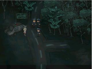
mansionoutside.jpg
author=Blindmind
Wow, suburb blending of graphics here.
Thank you! I added another version of this same picture, but in a 320x240 resolution.

