


SALOMAC'S PROFILE
SalOMac

10
I am a carbon-based life form located on the third planet from the star "Sol". I am mostly an artist , and dabble in various defunct, art styles that only I seem to find attractive. From time to time I flirt with making a game only to be sidetracked by life altering events. Now that I am finally _relatively_ stable. I'm climbing back on to the saddle... lets see how far this goes.
Search
Filter
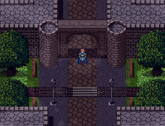
 Screenshot Survival 20XX
And as you go deeper... Giant mushrooms!


I had fun working on the graphics for these, but now that this new RM is coming out I may be jumping shit, keeping this same look but increasing the size to 24x24 for all tiles. OH! and I fixed the rock graphic as well.
I had fun working on the graphics for these, but now that this new RM is coming out I may be jumping shit, keeping this same look but increasing the size to 24x24 for all tiles. OH! and I fixed the rock graphic as well.
Screenshot Survival 20XX
I like medium and tall myself. XP Sprites were awesome imho. I freaking hate the VX/ VX ace sprites though.
RPG Maker MV announced for PC and MAC
Hmm very tempted to resize the ol' 2k RTP to 24x24 and try it out in this program. Yeah, this is happening... Still there's those blocky auto tiles again ;_;
Screenshot Survival 20XX
author=Luchino
Been doing some more pixel work for Tristian:


Dat style! I could definitely get into a game that looks like this. I'm glad to see I'm not the only one that digs tall sprites =)
 Gameplay Demo II (WIP)
Screenshot Survival 20XX
author=Healy
Don't usually have anything noteworthy to post here, but since we had a big discussion about shop screens a while back, I'd figure I'd post this here for feedback. How do y'all think of this screen?
(Made with the Knytt Stories level editor.)

What kind of game is this ? like a platformer?. Otherwise I don't think I have that much to say. It evokes a very retro feel with he black lines and simple colors. .. I have no complaints really =)
Gameplay Demo II (WIP)
Nice! I'm digging that camera slide effect. This looks like something made in 2k3 though. Because of the pixellation. Not that that's a bad thing. I was just under the understanding that VX Ace was capable of full color...
Screenshot Survival 20XX
@BizarreMonkey
Ah yeah I see now. That definitely works then!
@CashmereCat
Nice! I have to agree with everyone else. What really makes this come together is the consistency. Very much looking forward to seeing how this turns out.
Ah yeah I see now. That definitely works then!
@CashmereCat
Nice! I have to agree with everyone else. What really makes this come together is the consistency. Very much looking forward to seeing how this turns out.
Screenshot Survival 20XX
@JosephSeraph . Yeah I'm still looking for a tutorial for it for rm2k3...
@Infinite Yeah youre right, I should fix that. Nice catch
@ Kaempfer yeah It think we're kindred spirits there.
Thanks for the comments !
That red cat guys really stands out compared to the woman/maid/ mom ? and other sprites. ( the tile-sets as well) If that's intentional it's fine I guess, but looking at the portrait and message box it almost seems like the game is begging for a more lighthearted / simpler look. The shot as it is though is still pretty solid though. looks good !
@Infinite Yeah youre right, I should fix that. Nice catch
@ Kaempfer yeah It think we're kindred spirits there.
Thanks for the comments !
author=BizarreMonkey
Just a small one today, dearies.
Adding flavor text around thine house.

That red cat guys really stands out compared to the woman/maid/ mom ? and other sprites. ( the tile-sets as well) If that's intentional it's fine I guess, but looking at the portrait and message box it almost seems like the game is begging for a more lighthearted / simpler look. The shot as it is though is still pretty solid though. looks good !
Screenshot Survival 20XX
author=Luchino
I think the hard edged could work if they were a lighter color maybe? They look like outlines, which is fine, but I think if you made them lighten with the lighter values of the objects they would blend in more. I think the only thing that bothers me about the trees is that it looks like every one of the leaves has an outline. Again, I think it could work if you lighten the edges as with the lighting on the objects. Either way I still dig it. It's cool to see peeps making OG graphics!
author=Infinite

Is that..a sword on the rope? This looks like fun. Dude reminds me of Alex Kid. Boy did I just date myself with that one... Still waiting on that game page though
@Kaempfer
Yeah! hmm, you know what I'm gonna try that. Maybe do a transition for the cliff tiles going into water as well. Has anyone ever done a good waterfall transition?
@Sated & @Dookie
I have to admit I do kinda like the contrast. I'm trying to keep that silliness that the RTP instills in some respects. But I do agree that it may be too much. Perhaps I went a little overboard with the placeables? Here's a screen of it in game with the tint. Does it look any better or does is still bother y'all?


Thanks for the praise as well! Now I don't feel as bad for liking the RTP, lol

