


THEREXION'S PROFILE


Search
Filter
 Coffin.png
 Hikari Portrait
Hikari Portrait
 Short gameplay video
Though, this is a later version of the game than what is available here. So some things may not reflect the state of the current download--like the experience bar.
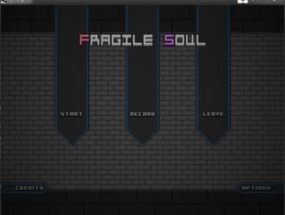
 Fragile Soul
I can assure you there is no virus. The file is new to the internet in general, and knowledgeable computer users will know that this causes anti-virus programs to spazz out as they do not recognize the file due to the aforementioned reason. It won't cause your computer to explode, I promise ya that much.
 The Screenshot Topic Returns
The Screenshot Topic Returns
Just thought I'd share a little somethin', hadn't been here in a while:
https://www.dropbox.com/s/ll0dmmiev5tst22/Screenshot%202013-12-17%2005.00.18.png
https://www.dropbox.com/s/ll0dmmiev5tst22/Screenshot%202013-12-17%2005.00.18.png
 Post your Music
sandstone.png
author=WolfCoder
No, now THAT looks jarring. Even more than I remember Disgaea being. They look completely out of place. It's like they dumped sprites from one version of Disgaea into a map from another (which is probably what they actually did). Are you looking at the drop shadows I don't have yet? Or the fact every game I referenced had lots of orthographic projection shots (no depth perspective and shot from low orbit) while mine uses 45 degree FOV.
... that's not jarring at all. It fits very well with the environment and it /works/. It looks nice, and it meshes incredibly well. There's no stark difference between the shading and coloring of the world and the characters, it's very subtle. Very nice and neat and easy to look at.
author=Link_2112
It might help the sprite to have a shadow. And in one of the images here with low lighting, with the lighting filters applied to the sprite, it looks really good.
author=WolfCoder
I haven't put them in yet.
sandstone.png
author=WolfCoder
I don't see this difference that you're talking about. The sprites in the games I mentioned (including Disgaea) stood out from their backgrounds just as much. If you're talking art-wise, I drew the sprites and backgrounds such that the backgrounds are soft and the sprites are sharp and high contrast (the outlines are much darker too) which differs from the PS2 era games that still did sprites on 3D.
They stand out, yes. But they still match due to the cohesive elements the 3D and the sprites share. They're fitting with one another, because it feels like they were made to be together.
http://pspmedia.ign.com/psp/image/article/777/777214/disgaea-portable-20070330001541942-000.jpg
Yours doesn't have the same effect. Even in the example you showed that has the effect your going for shows it. That has cohesion and it flows well from the 3D to the 2D. It looks nice, it bonds the elements well, and it just in general isn't mentally jarring to look at.
Applying filters isn't what I meant, just generally having them look good together is what I'm referring to.

