


CHARBLAR'S PROFILE

Hi I'm Nikki (everyone still calls me Char though) and I'm really bad at making descriptions.
I'm much more active on twitter!
I'm much more active on twitter!
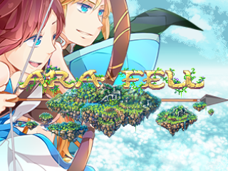
Ara Fell
A 16-bit era, Japanese-style roleplaying game set in a magical world floating above the clouds.
A 16-bit era, Japanese-style roleplaying game set in a magical world floating above the clouds.
Search
Filter
 Parallels Episode 2
 Screenshot Survival 20XX
author=Dookie
Char- I really don't understand the mentality, do you have some deadline to meet? Why wait to fix a design flaw with the main character??
Like you post your updates here for feedback but won't fix the most glaring problem with your screens. Don't take this character out of your map shots for my benefit, if you don't think the MAIN sprote is a priority to fix BEFORE the release then I just don't know what to say. I'm just trying to help. Don't listen to people who rush to get the content out.
Consider this..
Open a blank paint file.
Paste a few common objects from your map in there.
Use them as a size reference and do a few 100% new designs of your MC.
Ditch the earthbound body template and create something that matches your environment more.
Use the correct resolution, don't stack pixelsnto create larger pixels for outlines. One pixel should be one pixel just like on your map.
I can't believe you'd rather redesign computer monitors than the MC. That's like the focal point for the whole game. Saying you've spent enough time changing whatbyouve done is a pissy attitude for someone making custom gfx and I don't buy it.
Also I liked the old monitor angle better, it seemed more dynamic and less like another black box.
First off, I forgot I had made a computer in till I was halfway coloring it.
Additionally when I showed you what I had for a full size resolution sprite you said you just wanted them to fit better.
I will do it. I have said that. If I'm not in a set mood to work on something I'll waste time doing it. I've gotten approval on the sprites from others on here regarding them and i'm not going to pull out graphics don't make the game and blah blah blah but the game is mine it's not Eagleland and you know what it's probally never going to be as successful as yours but it's mine and it's my ideas and I take feedback to heart I'm not making this a rushed job but I'm a single person and a musician team.
If it bothers you so much I will do them right now but it's my game and I've heard about the sprites from almost everyone I'm sick of hearing it I'd like to have actual feedback on my maps for once.
I'm stopping this whole argument thing here I don't want to derail the thread or anything but for the time being I'm going to stop posting screenshots till maybe I have something you'll actually like to see.
Screenshot Survival 20XX
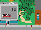
author=Dookie
Char I know its been said a million times by now but that character design is just not working. The bulbous head is bigger than the computer monitor and even the toilet. The sprites pixel outlines are too thick and seemingly in the wrong resolution compared to the environment. Either change the maps to fit the character size or simply redesib the character.
And as always I will say, I will get around do it but I have done more then enough of fixing of what I've done and I'm going to say as others have told me I'd rather have a game out then to keep fixing what I have done. It may be redesigned before chapter 1 is released or in between the time I take a bit of a break after it is released but if it really bothers you i'll take out the characters from the screenshots if you would rather not see them.
Additionally if we want to focus on the computers, hey i redid them so they actually look decent I've improved at pixel art.

Screenshot Survival 20XX
author=Rine
Finished enough characters to get a sizable sample, so working on more missions for my first playtest. Unfortunately, really hard to make RTP assets look good for short Mission-styled Maps when you only show screen shots.

It's kinda hard for me to even make sugestions with what you have from the map I see so like even something simple I would say is for short missions make the maps smaller you can shove stuff in make it detailed more then what you have here which has a lot of space, also the use of the parallax background is kinda weird (you also have an autoshadow so if you want to keep it be sure to remove that) The way you just pile the boxes as well don't look the best maybe at least replacing a few with a few different kinds at least or making it the box stack.

Okay here is some simple stuff I did that could help you, the version of the wall I used doesnt have that weird line on it which I don't know why it is exactly there BUT, also sides on where the edges are will help, also put a few cracks in the tiles at least. Also the dragon thing I think is supposed to be used either on a wall or as a thing off the ground so maybe a door to end the level? Lastly make the map bigger then needed in width so the background doesnt get cutoff.
Screenshot Survival 20XX
Hanging on is done from it's two week break which was more just me working on coding for the entire time but anyways here is some of the first work I've done back on the project.

Most of the map IS still using placeholders from when I left for my program or is using very unfinished tiles but it's a start to get back into it!
Most of the map IS still using placeholders from when I left for my program or is using very unfinished tiles but it's a start to get back into it!
 using rpg maker for the first time in like a week and a half after using unity from 9 to 5 everyday is like... I'm getting so much done so fast.
Yeah it's a great engine but honestly stuff like this is just what gets me on edge with it
and sadly I can't use things such as sorting layers because your working at a 2.5D perspective but oh well I'll figure it out one time.... eventually.
and sadly I can't use things such as sorting layers because your working at a 2.5D perspective but oh well I'll figure it out one time.... eventually.

