


SPRITES FOR A NEW GAME, NEED FEEDBACK
Posts


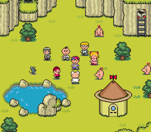
The trees could be cool for a certain style, but the bold horizontal lines are burning my eyes. I'd try reducing the contrast between the two green stripes by a factor of about a bajillion.

The trees and bushes could make a nice cartoon style game. The grass has to go. It should be patches of grass.

author=SaitenHazard
Don't know what a phalluse is, searching... searching...
Oh my!
Two balls and a stick ... That's all it takes!


Can't find anything to border out maps. By border out I mean how pokemon uses trees to border out their maps, my trees are too spaced to give that 'off limits feel'. Any thought.

They still remind me of phalluses...
Anyway, stop adding stuff. Do not add any other element to that image until you fix the grass. It's awful. The rest is actually not that bad, and you can make uneven surfaces. So do that with the grass. Make it look like there are actual blades of grass there. A bunch of lines doesn't work, and it contrasts too much with the more realistically shaded trees. No ammount of extra objects is going to hide the fact that your grass is horrible, so fixing it should be your first and only priority for now.
Fix the grass, and we'll talk about the rest.


author=kentonaOh crap! Someone has discovered my true motives. Now the ORGANIZATION is going to kill me.
SaitenHazard has discovered how to send pain through the internet.author=SaitenHazard
author=Archeia_NessiahI have actually read it way before. I am trying to make a world of my own, sprites which have a unique art style but are also consistent to each other.
I recommend reading this.
The initial note tag was, use simple shapes, which obviously wasn't working for the grass.
Well one of the biggest issues your 'style' has is color. Fill an entire screen with colors like that and you'll give your players a headache pretty fast.
Try moving it to a neutral color for starters.
The next one is your "stylistic choices." The grass should NOT detract attention away from the upper objects/tiles or your sprites. Which is what your grass is doing right now. Try moving to patterns and stuff. But idk, what else to tell you since style is something that should come in once you have got the gist of the foundation of real life objects and how they work.
When one says colours that are neutral is this what one means. Upper ones are new.Edit: scratch that off. Too sleepy and thus the mistake of showing sprites that are only half done. Gonna fix it tomorrow, off to bed.
Disclaimer: SaitenHazard is not responsible for any kind damage or sickness, specially to the eye.

author=SaitenHazardauthor=Archeia_NessiahI have actually read it way before. I am trying to make a world of my own, sprites which have a unique art style but are also consistent to each other.
I recommend reading this.
The initial note tag was, use simple shapes, which obviously wasn't working for the grass.
Although I appreciate the intention of creating a unique art style, I don't think overusing simple figures like copy&pasting squares and circle are going to be something great, Consistency is something that is going to be easy to achieve since everything boils down to squares and circle and the outcome of that is going to be something really null and boring, unless is something like minecraft which give the player the ability to do whatever the hell he wants as longs as it is in cubes.
This doesn't looks unique at all, it is something that even a kid would do (in terms of shapes), that's how I draw trees in my childhood. So if you want to use simplicity, it doesn't mean you have to attach to shapes, you can use them of course.

How simple was mario in nes and till today I can play it and have a nice time without saying the graphics are bad(and it stills goes for simplicity even with 3D games) You have squares indeed, but look at the mountains, at the bushes, the clouds, they are simple as hell, they don't have defined shape but you recognize the mountain even when there are tons of things that could have the same shape and mountains doesn't even make sense in that context of bricks and less with that green and things that seems to be eyes, but everybody that had spent time playing this will say, heey, that's from Mario, those are mountains.
But you see now many games trying to have unique art style, unique worlds and failing at everything else. To this I answer with this, is something that a lot may already know, but nothing it's original, everything comes from somewhere, but then what is about those games that are known for their uniqueness, despite of knowing the fact of nothing is original, in my case that's the presentation. If you are a hell of an artist but decide to paint an excrement, just for the sake painting it, only the ones that appreciate it is for the style which was used but not for the poop, even when the painting is about the shit. But give an emotional teenager without experience the ability to draw faces in everything because he likes doing that and he/she gives his effort to make it funny... and you have now a lot of kawaii dung surfing in the net and many are loving it as weird as it sounds.
My point is, that the artist was nailing only for the perfection of having a crap well done, while the crazeee teenager was aiming for the what he wanted and he present it in a way many could like. Not the best metaphor but I hope it delivers the message, whatever you like you can turn it in something unique, I just don't see those circles and squares as something your mind was excited to present as sprites, you said something like, I want something simple of this unique world and what is more simple than squares and circles, LETS DRAW!
The last sentence is exact. Although I loved how everything but the grass turned out to be and loved making them, but I don't know much about spriting and thus am looking for feedback to improve.
Summing up the post above tell me if I am wrong,
* even a bad artist can make art that is likable, while the best art has to offer many may not appreciate
* simplicity does not have to came from squares or any other guidelines, anything one wishes to draw can be made both unique and simple easily
I am obviously a novice spriter.
What would you have to say if I asked you to give me a way to sprite grasses that wont be hard for me but will still produce grasses that are not half bad? Not looking for the best grass tiles, just good ones.
author=SaitenHazard
1 even a bad artist can make art that is likable, while the best art has to offer many may not appreciate
2 simplicity does not have to came from squares or any other guidelines, anything one wishes to draw can be made both unique and simple easily
1.- Sort of a yes and no, the thing is that as better artist you become does not mean your work will improve, but that your aptitudes are better than when you started. And the art depends on how you apply those aptitudes, even the great ones can do mistakes, have hard times of inspiration, or do things that only other artist with a certain degree can appreciate the actual work which is an really sweet deal seen from their perspective (not like the poop I mention before where they only appreciate the style and not what it is). If you are a beginner it means you won't have the quality of the amazing artists but you can manage to do something attractive and good and learn along the way to become one, see how Mario started, and now he is dancing in galaxies.
2.-Sort of yes, I do think that most of things can be presented a lot more complex or simplified, most of the kids draw the sun as a circle with spikes and happy face when it is really an awesome ball of fire, as for making something complex it is a even harder. Your trees and rocks are good in terms of simplicity. but what bothers me is the lack of creativity, I think you are caging it with those shapes. What would be cool is that you actually think of a world and you throw that world into the screen and make it simple that would be more attractive.
Putting beside the part of shapes I actually liked the coloring you did. Not the best but it sure is pleasant to watch (only the coloring).
As for the grass it is hard to say, I don't know what you would want to have I mean, grass can be done so simple
As Nessiah says don't make a color so eye-catching, and using lines isn't really a great choice, if something is distracting; are lines, look:
hahahaha Even when it explains my point I don't really have reason to put this, but I said why not.

Keep it simple, and look in the internet references and reference until you get to know what is what you want.


