


SCREENSHOT SURVIVAL 20XX
Posts

That actually seems like it's not that dark, El_Waka. It's probably because the whole thing isn't pitch black apart from your little circle of light. You can basically see the whole map, except it retains that sense of darkness.
*thumbs up*
*thumbs up*

author=CashmereCat
I see that you're taking some sort of 'minimalist' approach with this game. I don't know if this is because you're learning to create your own graphics or if you're after a feeling of "emptiness" or what, but quite frankly, this looks boring to me... So, if it is not against your artistic vision, I suggest you to play around with color a bit. I don't know, I just feel that you could make a simple game like this be more visually appealing if, for example, every level had an unique color scheme, instead of all of them looking the same.
@alterego Yeah, the reason why my graphics are so simple is because I'm not that good at making art... I have almost zero artistic skills whatsoever so I make do with what I have :P Often that includes using math to make my graphics, and most of these graphics follow a very simple pattern that I can produce. As for the background parallax, I happened to fluke that using some effect plugin from paint.net. So really, I'm no artist, and I'm just making do with what I got lol

And here lays the ultimate peak of my rpgmaker era. It's gonna be pretty fuckin hard to top this.
One sad note, I'm not gonna have my exact "1000" maker score for much longer! :I
One sad note, I'm not gonna have my exact "1000" maker score for much longer! :I

No, you shouldn't. The thread isn't for advertising your game... If people want to play they know how to click your name. :/

I'm tossing up about the fog effect. Should I keep it? It's a bit of a bitch (took me forever to get it to look decent) and there will be more areas like this in the future that, for consistency's sake, would have to have steam as well. And yes, it animates, slowly fading in and out with another two images to give it the look of steam billowing.
I'm tossing up about the fog effect. Should I keep it? It's a bit of a bitch (took me forever to get it to look decent) and there will be more areas like this in the future that, for consistency's sake, would have to have steam as well. And yes, it animates, slowly fading in and out with another two images to give it the look of steam billowing.
author=LibertyAh yeah, I forgot about that (the click member name thing), we'll I'm happy to remove it because that thing is an ugly gif abomination.
No, you shouldn't. The thread isn't for advertising your game... If people want to play they know how to click your name. :/
As for your fog dilemma, I recommend making it slightly yellow if you want the place to feel hot, or slightly blue pink if you want to make it feel frigid, also make it more transparent and it should be fine. Right now it does, yeah, look like a cheap overlay.
You could try doing the 'add' blend filter in vx picture commands if thats what you're using, most overlay scripts have support for it, too.
I am using the add blend... XD
That's as thick as the fog gets - each layer fades in and out independently of each other (and there is a light yellow-orange tint to the actual images for it, too.) It might be the image quality (of the screenshot) that's the problem, but I'll see about trying to make it more yellow and transparent in any case.
(The transparency never gets over 80 for any of the images and scroll down to 20 - back and forth)
author=LibertyHaha, okay yeah its just a REALLY bad still.
I am using the add blend... XD
That's as thick as the fog gets - each layer fades in and out independently of each other (and there is a light yellow-orange tint to the actual images for it, too.) It might be the image quality (of the screenshot) that's the problem, but I'll see about trying to make it more yellow and transparent in any case.
(The transparency never gets over 80 for any of the images and scroll down to 20 - back and forth)

use gyazo gif or take a quick youtube vid of it to show us, liberty!
i'm taking a short holiday from the project I showed earlier (the desert path one) in order to fulfill the people's dreams of a proper EPIC MONSTER DUNGEON EXPLORE! 2 sequel... proudly titled SUPER BATTLE KIDDO EXPERIENCE 10000!. because it'll get me to 10k MS. yeah. EVILGOD is back (or before?) and has stolen (almost) all the adults from the world!! leon and myra have to slay EVILGOD (again?) in this sequel (prequel?). NEVER LET IT BE SAID THAT CRAZE DOESN'T GIVE TO THE PEOPLE
i could use some advice on the interior style. i've seen it done before and i like the overall effect but i'm not sure if it looks dumb or not the way i handled it...

Your kiddos have stats!

Kids don't get beer!

Poor Aspen has to run both the item shop and inn here.

Leon and Myra are inseperable, even on the world map.
the full world map:
do you know how awful it is to map something in a corner..... wait i JUST realized i should have mapped it on a different map and then used shift-rmb to put pieces of it on the map proper............................ fucking HELL
i'm taking a short holiday from the project I showed earlier (the desert path one) in order to fulfill the people's dreams of a proper EPIC MONSTER DUNGEON EXPLORE! 2 sequel... proudly titled SUPER BATTLE KIDDO EXPERIENCE 10000!. because it'll get me to 10k MS. yeah. EVILGOD is back (or before?) and has stolen (almost) all the adults from the world!! leon and myra have to slay EVILGOD (again?) in this sequel (prequel?). NEVER LET IT BE SAID THAT CRAZE DOESN'T GIVE TO THE PEOPLE
i could use some advice on the interior style. i've seen it done before and i like the overall effect but i'm not sure if it looks dumb or not the way i handled it...
Your kiddos have stats!
Kids don't get beer!
Poor Aspen has to run both the item shop and inn here.
Leon and Myra are inseperable, even on the world map.
the full world map:

do you know how awful it is to map something in a corner..... wait i JUST realized i should have mapped it on a different map and then used shift-rmb to put pieces of it on the map proper............................ fucking HELL

Craze where do those adorable RTP baby graphics come from?
I actually like that world map, looks good.
As for the interior style, I'm not a big fan of the "two maps on one map" effect personally.
I actually like that world map, looks good.
As for the interior style, I'm not a big fan of the "two maps on one map" effect personally.
http://ameblo.jp/makapri/ from here! (best translation I can get is "Symbol Kingdom Rise and Fall")
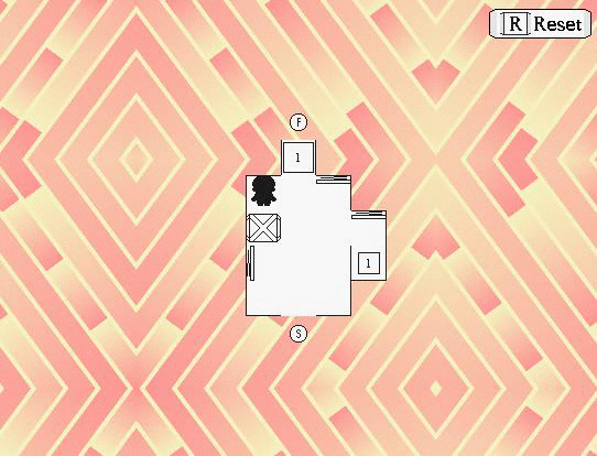
Thanks re: world! I thought the squished-together interiors would be kinda cute, especially since the entire game's mapping is supposed to be "tight." Even the upstairs areas are on the same map... here's an example:
If more people don't like it I'll either separate everything out normally or find some other compromise.


See if it all showed up on the same screen like that in game I wouldn't mind it. It's actually kind of cool.
But seeing half of a room on the map like this off to one side looks kind of wrong/distracting at least to me.
I can't get over those adorable RTP babies.
I squished together the insides a little more on that one map -- do you want me to send you a "TOWN EXPLORATION PACKAGE" later today so you can see how it feels when actually playing?
I COULD do some sort of script that hides the other interiors (based on the region painting available in Ace). Would that be a benefition option to put in the system menu? it's not really what i want to spend my time doing, but i also don't feel like "distracting" is what i want me game to be described as XD
I COULD do some sort of script that hides the other interiors (based on the region painting available in Ace). Would that be a benefition option to put in the system menu? it's not really what i want to spend my time doing, but i also don't feel like "distracting" is what i want me game to be described as XD
What the fuck?
An RTP face that actually looks good.
I am scared now.

@Blindmind - Fuck man how does your game keep looking prettier every time I see it, I don't know how you do it.
@Tau: he does it by not doing anything else.
If it's not how you feel like spending your dev time, don't worry about it. TBH it's not that big of a deal, I'd bet after an hour or so playing the game I wouldn't even notice.
I COULD do some sort of script that hides the other interiors (based on the region painting available in Ace). Would that be a benefition option to put in the system menu? it's not really what i want to spend my time doing, but i also don't feel like "distracting" is what i want me game to be described as XD
If it's not how you feel like spending your dev time, don't worry about it. TBH it's not that big of a deal, I'd bet after an hour or so playing the game I wouldn't even notice.
@Tau: Thanks! ~^-^~ Do the tiles mesh together well enough in your opinion?
And tbh I'm not so sure anymore! The communitiy's tastes have changed. Lmao I can't keep up with the RTP fetishism.
And tbh I'm not so sure anymore! The communitiy's tastes have changed. Lmao I can't keep up with the RTP fetishism.
[quote author=Blindmind]And tbh I'm not so sure anymore! The communitiy's tastes have changed. Lmao I can't keep up with the RTP fetishism. [/quote]Hahaha, well you're safe around me I could care less how a game looks, so long as it's fun.
Oh hey I forgot here's a Let's play someone did of the game I gave a trailer for a few posts back.
[youtube]libertyremoves.com[/youtube]

