


SCREENSHOT SURVIVAL 20XX
Posts

Oh, awesome gif Sated! I hadn't looked before -- the animation is really nice though I have to agree with Pizza about the flashes. TBH 2k3 flashes all look really horrible and make the game look like a flash game, it never fits, unless you control it frame by frame and even so it looks shabby. It'd look better if it had layer options support so you could use "add" flashes and such.
EDIT: Also, I don't like the rtp-ish gust sprites, you could make another sprite >.< othervvise, niece <3
And I've just put together two cool scripts to test how far I can push parallax mapping in vxa and voila! Graphics and music from SaGa Frontier.
I'm so hyped by the possibilities :V :V :V :V :V
EDIT: Also, I don't like the rtp-ish gust sprites, you could make another sprite >.< othervvise, niece <3
And I've just put together two cool scripts to test how far I can push parallax mapping in vxa and voila! Graphics and music from SaGa Frontier.
I'm so hyped by the possibilities :V :V :V :V :V

That looks really nice, Parallax Mapping is for me, the best way to create a good looking game (But it is tedious, i abandoned a lot of projects because this)
like this one :3

like this one :3

Ooh, new page!
A few things have been updated on the HUD / Onscreen display side, firstly Pep's HUDbase is dark blue instead of dark red, and the reason for this is that it's ideal to be able to see your health in the peripheral, and red on a slightly darker red doesn't really work for that effect.
Also, the Windowskin got a small but awesome update, which I'm sure Sated will be pleased with, here's all of that as well as the Second Saxxis (I mean, Yogg-Fuzz'mittens) boss fight in one succinct video.
That's not the in-game music, that was just a track from Devil May Cry 3 that I had on repeat and decided I'd just go with it.

Very early build stuff but

you can't STOP WALKING as of right now once you start but I'm working in other animations for directions tomorrow.

sketchy placeholder sprites (i actually kinda like them so i might keep an option to play as a bit more clean versions of them)

from the battle to get characters collisions working with my controller... CACTUS SMASH DOWN
It's basically a story driven rouge like game taking place in south western united states mainly in the desert areas of cali, new mexico, nevada, and arizona!
you can't STOP WALKING as of right now once you start but I'm working in other animations for directions tomorrow.
sketchy placeholder sprites (i actually kinda like them so i might keep an option to play as a bit more clean versions of them)
from the battle to get characters collisions working with my controller... CACTUS SMASH DOWN
It's basically a story driven rouge like game taking place in south western united states mainly in the desert areas of cali, new mexico, nevada, and arizona!
Haven't posted in a while. Here's an area we are working on. Underground Passageway with obligatory mine carts.


Hi guys. I've been trying to achieve seamless transitions in my game.
The following is the interior of a house where the front wall has been cutaway. Everything outside the house is a parallax background that exactly matches the exterior.
Before I apply this to the rest of the interiors I was wondering if people think this would work as a design choice or if there is any potential room for improvement?

I do love the idea behind it altough the roof looks really strange. I recommend changing it. I like what you were trying to do with the walls but it kinda breaks the perspective:extended edition.

I think it looks good, except the top edge of the roof should be shift-mapped so it doesn't connect with the top of the screen.
Typical kind Cash we all know and love ^^ Yeah I do agree tough shift mapping is important
I like the idea too, though it could be potentially a daunting task depending on the type of maps and game you're making.

author=ExtremeDevelopment
I do love the idea behind it altough the roof looks really strange. I recommend changing it. I like what you were trying to do with the walls but it kinda breaks the perspective:extended edition.
Agreed. Perhaps you could make the buildings more compact in general, as I'd imagine the exterior looks rather huge.
Another alternative is to use Charsets for the building tiles (the "outside" of it) and have them disappear when you go through the doorway or something. That way you wouldn't have to include a Teleport event, and things would be even more seamless.

The strangest thing about it is the front wall. And the strange wall-blob in the left part of the house.
i agree with others on an addition of illusion.
i agree with others on an addition of illusion.


New sprites and message display. How's the texture/grit looking?
Looks good. It has nice atmosphere. Is the grid animated? I can read it fine, but it can be busy for someone. If it's not animated i would recommend to remove the more contrasty layer.
You means the message box pattern? It doesn't animate-- I agree that it needs switching up a bit. It's actually an old text box from another game's UI, and I haven't changed it yet (I just dropped it in there during Revive the Dead 'cause I had a busted elbow and no time).
author=CashmereCat
I think it looks good, except the top edge of the roof should be shift-mapped so it doesn't connect with the top of the screen.
Thanks. I've corrected the top of the roof.
author=JosephSeraph
I like the idea too, though it could be potentially a daunting task depending on the type of maps and game you're making.
Thank you. I don't think it would take me too long as the building interiors aren't too large and it's just a case of taking a few screenshots and merging them.
author=Blindmindauthor=ExtremeDevelopmentAgreed. Perhaps you could make the buildings more compact in general, as I'd imagine the exterior looks rather huge.
I do love the idea behind it altough the roof looks really strange. I recommend changing it. I like what you were trying to do with the walls but it kinda breaks the perspective:extended edition.
Another alternative is to use Charsets for the building tiles (the "outside" of it) and have them disappear when you go through the doorway or something. That way you wouldn't have to include a Teleport event, and things would be even more seamless.
I can see why it would break perspective. I'll probably need to come up with some way to sell the idea that the shorter walls are cutaways.
I did actually use Character Sets in that manner for a previous project and it worked quite well. The only issue would be that I use a different chipset for the interiors and the exterior so I would have to add an event that swaps chipsets and I've not sure how smooth that is in rm2k3.
author=JosephSeraph
^that, or even a picture.
EDIT: I think Final Fantasy 1 for rm2k3 does exactly this
There is actually one instance in the village where I have a picture in a very similar way to this and it looked alright. It might be something to think about.
author=Puddor
New sprites and message display. How's the texture/grit looking?
I like it. Have you considered changing the background in the faceset so it contrasts better with the rest of the message box?

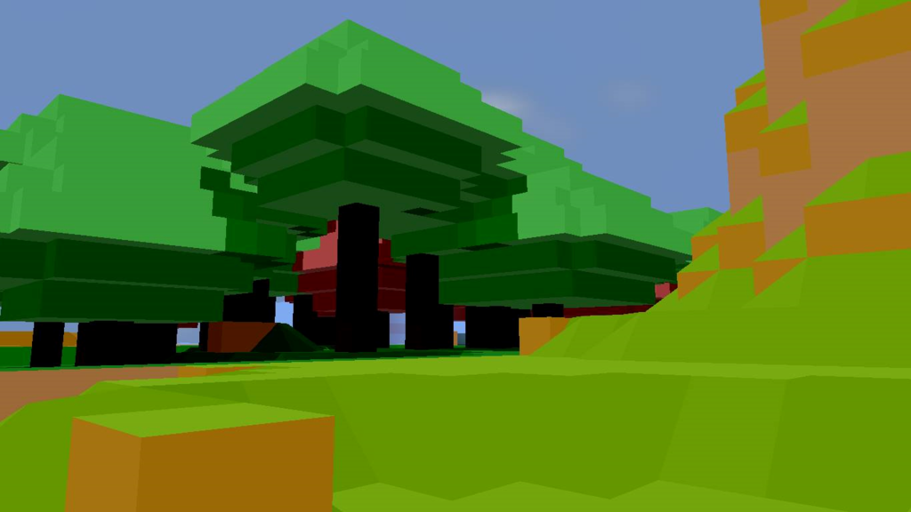
Been working on other biomes and on the shadows. fixed up some issues I had with some things got all my slopes back in.
All in all going well(but slow :P )

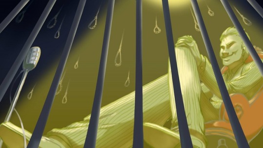
Getting art assets ready to release a much updated version of an older game of mine, Close Your Eyes, onto Steam. My artist Rincs has been doing new art for it for the release, here's a sketch she did earlier today in four hours (she did two different sketches today, this was just the most recent one and one I selected to use for a small teaser).
Small:
Big:

Small:
Big:

