


SCREENSHOT SURVIVAL 20XX
Posts

Really digging the tiles, Red! Very clean and simple. At the bottom of the first map, I suggest you to shift-map the walls in the middle, behind the two ghosts. The first two squares of the walls have black outlines, meanwhile the third squares don't.

author=Red_NovaI definitely like that dark green color. Double yes!
Thanks Infection! The carpet was there because the floor looked a bit barren otherwise. I have a darker version of the same carpet. Does this look better?
On the subject of bright, do you think the same thing about the bedsheets? I can lower the saturation if you think it needs it.

On the bedsheets, I'm staring at them and they do stand out a tad. Maybe try a lower saturation
Red_Nova

Sir Redd of Novus: He who made Prayer of the Faithless that one time, and that was pretty dang rad! :D
9192
T-they're statues, not ghosts. I'll put a podium underneath them to make it clearer as to what they are. As for the tiles, the black outline shows up on the edge of the pillars at the ends of the walls, so shift mapping wouldn't put a black outline where you specified as it's the center of the wall. I see what you mean, though, so I'll see if I can't find some other way that doesn't involved forcing a black outline where it shouldn't be.
EDIT: oh hi ninja Infection. You know what? I am a dumb and forgot that the maps head a tint to them that dropped saturation. I'm just gonna show the shots in game from now on instead of taking mapshots. Here's how it looked:
EDIT: oh hi ninja Infection. You know what? I am a dumb and forgot that the maps head a tint to them that dropped saturation. I'm just gonna show the shots in game from now on instead of taking mapshots. Here's how it looked:

Red_Nova
Sir Redd of Novus: He who made Prayer of the Faithless that one time, and that was pretty dang rad! :D
9192
Oh REMOVE the outlines? Yeah, I can do that. Thanks for clearing that up!
EDIT: Why can't I do the English well tonight?! The last five posts I made were friggin typos galore.
EDIT: Why can't I do the English well tonight?! The last five posts I made were friggin typos galore.
Maybe you've had one Christmas beer too much? ;) Don't worry though, my English is disastrous by default, since English isn't my first language. xD
@Gretgor: I think there's some room left for details. Rocks, flowers, logs, trees, you know the drill. Looking good overall though. I like the atmosphere.
@Gretgor: I think there's some room left for details. Rocks, flowers, logs, trees, you know the drill. Looking good overall though. I like the atmosphere.

TGhe thing that I have noticed is that you're doing a low resolution style, like a SNES style maybe (I love that) but randomly drawing stuff on the standard resolution, for... some reason.
You'd be probably better of doing everything SNES style. Its easier, more time efficient, more consistant and works better with this simple shading than a potentially HD style. By the way... you're drawing it and then upscaling 2x... right...? Because if you're drawing straight 4x pixels that's gonna take a LOT of time. XD
Since you seem to be new to pixel art I figured I'd tell you idk
Still that's a cute palette and overall pixels you got there! look forward for a complete game in that style <3
Red_Nova
Sir Redd of Novus: He who made Prayer of the Faithless that one time, and that was pretty dang rad! :D
9192
If it looks like I'm randomly drawing in standard resolution, then that's completely unintentional.
...
...
...
...
... Sure. Of course that's what I've been doing this whole time. Excuse me. I'm, uh... gonna be right back. I'm gonna go do... stuff.
EDIT: And yeah. I'm VERY new at this pixel stuff. I've only been at it for about... 13 days or so, since I started this on the 5th.
By the way... you're drawing it and then upscaling 2x... right...? Because if you're drawing straight 4x pixels that's gonna take a LOT of time. XD
...
...
...
...
... Sure. Of course that's what I've been doing this whole time. Excuse me. I'm, uh... gonna be right back. I'm gonna go do... stuff.
EDIT: And yeah. I'm VERY new at this pixel stuff. I've only been at it for about... 13 days or so, since I started this on the 5th.
Trying out at making some maps for my planned Twin Peaks/Lynchian Adventure Game, which will have time travelling and people getting abducted (by aliens?) to the mysterious Blue Moon.

Nothing special, just pure MACK tiles. I'm digging the simplicity of it though, and it fits the atmosphere/mood I'm aiming for with the game. Is the squarey-ness a big problem here or does it look fine? I think some parts of the cliffs could be a little more roundish. Also, are these tiles at the same height of the hate scale as the RTP?
Nothing special, just pure MACK tiles. I'm digging the simplicity of it though, and it fits the atmosphere/mood I'm aiming for with the game. Is the squarey-ness a big problem here or does it look fine? I think some parts of the cliffs could be a little more roundish. Also, are these tiles at the same height of the hate scale as the RTP?

You might try a different screen tint? Whatever tint you're using now is flattening out the palette and making it look really boring.


octopaca:
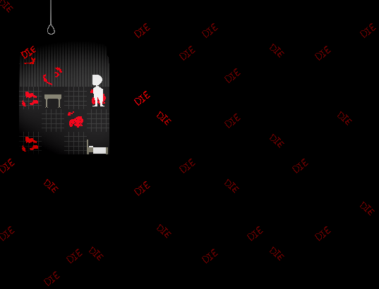
"Not even close"? I don't see anything wrong, apart from weird perspective on the furniture. And even that could be given a pass due to the minimalist style of graphics.
Maybe the screen with "DIE" written all over it could be too over-the-top to be considered creepy, but without context I can't say much.
I'm not really into horror games (All the creepiness usually goes right over me), but I'm still interested.
LockeZ

I'd really like to get rid of LockeZ. His play style is way too unpredictable. He's always like this too. If he ran a country, he'd just kill and imprison people at random until crime stopped.
5958
author=CrazeThree tile rule taken too far?
luii, that looks hella cluttered. there's just way too much going on there.
That amount of clutter is basically necessary when making outdoor maps using VX Ace tiles though to distract the player from the squareness of them.
author=SomeonemanDIEDIEDIEDIEDIEDIEDIE
Maybe the screen with "DIE" written all over it could be too over-the-top to be considered creepy, but without context I can't say much.
I find it hilarious so I hope you weren't going for creepy
Digging the use of black space though.

To not repeat what others have said idk what kind of angles your trying to make things but the floor and the walls don't match the bed and table. The character is pretty neat though.
Edit: I suggest when making games in 2 hours to use premade tiles and actually make a game then go back and do the graphics from personal experience.
Edit: I suggest when making games in 2 hours to use premade tiles and actually make a game then go back and do the graphics from personal experience.
@Pizza: Should I increase the tint or decrease it then? It's supposed to be nighttime. Maybe it's a bit too gray?
@Craze: From a gameplay or visual perspective? I don't think it feels too cluttered visually since the tiles blend in together pretty well, they don't really stand out. I also think that there's plenty of space to move around in. It's a forest, not an open field.
@LockeZ: It's sad, but I do agree with you on that one. I'll keep an eye out for some rounded cliffs.
lockez, i disagree entirely

by approximating the golden ratio and understanding how to utilize color, you can make something that's not jam-fucking-packed with tilevomit and still looks nice.
by approximating the golden ratio and understanding how to utilize color, you can make something that's not jam-fucking-packed with tilevomit and still looks nice.
ignore autoshadows, they'll be purged, but

i don't think this is gonna be improved with 500 flowers and seashells or anything, either. it's okay to have some open space, especially when the player will be moving around and not staring at the same area constantly like in a screenshot
i don't think this is gonna be improved with 500 flowers and seashells or anything, either. it's okay to have some open space, especially when the player will be moving around and not staring at the same area constantly like in a screenshot

Personally, I don't think cluttered maps work too well in VX Ace, at least with those square tiles. It just looks like an overly chaotic mess. That may just be me personally, though.
The very least you could do, luiishu, is fix up the dirt paths. Get rid of the random patches you have strewn about. Why would there be random dirt patches? Just place them where people would actually walk.
I must say though, the idea of a Twin Peaks inspired RPG is great.
The very least you could do, luiishu, is fix up the dirt paths. Get rid of the random patches you have strewn about. Why would there be random dirt patches? Just place them where people would actually walk.
I must say though, the idea of a Twin Peaks inspired RPG is great.
I don't think there's anything that makes cluttered 2k3 maps any better than ones made in VX/Ace. All maps don't have to be open deserts either. Forests are definitely more dense and for reasons. I find that playing these kind of games with a keyboard makes traversing a mess. A game-pad is the best bet and it's what I always use.
I find absolutely no difficulty in running around in maps like the one that I showed. People who do should definitely take it easy with the auto-dash and walk at a slower pace more fit for them. The game the map is made for doesn't take place in a huge world either.
I'm still very interested in knowing what's making the map terrible. Is it because of squares or are there too many ground details? Too many similarities? Is the dark tint making things hard to see?
I mapped the path that way since dirt paths are not always lined up perfectly. Not all of the dirt shown in the screenshot are paths either.
EDIT: Also I know that all 2k3 users hate VX/VXA tiles like there's no tomorrow. I don't have a problem with the VX tiles being a bit square, but I'm trying to find (or make, if I have to) tiles that are less square though. It's not like all things in my map are squares too; most of the tiles are more rounded. The right part of the cliffs are pretty square however. Hmm, know when I look closer, it's probably that weird shadow that makes the cliffs appear more square than they are. I'll see if I can get rid of it.
@luiishu- I think your screenshot looks fine for your purposes and my only advice would be to remove the square mountains or round them off.
But that's more a overall hatred to vx ace RTP squareness. Editing them might help or use that tile with bigger mountains/hills
the tiles right below the square mountain is nice and you could use it as the lowlands and use the mountain as more a legitimate mountain range.
But that's more a overall hatred to vx ace RTP squareness. Editing them might help or use that tile with bigger mountains/hills
the tiles right below the square mountain is nice and you could use it as the lowlands and use the mountain as more a legitimate mountain range.

