


SCREENSHOT SURVIVAL 20XX
Posts

As a 2k/3 user that also loves VXA, it's less about clutter and more about getting a bit more white space in that map of yours.
Here's some common sense:
- Dirt pathing only where people are going to walk.
- make that fence a full rectangle. why do people insist on weird shapes for fences when they're only ever made at odd angles when there's something blocking the way?
- get rid of the 2-tile cliffs. they really don't serve a purpose. if you want cliffage, make it a bit more.
- pay attention to axis placements. for decorative tiles, don't place the similar kind of tile on the same axis points as another of the same.
- get rid of the small one-tile grass patches. they're stupid. same with the one-tile dirt patches.
- that should cut down on enough cluttering to give the map some more white space, so as to draw your eyes to the paths and important parts of your map.
Why do you want white space? It's not only a bit part of balancing a scene and framing important areas, but it also allows the player to rest their eyes so that they're not full-on assaulted by details. You want them to know, at a glance, where they can go and what they can look at. Use your tiles to guide their eyes, instead of confusing them.

if you're ever stuck on how to map just look at chrono trigger to see why you suck*

bonus, rudras:
the snes had extremely mediocre gameplay but some fantastic visual design snese
*i mean generally not a specific person
bonus, rudras:
the snes had extremely mediocre gameplay but some fantastic visual design snese
*i mean generally not a specific person

author=Someoneman
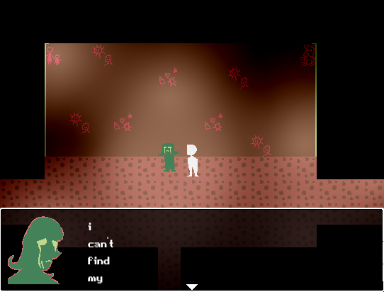
octopaca: I'm not really into horror games
It's actually not going to be a horror game, more surreal than anything uvu
author=charblar
To not repeat what others have said idk what kind of angles your trying to make things but the floor and the walls don't match the bed and table. The character is pretty neat though.
Edit: I suggest when making games in 2 hours to use premade tiles and actually make a game then go back and do the graphics from personal experience.
yeaaaah. I'm absolutely terrible at perspective. I'm just going to stick with not having a lot of furniture in my game. Also I'm very picky with tiles, and prefer to make my own sprites and most of the time the styles don't match.
---
anyways I done a lot of work, and decided to continue on with the game.

(the little girl is supposed to have bad grammar, every character has a different dialog style-)

Definitely looks trippy octopaca! Surreal games are usually well received

Totally revamped the first town in my garbage game, Tin Alley.
Banner animates, still working on the oil waterfall and pool..

(compare to the original file if you want: http://rpgmaker.net/media/content/users/2321/locker/MAPS_TIN_ALLEY_FINAL.PNG )
Banner animates, still working on the oil waterfall and pool..
(compare to the original file if you want: http://rpgmaker.net/media/content/users/2321/locker/MAPS_TIN_ALLEY_FINAL.PNG )
(Turns into dust waiting for people to put up screenshots that are less cool so that my screens won't stand out)
That is some very pretty garbage though, so much detail @_@ Definitely digging the transformation, though personally I think the trees are a tad out of place in this map. I think it'd look better if you had more of the bushes used in the first map instead. Those highrise buildings looked pretty far away, they must be creating a lot of smog for it to carry over and envelop the entire area :o Unless its creating it's own smog, that is.
Also, funny that it's called Tin Alley since a good chunk of the metal parts in the trash heaps are rusted, and tin does not rust. Just some food for thought there, though I won't deny that 'Tin Alley' is a lot catchier than 'Iron Alley' :U
Releasing some screens into the wild (A great fellow by the name of Ross Castro is doing artwork for the game):
Tess shares some wonderful news with her bestest friend.

Tess attempts to explain a diffusion metaphor.

Tess tries to deny the fact that she is, in fact, senile.

That is some very pretty garbage though, so much detail @_@ Definitely digging the transformation, though personally I think the trees are a tad out of place in this map. I think it'd look better if you had more of the bushes used in the first map instead. Those highrise buildings looked pretty far away, they must be creating a lot of smog for it to carry over and envelop the entire area :o Unless its creating it's own smog, that is.
Also, funny that it's called Tin Alley since a good chunk of the metal parts in the trash heaps are rusted, and tin does not rust. Just some food for thought there, though I won't deny that 'Tin Alley' is a lot catchier than 'Iron Alley' :U
Releasing some screens into the wild (A great fellow by the name of Ross Castro is doing artwork for the game):
Tess shares some wonderful news with her bestest friend.
Tess attempts to explain a diffusion metaphor.
Tess tries to deny the fact that she is, in fact, senile.

I'm away for two days and I have like 100 notifications to take care of. Anyway, quickly gonna comment on people's stuff.
Luii, looks pretty awesome.
Octo, love that! Looks seriously awesome! I like the idea that the lil girl has bad grammar too :)
Atlas, that looks great! I'm gonna assume she's being sarcastic in the first screenshot, because if not you gotta change that expression.
Luii, looks pretty awesome.
Octo, love that! Looks seriously awesome! I like the idea that the lil girl has bad grammar too :)
Atlas, that looks great! I'm gonna assume she's being sarcastic in the first screenshot, because if not you gotta change that expression.

@InfectionFiles: Yeah, I'll definitely try to find some rounder tiles for the cliffs. Haven't found any for the Mack cliffs yet though. Sometimes, I feel like all of the maps I've made with RTP/square tiles have been a waste. I might just ditch them altogether in the future.
@Liberty: Thanks for the tips! Though I may not agree with all of them, they've definitely given me things to consider.
@Craze: Don't worry I see what you mean. I personally think that the mapping in Chrono Trigger is pretty good, but nothing masterful. What lifts the game up is the graphics IMO and graphic don't particularly equal mapping. One thing that good graphics can save though is bad mapping. Perhaps the small Mack trees are part of the reason you see the map as cluttered. Bigger trees would fill more space, without needing to add an army of them just to fill a map. Bigger trees/tiles makes mapping a lot easier/quicker as well.
@Dookie: Looking good as usual! Good sense of color.
I'll be back with more maps later. I really appreciate the feedback, but I think it's sometimes hard to fix from it when you don't really agree with all of it. I do have the mindset that maps should be made with a gameplay perspective in mind and not just pictures. I really am trying to be as open-minded as possible. Thanks again for the feedback, everyone!
EDIT: Perhaps it would be better to have most details/clutter appear in places that the player can't walk to. In that way, the clutter won't be in the way of the player's path.
EDIT 2: Edited the map a little after Libby's suggestions. I always removed the grayness from the tint.

Eh, I don't know.
@Liberty: Thanks for the tips! Though I may not agree with all of them, they've definitely given me things to consider.
@Craze: Don't worry I see what you mean. I personally think that the mapping in Chrono Trigger is pretty good, but nothing masterful. What lifts the game up is the graphics IMO and graphic don't particularly equal mapping. One thing that good graphics can save though is bad mapping. Perhaps the small Mack trees are part of the reason you see the map as cluttered. Bigger trees would fill more space, without needing to add an army of them just to fill a map. Bigger trees/tiles makes mapping a lot easier/quicker as well.
@Dookie: Looking good as usual! Good sense of color.
I'll be back with more maps later. I really appreciate the feedback, but I think it's sometimes hard to fix from it when you don't really agree with all of it. I do have the mindset that maps should be made with a gameplay perspective in mind and not just pictures. I really am trying to be as open-minded as possible. Thanks again for the feedback, everyone!
EDIT: Perhaps it would be better to have most details/clutter appear in places that the player can't walk to. In that way, the clutter won't be in the way of the player's path.
EDIT 2: Edited the map a little after Libby's suggestions. I always removed the grayness from the tint.
Eh, I don't know.
That looks a lot better.
The beauty of CT's levels is that they keeps a lot of the clutter off to the side. While this might have been primarily for the battle system, it also just lets everything feel organic and natural (the growth on the edges of the forest paths) but also lets the player and the player's eyes flow through the map instantaneously. I mean, the tabs you find are briefly shining dots. Those wouldn't be noticeable at all on a cluttered map.
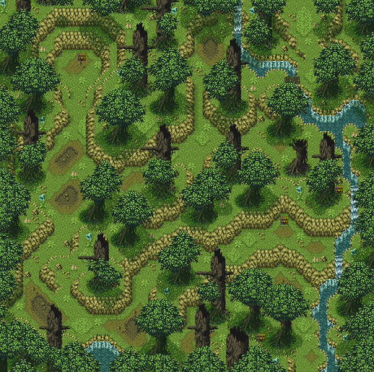
Look at how rudras's forest uses all greens in the path (except the dirty water bits, but that's part of the storytelling -- rudras is about pollution and mire caused by human greed, especially for the character whose first dungeon that is). All the blue flowers and the dark trees are pushed to the sides to indicate where not to go while still having interesting stuff to look at!
Simplicity is beautiful in mapping, even stuff that SEEMS complex. I think you'll find that a lot of amazing-looking videogames keep clutter on the edges while using similar-colored stuff in the path itself to provide variation while not distracting you.
there's a lot going on, but you know exactly where you can and can't go, right? the only contrasting thing within the walking area is a light brown root.
edit: why is that image so small >=|
The beauty of CT's levels is that they keeps a lot of the clutter off to the side. While this might have been primarily for the battle system, it also just lets everything feel organic and natural (the growth on the edges of the forest paths) but also lets the player and the player's eyes flow through the map instantaneously. I mean, the tabs you find are briefly shining dots. Those wouldn't be noticeable at all on a cluttered map.
Look at how rudras's forest uses all greens in the path (except the dirty water bits, but that's part of the storytelling -- rudras is about pollution and mire caused by human greed, especially for the character whose first dungeon that is). All the blue flowers and the dark trees are pushed to the sides to indicate where not to go while still having interesting stuff to look at!
Simplicity is beautiful in mapping, even stuff that SEEMS complex. I think you'll find that a lot of amazing-looking videogames keep clutter on the edges while using similar-colored stuff in the path itself to provide variation while not distracting you.
there's a lot going on, but you know exactly where you can and can't go, right? the only contrasting thing within the walking area is a light brown root.
edit: why is that image so small >=|
becausew KWEH! that's why!
@luiishu- That looks good!
@luiishu- That looks good!
@Craze: Yeah, I agree with that. I'll start putting that style into practice from now on. Also, notice how I've made the trees more detailed by adding some firs. It breaks the repetition a bit and adds variety without getting in the way of the player.
My last two games had big arrows placed on the maps, showing where players can and can't go. Perhaps this design choice has made my latest maps harder to navigate.

Yup, it's blocky as heck, but that's not my point here right now.
I think this is a better example of clearing the players path, while leaving most details to the side.
Now, if my game won't have any big arrows like those pointing where the player can go, I'll have to convey the same effect with my mapping a lot more.
@InfectionFiles: Thanks! Perhaps I'll start to see the beauty of it myself soon enough.
My last two games had big arrows placed on the maps, showing where players can and can't go. Perhaps this design choice has made my latest maps harder to navigate.
Yup, it's blocky as heck, but that's not my point here right now.
I think this is a better example of clearing the players path, while leaving most details to the side.
Now, if my game won't have any big arrows like those pointing where the player can go, I'll have to convey the same effect with my mapping a lot more.
@InfectionFiles: Thanks! Perhaps I'll start to see the beauty of it myself soon enough.
...Actually, my eyes are jumping all over that screen, luiishi. >.<; They're not focussing on the main path at all. the only white space in it is the waterfall, due to the overlay not causing much of a pattern on it. Everything else is just a jumble of eye-catch. The overlay doesn't help at all in that regard, nor do the over-abundance of details.
@Dookie: That's looking great, though you could probably be a bit less smooth with the pixels on the trash piles since they're supposed to be separate pieces of trash piled up and not mounds of dirt (I assume?)
@Dookie: That's looking great, though you could probably be a bit less smooth with the pixels on the trash piles since they're supposed to be separate pieces of trash piled up and not mounds of dirt (I assume?)


Some screens from an ambient puzzle game I'm doing in my free time, inspired by Yume Nikki! It stars a dog with a scarf named Happup. He's pretty cool.

@octopaca and @Punkitt. Love these <3 Very surreal, very beautiful.
@Red Nova. Love the new tiles <3 That's the opening scene setting of Prayer of the Faithless, am I right?
@Red Nova. Love the new tiles <3 That's the opening scene setting of Prayer of the Faithless, am I right?
author=CashmereCat
Love these <3 Very surreal, very beautiful.
Ahhh, thank you!! Glad you like them, I'm pretty happy with them so far. c:
author=AtlasAtrium
(Turns into dust waiting for people to put up screenshots that are less cool so that my screens won't stand out)
These screenshots are awesome! I'm a big fan of the Ancient Dungeon set, and it's great to see it being used so well. I'm jealous!
Screenshot 1: Is there a reason why there isn't a wall over the cell gate? I guess the question is: Is there a reason why our heroine can't just climb over the gate to freedom? Perhaps that's why she seems unimpressed with her current situation?
Screenshot 2: Looks great, but the stairs end into a cliff and there's no depth to the stairs. Usually stairs either start one tile down or end one tile up from the wall they're "in". Might want to clean that up.
Screenshot 3: I love it. I'm jealous of it. I want it in my game. No edits! :D
@Sated: You can just make out a slight line in the fence near the top - other than that it looks great. Also, maybe edit the roofs a little to include some top edging?


Like so?
Like so?

*frowns at people saying that the SNES had mediocre gameplay*
But yeah, Chrono Trigger's mapping is beautiful.
Also, @Punkitt: I really like the cute style you're going for. It looks good, but the text is extremely hard to read, even though you took care to use different font colors. Maybe some font shadows?
But yeah, Chrono Trigger's mapping is beautiful.
Also, @Punkitt: I really like the cute style you're going for. It looks good, but the text is extremely hard to read, even though you took care to use different font colors. Maybe some font shadows?

