SCREENSHOT SURVIVAL 20XX
Posts

@Colt: That looks great. Is that a commercial game? It looks like it could be... Anyway, here are some things caught my eye. When characters are strafing the walking animation is too subtle. The movement of their legs is barely noticeable and their bodies remain stiff. The result looks a bit odd, almost as if the characters are hoovering around. Yet when they're running, they throw their bodies to the front and their leg's movement is more pronounced. Maybe find a middle ground between these animations?
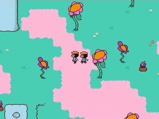
In the stealth part; with sprites that big, getting so close to the enemies, in areas so wide open, you kinda expect the character to be seen. If the character was aided by shadows or had some kind of "optical camo" like in mgs, it would be easier to suspend disbelief there. I mean, it's not bad, many games do it like that. But if you can address that somehow, that would be great.
Also, in the video it seems like you cannot shoot the bad guys, nor they can shoot you, from above tables and stuff. That's odd.
@Chilly-Pheese-Steak: (That's quite the nickname xD) So, I take it that you're working with rm2k/3, right? Are you still dependent to any of the default menu systems? Because it seems like you're trying to imitate that style. However if you can event your own, I think someone with your talent can strive for something less dull and boxy. You game has certain charm to it and I think you could benefit from the extra effort... Unless what you're showing us is still a WIP, in which case, disregard. (Love the animations btw)
@Alterego
Thank you for the comments. And yes, this is a commercial game. It has already made it through steam's greenlight selection.
The strafing animation are the slow walking animation, this occurs when the player moves in any direction other then the aiming direction. It seemed to make the most sense that the character wouldn't move as smoothly as they would when they walk forwards. I do agree that there is room for improvement, better walking animations or even dedicated strafing/back stepping sprites.
The stealth gameplay is based mostly on the player to stay out of the enemy vision-cones and not making noise. Like firing a weapon, or by getting to close and them hearing your footsteps.
Originally stealth was more realistic. The enemy vision cones had a much wider angle, had a much longer range. They had incredible hearing and could track the player relentlessly. They also had completely random patrol routes, viewing directions and even the vision cone itself wasn't visible; You'd have to determine their facing direction by observing where they where aiming.
But this made the game way to difficult to play stealthily. No matter how hard you tried, eventually you'd get into a gunfight. Ruining your stealth ranking. This is way the enemy vision has been made more lenient. I can't make the area's less wide open as that would hinder the other possible approach; Going on full assault and maneuvering through the enemy bullets.
Like the more recent entries in the Metal Gear Solid series, I really want to give the player the choice between stealth and full assault. Or something in between. If the mission objective allows it ofcourse. During a mission where you are actually tasked with fighting and defeating enemies, stealth isn't really possible; And there for also omitted from the ranking for those levels (incidentally, you can see that in the video I posted earlier. The ranking shown is for the boss fight and if you look carefully, you'll see that the stealth portion has a "N/A" indication)
I do agree with you completely about the tables. It looks kinda weird that the enemies can't see over them and both they and the player can't shoot over them. I was thinking about replacing some of the tables with other taller objects; Or placing crates, bags or other stuff on top of the tables to obstruct sight/gunfire.
A demo version of the game is available for download, if you'd like a more hands on impression of the game. Here is the link to the game's page on rpgmaker.net. Just recently approved :)
@Punkitt
Is the latest screenshot from the battle system?

Trying out a new HUD layout according to Pizza's advice. I have to say I really like this, it looks a lot slicker than before.
The white flower represents the "kindness" meter that will be used to open new paths, and the golden leaf is kinda like currency.

The white flower represents the "kindness" meter that will be used to open new paths, and the golden leaf is kinda like currency.

@Gretgor that looks nice. You have a great snes feel going on there.
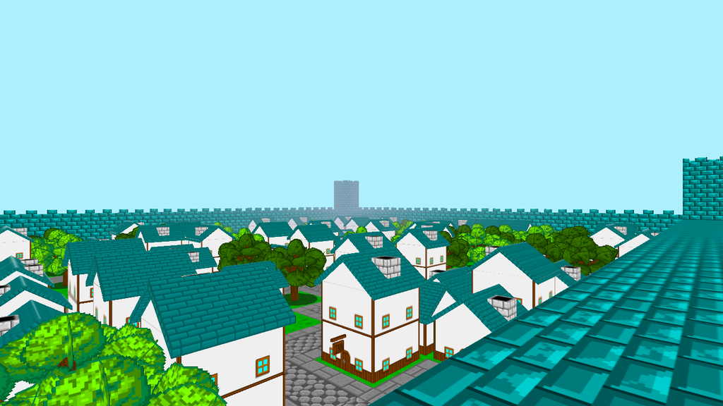
So Ive been working on cities and villages. I still have the desert Biome to make buildings for and then I can move onto the next step which is stitching everything back together(I stripped a lot out so I could work on the biomes easier) then its..... gameplay :)
Come visit me on FaceBook
https://www.facebook.com/grimoireofworlds/

Absolutely love your stuff, gridalf. Gives me such a Might & Magic feel

author=alterego
@Chilly-Pheese-Steak:(That's quite the nickname xD) So, I take it that you're working with rm2k/3, right? Are you still dependent to any of the default menu systems? Because it seems like you're trying to imitate that style. However if you can event your own, I think someone with your talent can strive for something less dull and boxy. You game has certain charm to it and I think you could benefit from the extra effort... Unless what you're showing us is still a WIP, in which case, disregard. (Love the animations btw)
Yeah I'm using RM2k/3. I've been slowly phasing out the default menu systems, but yeah I see what you mean about the menus looking dull.
I've actually liked the way the simple menus looked, but if you want to improve upon them then by all means do so! Can't wait for your game.
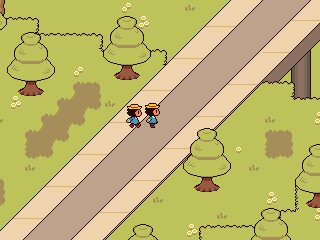
Been working on creating an overpass area to bridge two towns together. I'm working on diagonal corner tiles for the grass, but for now how does this look?
Been working on creating an overpass area to bridge two towns together. I'm working on diagonal corner tiles for the grass, but for now how does this look?

Not gonna lie: gettin' major Earthbound/Mother vibes from it, Punkitt. It's pretty good, though. Diagonals are a pain to work with and get looking decent.
author=Liberty
Not gonna lie: gettin' major Earthbound/Mother vibes from it, Punkitt.
That's what I'm going for!

@Gretgor-I think the new HUD is way better. Gj on it! I like the idea behind having a kindness meter.
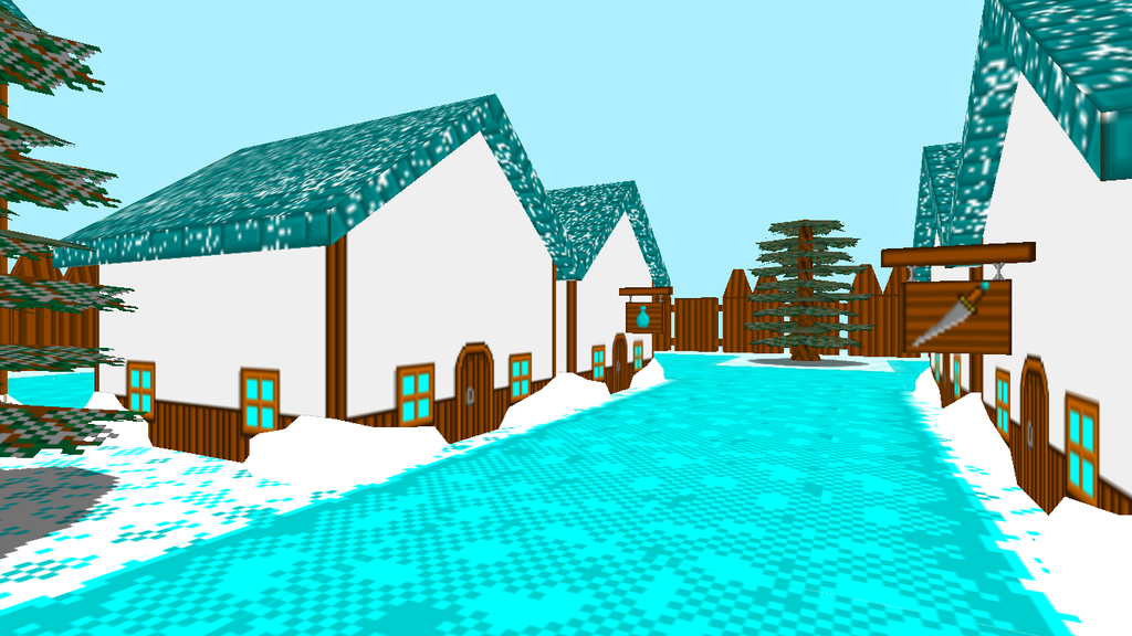
@Grindalf-That's really nice! The only thing I do not like is how the houses have their doors facing a frozen lake(unless it's supposed to be a path in which case I would recommend making it brown. It might be snowy but blue paths don't really make much sense).
@Punkitt-That's awesome, as always.
@Grindalf-That's really nice! The only thing I do not like is how the houses have their doors facing a frozen lake(unless it's supposed to be a path in which case I would recommend making it brown. It might be snowy but blue paths don't really make much sense).
@Punkitt-That's awesome, as always.
thanks punkit
thanks infectionfiles
Yeah I know it looks more like a frozen river than a pathway. I tried a few variations of dirt but it looked really out of place. I will change it eventually(and then keep this one for the frozen river :P )
thanks infectionfiles
author=Frogge
@Grindalf-That's really nice! The only thing I do not like is how the houses have their doors facing a frozen lake(unless it's supposed to be a path in which case I would recommend making it brown. It might be snowy but blue paths don't really make much sense)
Yeah I know it looks more like a frozen river than a pathway. I tried a few variations of dirt but it looked really out of place. I will change it eventually(and then keep this one for the frozen river :P )

Feel like sharing some screenshots for a level I made.

Here's another one. I didn't want the post to get too big.
Here's another one. I didn't want the post to get too big.

Maybe on the second one, you could have a darker outline under the islands with the water tiles so that it looks like they reach below the water. A quick edit, but maybe something like this:

Otherwise it looks really neat.
Otherwise it looks really neat.
author=FroggeHey, thanks!!
@Punkitt-That's awesome, as always.
Your SMBX level seems to be coming along nicely, too! I love the little Cheep Cheeps in the water. The only thing I'd suggest aside from the thing Liberty was suggesting was that the Goomba's style seems a little out of place and the sign's outline is far too light compared to everything else.
Other than that, looks great!
Hey, remember this guy from the top of the page?

He's on the overworld now! He hops around and stuff.