


SCREENSHOT SURVIVAL 20XX
Posts
Luchino, what's wrong with the palm trees? They looks just fine to me. Nice screens otherwise too!
octopaca, I think that green room looks maybe too plain? Although I get a feeling it's supposed to be like that, which is fine I guess. The other screen with those drawings on walls looks more intriguing.
EDIT: oh sht, top of the page!? I guess I'm gonna release first shots of my project in that case (:
Just the first graphic tests. This is very much WIP

I had to hide the other screenshot because it's some morbid stuff, watch at your own risk, just make sure you're alone in the room D:
octopaca, I think that green room looks maybe too plain? Although I get a feeling it's supposed to be like that, which is fine I guess. The other screen with those drawings on walls looks more intriguing.
EDIT: oh sht, top of the page!? I guess I'm gonna release first shots of my project in that case (:
Just the first graphic tests. This is very much WIP
I had to hide the other screenshot because it's some morbid stuff, watch at your own risk, just make sure you're alone in the room D:


i love the palette too! and the pixelatedness of everything. It's really good <3 <3 <3
As for me:
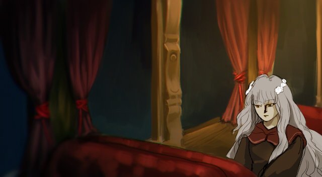
a really important person challenged me to make a game in a week. This was gonna eb the game's first cutscene but I've already changed it from yume-nikki-with-anime-cutscenes to a silly romance between a demon prince and a nerdy guy :V
As for me:
a really important person challenged me to make a game in a week. This was gonna eb the game's first cutscene but I've already changed it from yume-nikki-with-anime-cutscenes to a silly romance between a demon prince and a nerdy guy :V
Ah hey thanks! When ever I try to do digital painting, it ends up with a real painting-like feel. I think it gives this project a nice feel, although I have troubles getting the same look to smaller pixel tilesets..
JosephSeraph, that looks really awesome, if you're doing a whole game in just one week, what are doing cutscenes like this then!!? That's madness! But if you can pull it off, that's impressive! I really like the style and sounds interesting (anything with yume nikki being mentioned, catches my interest)
JosephSeraph, that looks really awesome, if you're doing a whole game in just one week, what are doing cutscenes like this then!!? That's madness! But if you can pull it off, that's impressive! I really like the style and sounds interesting (anything with yume nikki being mentioned, catches my interest)

Made a mockup of a menu (still not implemented, though).

The "Escape" function is supposed to simply warp the character back to the last save point (or the overworld in case the player didn't encounter any save point since they entered whatever map they're at). The "Split" function is going to split up the party of characters, which will sometimes be necessary to solve a puzzle. The rest is pretty straight forward, and I'm still thinking about how I'll go into making the inventory menu.
What do you guys think? What should be changed?

Those are fucking beautiful, orange~

That does look pretty sweet, I'm assuming you'll use pictures for the menu? It made me wonder if I could use pictures for the sub-cms I'm using...

@Gretgor: The only thing I'd change is to add maybe a bit of desaturation or fade to the map just so the fact that you're in-menu becomes more obvious.
author=Pizza
@Gretgor: The only thing I'd change is to add maybe a bit of desaturation or fade to the map just so the fact that you're in-menu becomes more obvious.
Yeah, I'm actually making it so that the screen goes darker when I'm on the menus. I made a comparison here.

Should I make it darker, maybe?
Also, @Pyramid_Head, yes, I'm using pictures. It's the only way to do it on RPG Maker 2003 with no plug-ins :'(
I thought you were already using pictures for most of the Steel Spirit SaGa menu stuff, actually. Are you not? o_O
Yay ^_^
Also, @Pyramid_Head, feel free to PM me if you need any help with picture-based CMSes in RM2K3! :D
Also, @Pyramid_Head, feel free to PM me if you need any help with picture-based CMSes in RM2K3! :D
Thanks for the offer Greg, however I feel my knowledge of 2K3 is good enough for me to figure it out on my own. The sub-cms for my game is set using a different map and tilesets, I've learned a lot since I first started work on it. I mean a whole bunch.
While things like the weapon menu screen would still be done using a tileset. Your screenshot gave me the idea to use pictures for everything else.
Either way your game looks pretty nifty.
While things like the weapon menu screen would still be done using a tileset. Your screenshot gave me the idea to use pictures for everything else.
Either way your game looks pretty nifty.

at the risk of spoiling my swap event game
it's all rtp but i think it's looking pretty good for my first real game attempt
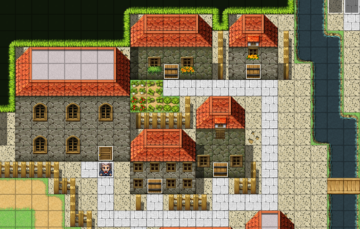
it's all rtp but i think it's looking pretty good for my first real game attempt

All of the canopy tiles are missing their pillars (bottom part of the the trees). I'm not a fan of the stone ground combinations in the first one though (the white stone just looks too bright and clean in comparison to the other stone ground). Otherwise it looks pretty good, if a tad empty on details.


author=supersonicsodaUnfortunately, that's not how they're meant to be used, and it makes absolutely no sense for there not to be something holding them up. It's a mapping issue not to have the tree trunks under the canopy.
noted! and thank you
i actually kinda like the canopy without the trunks, dunno why
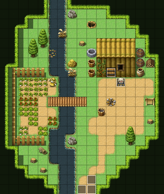
@Infinite: I really like that world map! Personally not a huge fan of the no-ceiling in the first image, but I can understand why you might go that way.

Thanks to pizza for the suggestion to get rid of the main body of the ceiling tiles and edit the water a bit so that it wasn't as similar a tile to the ground.
@Liberty
Thanks. I like the darker/claustrophobic/closed-in feel of the no ceiling style. I could put in a bit of effort and add one that fades to black to provide a similar feel, but this way works well enough for me.
I have a feeling your water looks better while it's animated.
Thanks. I like the darker/claustrophobic/closed-in feel of the no ceiling style. I could put in a bit of effort and add one that fades to black to provide a similar feel, but this way works well enough for me.
I have a feeling your water looks better while it's animated.


Working on creating a desert tileset. I still need to add tons of detail, GUH
A sneak peak at the building's inside, too.

I need to add some more tile variation to everything here. Anyone got any suggestions?
OHANDALSOHEY
I got a gamepage set up for Happup! That other game people seemed to like here!
The tree canopy tiles have always looked off to me anyways, but without trees undetlr them it looks plain dumb lol

