


SCREENSHOT SURVIVAL 20XX
Posts

oh, that actually looks sweet.
edit: quoting pizza because i sniped him
edit: quoting pizza because i sniped him
author=PizzaCrazeIt doesn't animate at the moment- leaving that for a later date. What I'm thinking id to have it bob up and down sequentially in a way that suggests the direction of current for rivers and the motion of waves for ocean.
how does the water animate, if it does?InfectionFiles
God, i know this is a tiny nitpick, Pizza, but bridges like that usually dip/sink in the middle. As it is right now it looks too straight.
Yeah, I'll take a look at it. I pixelled it completely straight just to get it right, and forgot about that aspect.
With the finished and tiled large trees, for reference. I'm sort of taken by it, personally. Just makes more sense in terms of actual IRL scaling.


Char, you might consider adding some vertical bobbing/movement to the running animation. Right now it looks like the top half of the dog isn't being affected by the motion, so there's no weight to it.

There's definitely something off about the running animation
Pobably what Pizza said, its tail isn't moving at all
Pobably what Pizza said, its tail isn't moving at all
author=Pizza
Char, you might consider adding some vertical bobbing/movement to the running animation. Right now it looks like the top half of the dog isn't being affected by the motion, so there's no weight to it.
That's what I always forget oops. I did actually animate the tail right after I posted this so that is at least changed but yeah it should be moving.


Going for that rocky Ireland island vibe, ex: http://www.radiotimes.com/uploads/images/original/95134.jpg
I'd say that the ground detail is lacking, Ramshackin. Going by your reference you'd want more patches of spotty grass/dirt and rocky outcroppings, as well as many some rocks in the water near the cliff faces.
I don't know, right now it looks like a more generic coastline with a tint applied to it, so it seems like the tint is doing more than the actual map.
I don't know, right now it looks like a more generic coastline with a tint applied to it, so it seems like the tint is doing more than the actual map.

I've been working on the aesthetic for my game's next area. I hope you didn't think it just be all forests and caves.
This first screen is largely a mockup using the tileset I've made for it:

And here's some combat:
This first screen is largely a mockup using the tileset I've made for it:
And here's some combat:
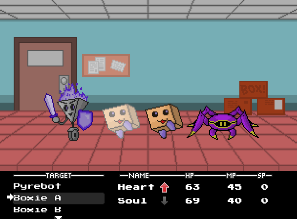
I get a pokemon vibe from it, Sgt. Simple but it works!
Corfaisus

"It's frustrating because - as much as Corf is otherwise an irredeemable person - his 2k/3 mapping is on point." ~ psy_wombats
7874
author=SgtMettool
Boxie is too cute. I want one.


Updated Equip menu after the feedback:

(previous one)
I realized I wasn't using the max resolution possible (was 416 height, now it's 480) which opened a lot of space. I added the status resistances of the player and evasion and counter (which are the only xparams that matter)
I made the actual equips area the focal point, while the stats have a more simpler look, hopefully avoiding too much visual noise
And since this one screen has all the information about the actor, I'll remove the "status" menu from the game
---
I was also hoping to get some feedback on the element icons. I decided not to go with the common ones (fire, ice, etc) and I know the caveats of doing so
I mainly want to know if the icons are good representations of what the element does (ignore the status icons, most are placeholders)
There are 3 physical and 3 magic elements
Crush, Punch and Poke are physical
- Crush attacks always reduce enemy armor
- Punch attacks can cause bleeding, and deal more damage to already bleeding enemies
- Poke attacks have higher critical damage
Angry, Funny and Weird are magical
- Angry magic can cause the Furious debuff (target attacks randomly)
- Funny magic can cause the Laughing debuff (target's magic is weaker)
- Weird magic can cause the Feeling Weird debuff (target's stats are lowered)
author=Pizza
I don't know, right now it looks like a more generic coastline with a tint applied to it, so it seems like the tint is doing more than the actual map.
Hopefully I can get away from the tint being the most impactful piece of the map, as the only reason it's there is because the dynamic weather system chose thunderstorm when I was taking the screenshot.
I'll try putting together some rocky ground tiles.
The difference is quite dramatic, and for the better. It's a lot more readable now, and has a definite focal point/hierarchy, which is good.
I'd say that most of the icons are okay, save for Crush and Punch. IMO, you should add a little yellow "pow" effect beneath the Crush hand instead of squishing it like that (since it would give the effect of crushing better- right now it looks like melting). As for the punch hand, maybe make it a boxing glove? Might be just the colours playing with my eyes, but it's hard to see that it's supposed to be blood, and it looks a little too similar to Crush damage's icon.
EDIT:
Made the hero's house for my current project:

Every house in the village will be pretty unique. I'm worried that the map of the town will be a little too big, but I have to fill it in first to really check- might just be caused by how empty it is at the moment.
I'd say that most of the icons are okay, save for Crush and Punch. IMO, you should add a little yellow "pow" effect beneath the Crush hand instead of squishing it like that (since it would give the effect of crushing better- right now it looks like melting). As for the punch hand, maybe make it a boxing glove? Might be just the colours playing with my eyes, but it's hard to see that it's supposed to be blood, and it looks a little too similar to Crush damage's icon.
EDIT:
Made the hero's house for my current project:
Every house in the village will be pretty unique. I'm worried that the map of the town will be a little too big, but I have to fill it in first to really check- might just be caused by how empty it is at the moment.
That house is making my mouth water. Wait, Punkitt, that's weird! Stoppit!
I love how clean and connected everything looks. That always seems to be your strong suit. If I had one complaint, it'd be that that grass looks really...empty? Flat? Maybe if you just threw in some more obvious grass blade tiles then that'd fix it pretty quickly. That's only a minor complaint, though.
I love how clean and connected everything looks. That always seems to be your strong suit. If I had one complaint, it'd be that that grass looks really...empty? Flat? Maybe if you just threw in some more obvious grass blade tiles then that'd fix it pretty quickly. That's only a minor complaint, though.
Honestly, I've been meaning to do some grass blade stuff for a while now- I even have some I can just plug into it from unused stuff. Been too lazy/occupied with things like the house, I guess. I'm probably going to rough up the edges of the path eventually, too.
Anyways, I'm glad you like it.
...I just realized, I forgot to finish the left half of the roof. SHIT.
Anyways, I'm glad you like it.
...I just realized, I forgot to finish the left half of the roof. SHIT.
I feel like the cellar would fit better on the left side of the house. For a few reasons: one being that the space under it is nothing (No ground) so is there a tunnel under the deck into the side of the cliff? Second is that it's right on the deck and doesn't look like it's accessible from that angle
The house looks great, otherwise! I noticed the roof but you got it.
The house looks great, otherwise! I noticed the roof but you got it.
pizza, that's awesome. I already noticed your duck character on another page of this topic and it immediatly caught my attention! I love the house and those trees are exceptionally cool. That sand/road-whatever could use one more colour or shading though.
Sweetmeltylove, the icons make sense once you know what they're supposed to represent but I would have never guessed some of those; namely funny and crush. Menu itself looks great and even the icons are fine if they're explained somewhere in the game.
sgtMettool, everything looks cool, Boxies are really iconic already :3. in your tileset I wish those boxes would be more stackable and together if you can understand what I'm saying. I just don't like the empty space around them.
ramshackin, yea you pretty much nailed the look as far as that tileset goes. Hard to say any criticism or anything lol. I really enjoy barren cliffs like that so it makes me happy to see them in rpg maker format, Icelandic cliffs are really cool too.

