


SCREENSHOT SURVIVAL 20XX
Posts

Corfaisus
No need to get testy.
I wasn't talking to you, you fucking babbling brook.
EDIT:
author=Kaempfer
It's been a quiet few days for the screenshot topic! I have been without the internet (except when I've stolen it from friends) for many moons, and have been working on recolours/edits to get away from straight-up rips. Here are some of them.
Here is the FF5 cave recoloured twice (the first is its generic form, the second is the colours I use for a few specific areas):
And here's an overhaul of the earlier FF5 cliffs I was using.
I intend to add a few more minor things to the caves, but I don't want to complicate the aesthetic too much.
edit: I intend to overhaul most of the graphics now that I have a good feeling for how I intend to use them in situ. A very small number will remain unchanged, but the majority will receive a recolour+several edits at the very least.


Sorry for the page snipe!

That looks very fun to explore! I really like it :)


author=Frogge:D
That looks very fun to explore! I really like it :)
@Pizza: I felt the new mountain tile might prove to be divisive, but I had no idea it would happen so fast. What have I done?!
@Gredge: The ultra-fine vertical lines on that surrounding tile in the 3rd and 4th screen hurt my eyes. Otherwise, seems like a cool aesthetic. If you're going for the low-colour vibe, you might want to shorten the text windows (and change the font, maybe?). I might even go so far as to get rid of the text windows, since it seems like an action game. A simple "nothing!" textblurb appearing when you use a useless terminal would work just as well and wouldn't interrupt gameplay at all.
author=Kaempfer
@Gredge: The ultra-fine vertical lines on that surrounding tile in the 3rd and 4th screen hurt my eyes. Otherwise, seems like a cool aesthetic. If you're going for the low-colour vibe, you might want to shorten the text windows (and change the font, maybe?). I might even go so far as to get rid of the text windows, since it seems like an action game. A simple "nothing!" textblurb appearing when you use a useless terminal would work just as well and wouldn't interrupt gameplay at all.
Thanks for your advice! The vertical line wall piece was my list favorite, so I got rid of that and added a few different wall tile variations.
I still have a few more things to do, such as how I want to handle the text (perhaps 1 line per text box, and keep it close to the bottom). I also worked on the colors a bit.
The game play itself is basically a side-view RPG which looks a bit like a sidescroller. Been making more assets for it. I'm glad you enjoy my gameboy graphics! Thanks for your help. The unnamed skull-helmet hero thanks you, too.


@Gredge: heh heh That guy didn't listen and now he's dying.
edit: ok here is the screenshot:
This is the third and final rendition of the cave tileset, this one showing off the water (which was an imaginable pain to recolour):

The watery cliffs should be silvery grey, not brown, but RMN doesn't seem to want to update my locker.
edit: ok here is the screenshot:
This is the third and final rendition of the cave tileset, this one showing off the water (which was an imaginable pain to recolour):
The watery cliffs should be silvery grey, not brown, but RMN doesn't seem to want to update my locker.

If you uploaded an old screenshot, took a new one, then replaced it in your locker it's probably your browser cache instead of RMN. Do a hard refresh (or open a new tab with nothing but the image and refresh that).

@Punkitt: I use Paint.net's recolour tool to recolour things. I used to use RMB erasing in MS Paint (select the new colour as the background colour, select the old colour as the foreground colour, right-click erase and it'll replace only that), but Paint.net is 100000000x faster.
The problem wasn't the act of recolouring, the problem was the palette of the water-cliff tiles. Most 16-bit games use between 4 and 8 shades for each set of tiles (floor, wall, carpet). The cave walls used 7 and the water was another 8, but animated water-cliff tiles introduced another 5 to those 8 water tiles, giving me a very unusual 13 colour palette. The original palette also used some of the cliff colours in the water, meaning a straight recolour was impossible. I ended up having to go through and manually change all the various animated charset tiles for the water, about 72 in total.
Now I've separated the colour palettes of the cliff and the water, so further recolours will be much easier, but hooo-boy was that tedious.
edit: to further clarify, you'll notice the cliffs are now a purplish colour and the water is steely grey; in the original tiles the cliffs and water were both the same bluish green colour. There was lots of overlap. FF5 (from which I ripped the water tiles) uses a transparent overlay to display water, and it was too difficult for the likes of me to rip correctly. I might go back and do it right, one day.


@SpicedMocha: Those trees are looking really flat, especially with how the smaller ones tile. The darker shade near the base combined with the outline at the top is making the outline appear double-thick, and re-enforcing the flatness so much that they look like cardboard cutouts.
You should take a crack at improving the tiling on the path and walls too, since right now it's very obvious.
You should take a crack at improving the tiling on the path and walls too, since right now it's very obvious.
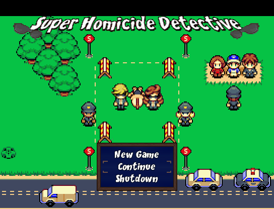
Before school started I showed a few screenshots during Release Something for a project I'm working on:
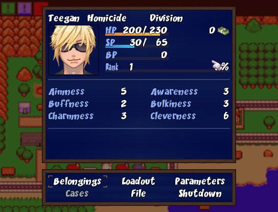
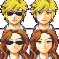
Now that's summer back I've gotten into it again (was a hell of a semester) and I got someone to put together a couple new facesets for me and was looking for some feedback on them.
I really like them but there's something about the sunglasses that is bugging me... Curious to see what people think about that. I like the new menu a lot more now though.
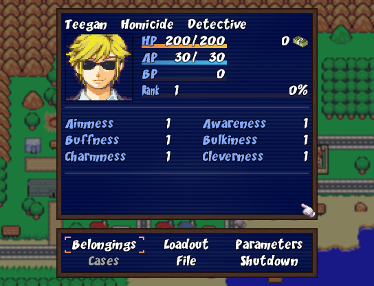
OLD:
NEW:
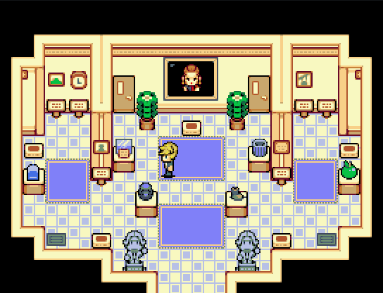
And here's a new map I put together for an art gallery:
Now that's summer back I've gotten into it again (was a hell of a semester) and I got someone to put together a couple new facesets for me and was looking for some feedback on them.
OLD:

NEW:
NEW:
I really like them but there's something about the sunglasses that is bugging me... Curious to see what people think about that. I like the new menu a lot more now though.
OLD:
NEW:
And here's a new map I put together for an art gallery:
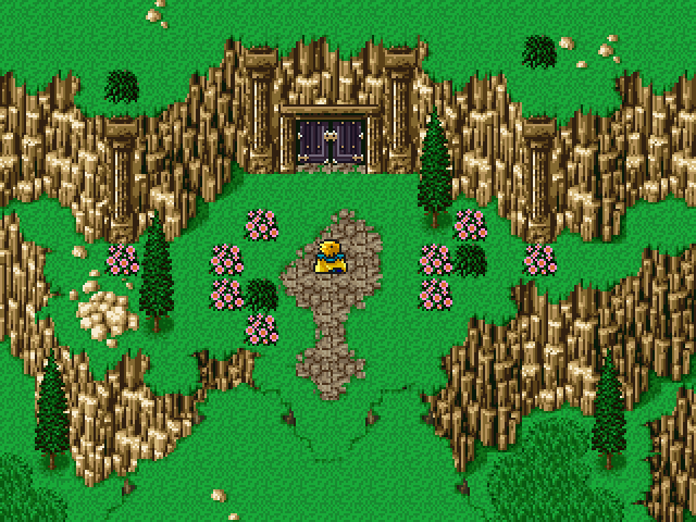
I spent most of the day workin on a dungeon/caves themed chapset. The rest was spent cooking.
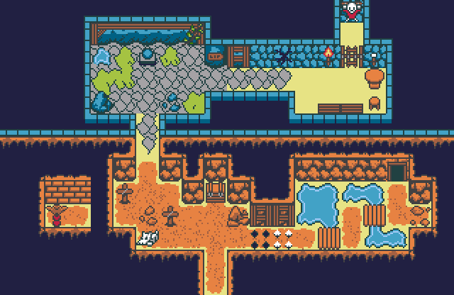
This is by no means a good map, just a showoff of various tiles. Totems and some other items need re positioning. Among original tiles can be recognized heavily modded FF rips and RTP. If someone wants to check the whole chapset, here it is.
This is by no means a good map, just a showoff of various tiles. Totems and some other items need re positioning. Among original tiles can be recognized heavily modded FF rips and RTP. If someone wants to check the whole chapset, here it is.


I think the stone tiles could use a little shading on the bottom edge, they look very flat.

tryna piece together a little overgrown cave tileset
tryna piece together a little overgrown cave tileset

