HAUS'S GENERAL ART THREAD
Posts
Focusing on that last pic you posted...
-start of a great composition, interesting scene, i'm interested and intrigued by the situation you got doing on here
- feels empty and like the detail is weirdly spaced
-posing on the dude in armor is a little ??? in concept; what is he doing? why is he doing it? it's unclear. Also not sure what his cape is doing...are they underwater? getting some rad underwater vibes from this pic, or just...airy?
I stopped writing bullet points and just went into detail so here you go:
It looks like you did some lovely detail work on the two main characters, but the rest of the piece does not have much detail...so it does just look unbalanced there

The contrast is very, very high and while this can look nice, it's kind of harsh here...
In your colors, you seem to use a lot of pure white/black for lighting, which is what makes that super high contrast look. Even if this is intentional, most Color Guides and whatnot advise not using pure of any color. If you use 100% saturated or 100% black/white colors, just be careful about it.
The main colors here are a blue/white/red/black scheme going on... I think having the background be predominately blue + the dude in armor being predominately blue, but then ghost lady being the white is jarring. The dude in armor blends with the background in terms of color (but I want to note that you do a good job making him distinct from the background with how you use highlights) and she stands out SUPER A LOT due to being primarily white.
I think if you want a ghostly effect, consider having some part of her be semi-transparent. And if she is not affected by the lighting of the scene, well, she'll stand out! no getting around it, and I think the "emitting light" idea is not bad at all, but it does contribute to making her stand out as well.
basically ghost lady looks as if she's the prime focus of the piece, and because of how bright she is in comparison to the environment, she looks like she SHOULD be the main subject...but then she's not?
which just makes me think that my eye isn't being led by the composition. Where do you want us to look? What is this picture about?
just a random note but i really love the upper part, with the fish and sky view? like that's just hella rad and I think you have a strong concept for this picture, overall. It's a cool idea.
And anyways, up top I mentioned that the picture felt "empty", and you mentioned being aware that the background felt it lacked definition. Don't be afraid of just using a hard brush with a bit of transparency so it! Work in color blocks, and if it helps you...then just line out the whole scene! no reason why you can't and you seem v patient with art.

I don't actually know what kind of background you want, but there's like 5 minutes of me jamming on random shapes in the bg + lowering the amount of pure black. The idea was just an example of creating visual interest/"hardening up" the background colors, feel free to ignore.

This is an edit focusing on lighting in particular...if you have these two light sources, and the dude is wearing metal, then his armor ought to reflect more light. Uh, please don't follow this exactly if you change anything since i did not look up references or anything and it's hella unrealistic, but i hope the idea gets across!
It's hard to put into words how I think about lighting. Consider how close someone is to a light source. Closer = brighter light. And try to think of things in 3d forms. And think about how reflective the material is!
really digging Zylverhia tho. She's rendered p nicely in this picture and idk, she looks nice!
Overall, like I mentioned, I think you have a great concept and it's not bad! But I do also think you can push it further and add detail/maybe fiddle with the contrast. I'm not focusing too much on composition since IDK what you're going for, so do whatever you want, man. I would advise adding some kind of interest in the foreground, since you have a great background + a midground with the characters, but not much going on in the foreground.
For improving yr colors at all...well you know. study color theory. It's huge and messy and a complicated topic, but that's how you improve yr color choices.
Maybe one of these links might help? I don't have one single thing I can point to and be all "this is it, this is the Guide to Color Theory".
I almost always blanket recommend these techniques for anyone trying to problem solve a picture. i mostly just flip things and do a value check and if something looks weird... problem solve! what looks off about it? what might fix it? usually the answer to the second one is "look up some sort of reference"
Trying to mimic artists you like is not a bad place to start, straight-up. See if they have process resources, like a gif of their workflow, and see what you can learn from it. I always stress the importance of using reference and drawing from life where you can... really, if you don't know what something looks like? Look it up, i know it sounds all "no shit, sherlock" but...yeah. Also try to find out if you're more comfortable starting from a dark background and painting on the light, or if you prefer to work light to dark.
I don't think I have any personal tips about how to choose shadow and highlight values... um I probably have links to someone writing Smart Words about it but not off the top of my head. If I think of something or go ferret out something nice i will probably edit this chunk or something.
idk, maybe this will have something helpful to you.
And if it seems a bit overwhelming, just pick one thing to focus on and go there! whether it's color choice, values, or lineart quality or whatever... So long as you practice and study, you will only grow stronger.
Good luck! i hope even some of that was helpful.
-start of a great composition, interesting scene, i'm interested and intrigued by the situation you got doing on here
- feels empty and like the detail is weirdly spaced
-posing on the dude in armor is a little ??? in concept; what is he doing? why is he doing it? it's unclear. Also not sure what his cape is doing...are they underwater? getting some rad underwater vibes from this pic, or just...airy?
I stopped writing bullet points and just went into detail so here you go:
It looks like you did some lovely detail work on the two main characters, but the rest of the piece does not have much detail...so it does just look unbalanced there

The contrast is very, very high and while this can look nice, it's kind of harsh here...
In your colors, you seem to use a lot of pure white/black for lighting, which is what makes that super high contrast look. Even if this is intentional, most Color Guides and whatnot advise not using pure of any color. If you use 100% saturated or 100% black/white colors, just be careful about it.
The main colors here are a blue/white/red/black scheme going on... I think having the background be predominately blue + the dude in armor being predominately blue, but then ghost lady being the white is jarring. The dude in armor blends with the background in terms of color (but I want to note that you do a good job making him distinct from the background with how you use highlights) and she stands out SUPER A LOT due to being primarily white.
I think if you want a ghostly effect, consider having some part of her be semi-transparent. And if she is not affected by the lighting of the scene, well, she'll stand out! no getting around it, and I think the "emitting light" idea is not bad at all, but it does contribute to making her stand out as well.
basically ghost lady looks as if she's the prime focus of the piece, and because of how bright she is in comparison to the environment, she looks like she SHOULD be the main subject...but then she's not?
which just makes me think that my eye isn't being led by the composition. Where do you want us to look? What is this picture about?
just a random note but i really love the upper part, with the fish and sky view? like that's just hella rad and I think you have a strong concept for this picture, overall. It's a cool idea.
And anyways, up top I mentioned that the picture felt "empty", and you mentioned being aware that the background felt it lacked definition. Don't be afraid of just using a hard brush with a bit of transparency so it! Work in color blocks, and if it helps you...then just line out the whole scene! no reason why you can't and you seem v patient with art.

I don't actually know what kind of background you want, but there's like 5 minutes of me jamming on random shapes in the bg + lowering the amount of pure black. The idea was just an example of creating visual interest/"hardening up" the background colors, feel free to ignore.

This is an edit focusing on lighting in particular...if you have these two light sources, and the dude is wearing metal, then his armor ought to reflect more light. Uh, please don't follow this exactly if you change anything since i did not look up references or anything and it's hella unrealistic, but i hope the idea gets across!
It's hard to put into words how I think about lighting. Consider how close someone is to a light source. Closer = brighter light. And try to think of things in 3d forms. And think about how reflective the material is!
really digging Zylverhia tho. She's rendered p nicely in this picture and idk, she looks nice!
Overall, like I mentioned, I think you have a great concept and it's not bad! But I do also think you can push it further and add detail/maybe fiddle with the contrast. I'm not focusing too much on composition since IDK what you're going for, so do whatever you want, man. I would advise adding some kind of interest in the foreground, since you have a great background + a midground with the characters, but not much going on in the foreground.
For improving yr colors at all...well you know. study color theory. It's huge and messy and a complicated topic, but that's how you improve yr color choices.
Maybe one of these links might help? I don't have one single thing I can point to and be all "this is it, this is the Guide to Color Theory".
I almost always blanket recommend these techniques for anyone trying to problem solve a picture. i mostly just flip things and do a value check and if something looks weird... problem solve! what looks off about it? what might fix it? usually the answer to the second one is "look up some sort of reference"
Trying to mimic artists you like is not a bad place to start, straight-up. See if they have process resources, like a gif of their workflow, and see what you can learn from it. I always stress the importance of using reference and drawing from life where you can... really, if you don't know what something looks like? Look it up, i know it sounds all "no shit, sherlock" but...yeah. Also try to find out if you're more comfortable starting from a dark background and painting on the light, or if you prefer to work light to dark.
I don't think I have any personal tips about how to choose shadow and highlight values... um I probably have links to someone writing Smart Words about it but not off the top of my head. If I think of something or go ferret out something nice i will probably edit this chunk or something.
idk, maybe this will have something helpful to you.
And if it seems a bit overwhelming, just pick one thing to focus on and go there! whether it's color choice, values, or lineart quality or whatever... So long as you practice and study, you will only grow stronger.
Good luck! i hope even some of that was helpful.
Oh man, that post is a lot of help, trust me. I always love it when people edit my pictures directly to demonstrate a point, since I'm more of a visual person. I can definitely keep some of these things in mind as I go along.
Anyway, to answer some of your quesitons:
I did this as a rough concept for the first "dungeon" to give myself an idea for how I wanted it to look (so that I can edit my chipsets appropriately and try to strive for it). To that end the picture itself is pretty boring since I wanted to just draw the two protagonists in that environment, and in this case they're just standing there overlooking something offscreen. The platform the knight is standing on is meant to be some kind of edge of a cliff but that got lost somewhere in between.
As for the environment, they're in a coral reef that's littered with shipwrecks, and they're traveling around in the "canyons" underneath the rocks, so very shadowed punctuated by lots of colored light from the cracks and openings above.
The game is called "Undersea Mountain" and the entirety of it occurs underwater. The protagonists are an undead knight, Skulhoarse (also the same guy in my avatar) and his equally undead wife, Zylverhia, and they're down here because they're looking for something important. So yeah, this situation is entirely weird as we literally have a knight and a ghost running around under the sea.
Both of them SHOULD be the main subject buuuut...I kinda put myself into a tough spot there considering the knight is a physical form in the environment and the ghost is not really part of it, so the latter will stand out regardless. These two should be the focal point but I see what you mean with the leading issue.
Once again, thanks a lot for the detailed info. This was definitely helpful and gives me things to try for the next one I do.
Anyway, for today:
DAY 9
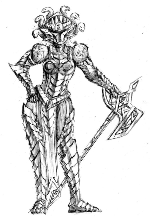
Felt like drawing one of my female armored bastards today. Of course since I was at work that meant I had to try my best sans references. I think I had a good idea for the pose but somewhere during my roughing something didn't work out and now I'm not that happy with it, like it doesn't look that relaxed a pose. Helmet's probably too big too. Oh well, I wanted to get a full body of this character done either way.
Anyway, to answer some of your quesitons:
author=PentagonBuddy
-start of a great composition, interesting scene, i'm interested and intrigued by the situation you got doing on here
I did this as a rough concept for the first "dungeon" to give myself an idea for how I wanted it to look (so that I can edit my chipsets appropriately and try to strive for it). To that end the picture itself is pretty boring since I wanted to just draw the two protagonists in that environment, and in this case they're just standing there overlooking something offscreen. The platform the knight is standing on is meant to be some kind of edge of a cliff but that got lost somewhere in between.
As for the environment, they're in a coral reef that's littered with shipwrecks, and they're traveling around in the "canyons" underneath the rocks, so very shadowed punctuated by lots of colored light from the cracks and openings above.
author=PentagonBuddy
-posing on the dude in armor is a little ??? in concept; what is he doing? why is he doing it? it's unclear. Also not sure what his cape is doing...are they underwater? getting some rad underwater vibes from this pic, or just...airy?
The game is called "Undersea Mountain" and the entirety of it occurs underwater. The protagonists are an undead knight, Skulhoarse (also the same guy in my avatar) and his equally undead wife, Zylverhia, and they're down here because they're looking for something important. So yeah, this situation is entirely weird as we literally have a knight and a ghost running around under the sea.
author=PentagonBuddy
basically ghost lady looks as if she's the prime focus of the piece, and because of how bright she is in comparison to the environment, she looks like she SHOULD be the main subject...but then she's not?
which just makes me think that my eye isn't being led by the composition. Where do you want us to look? What is this picture about?
Both of them SHOULD be the main subject buuuut...I kinda put myself into a tough spot there considering the knight is a physical form in the environment and the ghost is not really part of it, so the latter will stand out regardless. These two should be the focal point but I see what you mean with the leading issue.
author=PentagonBuddy
Good luck! i hope even some of that was helpful.
Once again, thanks a lot for the detailed info. This was definitely helpful and gives me things to try for the next one I do.
Anyway, for today:
DAY 9

Felt like drawing one of my female armored bastards today. Of course since I was at work that meant I had to try my best sans references. I think I had a good idea for the pose but somewhere during my roughing something didn't work out and now I'm not that happy with it, like it doesn't look that relaxed a pose. Helmet's probably too big too. Oh well, I wanted to get a full body of this character done either way.
DAY 10
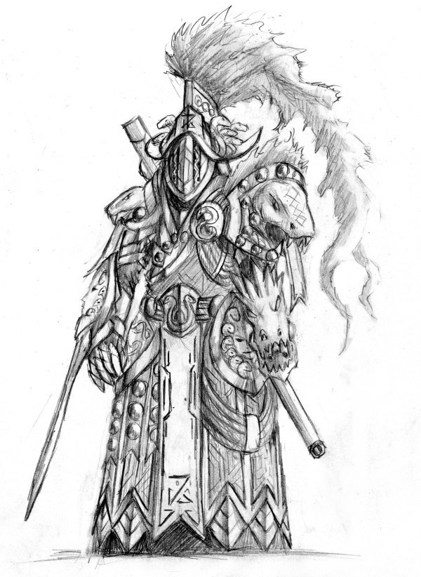
Another one of these lovely but heavily armored ladies, this one in particular being the most absurdly armored out of the ones in this series (this series being, hybrid mage/warrior snake/medusa themed ladies wearing magic armor). There is in fact a normal woman inside of there somewhere, but you could probably think of this suit as less armor and more powered suit.

Another one of these lovely but heavily armored ladies, this one in particular being the most absurdly armored out of the ones in this series (this series being, hybrid mage/warrior snake/medusa themed ladies wearing magic armor). There is in fact a normal woman inside of there somewhere, but you could probably think of this suit as less armor and more powered suit.
author=sinnelius
Those animations are crazyyyy!!
What kind of input you need?
Anything you can think of that you can see that I need to improve really. It's mainly technique and colors/shading and etc that I need help with. I already know I need to do a lot more studying and practicing on things like anatomy and whatnot but I'm open to anything constructive or specific. You're welcome to mark up my drawings if you feel like it to illustrate your point, since we tend to be more visual people anyway.
DAY 11
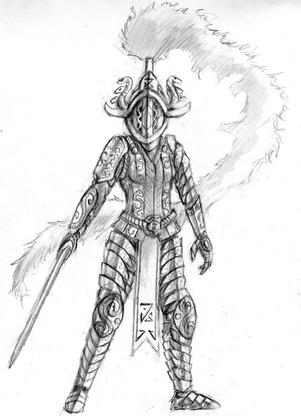
This is the same lady as before, except after armor purging (yes, like a mecha. I know it's weird DON'T JUDGE ME). It's a pretty out there idea but I did plan out the logistics of her fitting into that larger suit and there was more than enough space for the rest of this. Also the feathery crest thing on her helmet got a bit exaggerated this time.

This is the same lady as before, except after armor purging (yes, like a mecha. I know it's weird DON'T JUDGE ME). It's a pretty out there idea but I did plan out the logistics of her fitting into that larger suit and there was more than enough space for the rest of this. Also the feathery crest thing on her helmet got a bit exaggerated this time.
DAY 12
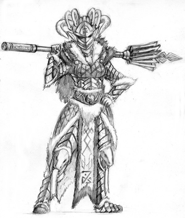
Here's another lady from the same series. Despite having all the same theme (shiny gold armor, 100% covered, snakes, medusa, etc) I try to vary up each design and give them minor themes and differences from each other. In this case there's more fur cloth than the others and the segmented armor plates are angled in a different direction.

Here's another lady from the same series. Despite having all the same theme (shiny gold armor, 100% covered, snakes, medusa, etc) I try to vary up each design and give them minor themes and differences from each other. In this case there's more fur cloth than the others and the segmented armor plates are angled in a different direction.
DAY 13
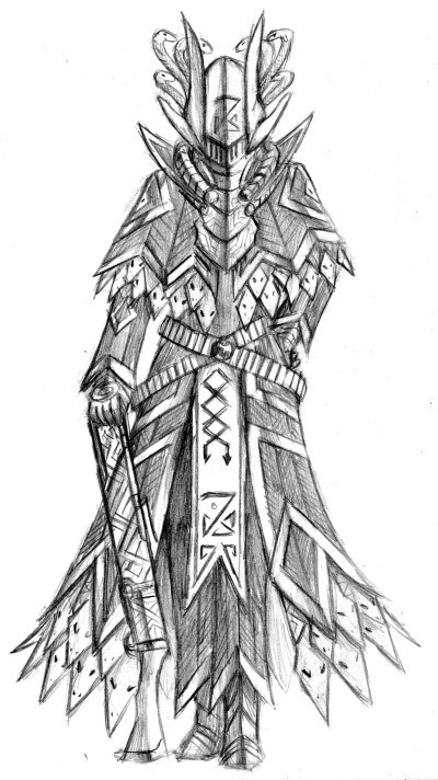
Possibly the strangest one in the lot so far. Although these are all magic warriors, this one is probably the most magic-focused one, though still a bit different since she uses that gun for her magic. In this setting, "sorcerers" are plate-wearing magic-using knights, so this is actually relatively normal.

Possibly the strangest one in the lot so far. Although these are all magic warriors, this one is probably the most magic-focused one, though still a bit different since she uses that gun for her magic. In this setting, "sorcerers" are plate-wearing magic-using knights, so this is actually relatively normal.
Setting note sounds epic. And this is yet another interesting variation. I hope there will be more revelations on your project in upcoming days, near future.
DAY 14
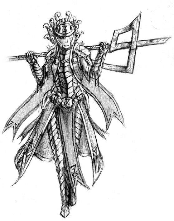
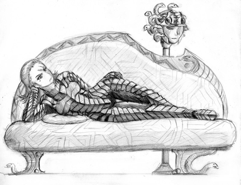
This character is the original medusa-helmeted snake-themed warrior mage of this series and is the one I used as the basis for the past four I posted. She also gets slightly redesigned every time I draw her it seems. I only meant to draw the first one but ended up drawing the second one because I ended up really liking how her figure looked dressed in that strange reptilian pseudo lamellar/plate mail while I was planning the first drawing and was a bit disappointed I had to cover it up with more clothing, so I decided to draw her without any of the extra armor on top. And hey, similarly themed furniture because why the hell not.


This character is the original medusa-helmeted snake-themed warrior mage of this series and is the one I used as the basis for the past four I posted. She also gets slightly redesigned every time I draw her it seems. I only meant to draw the first one but ended up drawing the second one because I ended up really liking how her figure looked dressed in that strange reptilian pseudo lamellar/plate mail while I was planning the first drawing and was a bit disappointed I had to cover it up with more clothing, so I decided to draw her without any of the extra armor on top. And hey, similarly themed furniture because why the hell not.
I like your designs.... That's for sure.
I think it could use some anatomy fixing but... Meh, try some polishing on your favorites ones...in black and white.
I think it could use some anatomy fixing but... Meh, try some polishing on your favorites ones...in black and white.
I've been working mostly on programming recently, which unfortunately isn't exactly something I can post here. Regardless, here's a nice update:
DAY 15
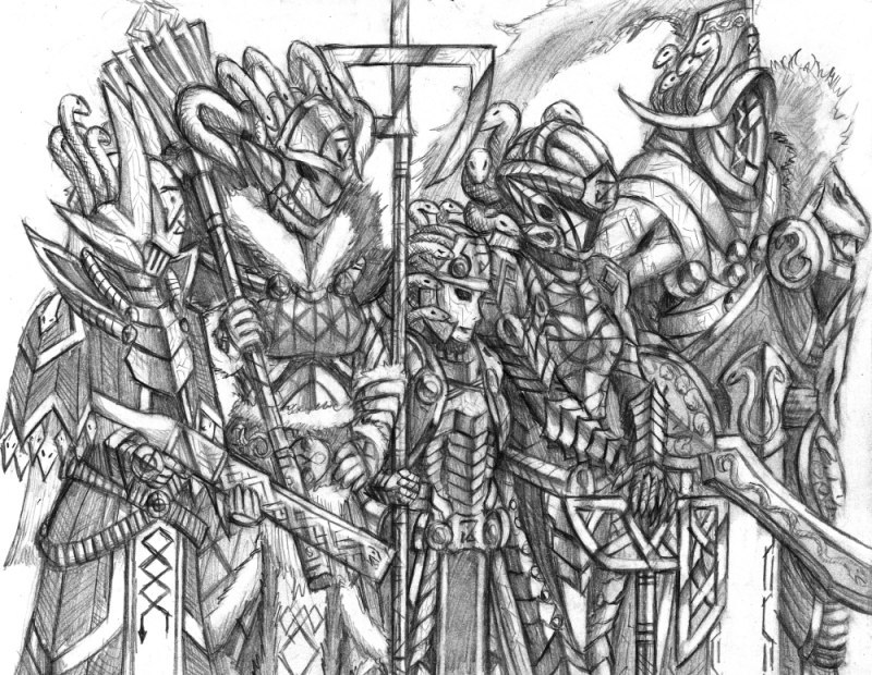

The first picture combines the last 5 armored women that I drew in one picture and shows their heights a bit (yes, the middle one is tiny but it's mostly relative to the others). The second picture shows the goddess that these women work for which you can probably tell by the actual medusa hair and the matching patterns. This one generally has a frail elderly lady appearance to her in contrast to her champions above and has a more Tron-like appearance because ancient/advanced civilizations and all that.
But yes, so many snakes.
DAY 15


The first picture combines the last 5 armored women that I drew in one picture and shows their heights a bit (yes, the middle one is tiny but it's mostly relative to the others). The second picture shows the goddess that these women work for which you can probably tell by the actual medusa hair and the matching patterns. This one generally has a frail elderly lady appearance to her in contrast to her champions above and has a more Tron-like appearance because ancient/advanced civilizations and all that.
But yes, so many snakes.
author=JIHAUS
I've been working mostly on programming recently, which unfortunately isn't exactly something I can post here. Regardless, here's a nice update:
DAY 15
The first picture combines the last 5 armored women that I drew in one picture and shows their heights a bit (yes, the middle one is tiny but it's mostly relative to the others). The second picture shows the goddess that these women work for which you can probably tell by the actual medusa hair and the matching patterns. This one generally has a frail elderly lady appearance to her in contrast to her champions above and has a more Tron-like appearance because ancient/advanced civilizations and all that.
But yes, so many snakes.
You could polish them, I could polish them.
The armor designs are rad, reminds me of the latest Seven Sins comic.
Lots of ideas flow through every nook and cranny of those armor details, if anything this'll be a great game pitch.
Thanks, I'm a bit of an excessive world builder so I'm very particular about details on characters as well as whether they're relevant to cultures, etc. Unfortunately these are no more than doodles at work so they'll be rough around the edges in general, and can best be considered concept art.
DAY 16
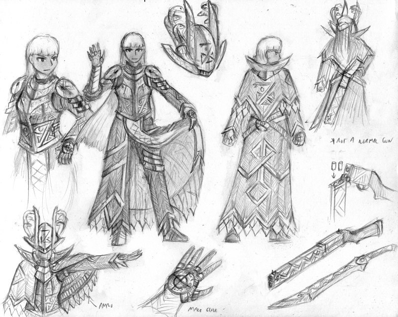
For characters that have more intricate or layered outfits I like to draw these style sheet type of things that I refer to as OCD diagrams, which are really just me filling a sketchbook page with details on a character's outfit, especially details that aren't normally seen. In this case I'm illustrating that this girl is in fact as much of an armored bastard as the rest of them. Also, that gun is actually not functional as a regular gun and is instead a magic-using implement called a "castgun" used for offensive magic by sorceresses like this lady.
DAY 16

For characters that have more intricate or layered outfits I like to draw these style sheet type of things that I refer to as OCD diagrams, which are really just me filling a sketchbook page with details on a character's outfit, especially details that aren't normally seen. In this case I'm illustrating that this girl is in fact as much of an armored bastard as the rest of them. Also, that gun is actually not functional as a regular gun and is instead a magic-using implement called a "castgun" used for offensive magic by sorceresses like this lady.
DAY 17
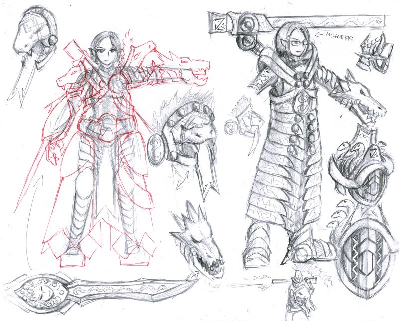
Another OCD diagram, this time depicting the heaviest one of them all. This armor is practically medieval fantasy power armor and being that these ladies are all magic users, there's probably some kind of magic craziness going on there. However I still wanted it to look like a woman can fit in that huge thing properly, if awkwardly. Heh.

Another OCD diagram, this time depicting the heaviest one of them all. This armor is practically medieval fantasy power armor and being that these ladies are all magic users, there's probably some kind of magic craziness going on there. However I still wanted it to look like a woman can fit in that huge thing properly, if awkwardly. Heh.
Red_Nova

Sir Redd of Novus: He who made Prayer of the Faithless that one time, and that was pretty dang rad! :D
9192
Dude... This is great stuff! I love these designs!
Sorry I'm not experienced enough to give you any useful kind of feedback, but I had to go get a new jaw from the hospital because mine just fell to the floor and shattered. I think my favorite ones might be days 16, 2, and 7.
Although if I reeeeally stretched to give you feedback, I'd have to say that some of the characters seem a bit... overdesigned. Day 10 sorta jumps out at me that the woman is more of a walking fortress than a person. Which may have been the intention, from your description. Have you ever played Darksiders? I haven't, but looking at the main character, War, one of the biggest turnoffs to me was the fact that he barely even resembled a human being underneath all that equipment. It's fine if you want to give a character heavy armor, but I would have a serious issue with characterization if I doubted a person was even able to MOVE under all that armor.
Anyway, that's just my two cents. I still love all these designs. Keep it up!
Holy Moly, these schematics are rad!
I really like that one sketch showing armor's position on body in red. I don't share Nova's point of view as I have that these are female fantasy Blood Ravens (or any other guys in armor from Warhammer 40k). And their powersuits are lovely. To tell the truth I like the heaviest design best.
Also Sofa lady has some sexy lines.
Thanks for the comments! The really heavily armored girl in question is definitely doing the same thing as space marines in 40k, so you're definitely spot on with that. I am actually also in agreement with Nova's because personally I tend to hate armor that only looks cool but doesn't look practical, which is what a lot of artists designing heavy armor/powersuits tend to do; that's why I made sure that a person can still reasonably fit in that thing.
But yeah the armor on day 10/17 are not meant to be a very mobile suit of armor and can be best described as a walking fortress, where it's meant to defend a place and be largely stationary. That's why she has a far lighter suit of armor (day 11) underneath all that and can purge the armor if necessary. The rest of the ladies are a far more practically armored, with the "sofa lady" of day 14 being a bit more like a sci fi-ish form fitting armor suit really (dat sexy lines). With the details, since I use history and real armor as my inspiration, a lot of the fancier ones really do get this detailed and ornate (moreso even) so I go crazy with that with these stationary drawings and integrate as much of their motif as possible. Obviously if I had to either do a comic of them or animate this in 2d, I'd have to SIGNIFICANTLY reduce the detail or else I'd kill myself, heh.
But yeah the armor on day 10/17 are not meant to be a very mobile suit of armor and can be best described as a walking fortress, where it's meant to defend a place and be largely stationary. That's why she has a far lighter suit of armor (day 11) underneath all that and can purge the armor if necessary. The rest of the ladies are a far more practically armored, with the "sofa lady" of day 14 being a bit more like a sci fi-ish form fitting armor suit really (dat sexy lines). With the details, since I use history and real armor as my inspiration, a lot of the fancier ones really do get this detailed and ornate (moreso even) so I go crazy with that with these stationary drawings and integrate as much of their motif as possible. Obviously if I had to either do a comic of them or animate this in 2d, I'd have to SIGNIFICANTLY reduce the detail or else I'd kill myself, heh.
DAY 18
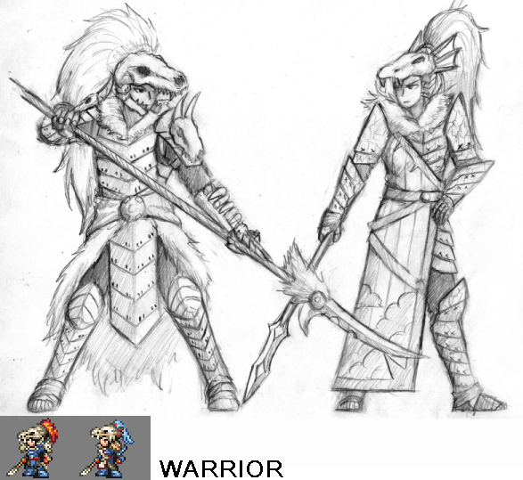
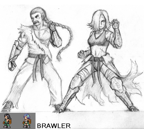
At some point last year Ocean had me redesign the classes in Paradise Blue to get them away from their FF roots and I drew him a bunch of concepts to that end. I decided I'd start drawing them on pencil as I hadn't done so before so here's the first two. The sprites are Ocean's, of course, but I thought it'd be cool to see how well he was able to replicate my designs as sprites. As expected with these things, there'll be slight variations between my drawings and the sprites, but that's pretty normal for this kind of thing.
Today we have the Warrior (formerly fighter) and Brawler (formerly monk) classes. The classes in Paradise Blue are pretty standard for RPGs in general so when I redesigned them I tried to make them look more unique than the usual stuff but still recognizable enough in function. As always I took a lot of inspiration from history and past cultures but I suppose we'll find out after I've posted the rest whether or not I was able to successfully make them interesting enough.


