


NEW DEVELOPER MAPPING HELP THREAD
Posts

author=tawmanauthor=KylailaIm ashamed you know? If you look at my game profile(tho u cant as it aint published yet) its from 2015! thats like 2 years already. ANd the cause of that wasnt my bad skills its because i abondoned it like a slime(classic rpg slang?) because of too much criticism and naiive thoughts in me. It wont happen again. Im gonna finish this and keep on developing more of what i once set out to do 2 years ago. I loved rpg since i was a child and i will keep on developing it till i have my imagination
Looks a lot better : ) Keep going man~ it's cool to see you seek out more feedback ^.^ by the by
The only thing to be ashamed about would be to never look at those facts.
So chin up, friend. Yer on the right path, and it's not an easy choice to make.
*chuckle* It's how I work n see things at least ; ) Yer learning from it and are determined to see it through. That's good.
And listen to Trihan, yer welcome doing so~

Hey again yall awesome people! Long time! Back again to bother you all with my useless howl to get maps fixed xD so basically this is one of those 'map-that-looks-fine-but-still-has-some-doubt-that-its-NOT-FINE' ones. Im tryna make like a miniature gate checkpost. the walls have this floors where archers can surround the door and if any ugly's enter the gate, theyll be shot in the guchacha. i gave some black marks to show that numerous battles have undergone in that area or to show rotten blood( they turn black) and inside that gate,on the left theres another pathway guarded by another soldier.


Remember that if a wall has the same height of ceiling as other walls, they need to be the same. The walls in the middle are three high, but at the back they're only two (and that small part in the middle near the banner), yet the ceiling is all the same height.
The cracks in the brown wall are cool, but some are open darkness and some show more brick underneath. I think it should be one or the other: either they are big holes or the brown bricks are over smaller gray bricks.
And Liberty's note on the wall height - that's a big one.
Aside from that, it's a pretty solid map.
And Liberty's note on the wall height - that's a big one.
Aside from that, it's a pretty solid map.


Sorry for the long delayed update, i was kinda proceeding on the other stories and maps until i checked the thread and saw that i had a lot of flaws xD
-Liberty, sorry that was so stupid of me to not realize it :I i fixed it now, also if ur wondering theres 2 tile wall on the inside and 3 tile on the outer walls, i kinda did that on purpose to show that the interior walls has low altitude for the archers to focus on.
DjBeardo-I chose the big hole faction. All dem bricks are gone. Thanks as well thats a pretty solid Milotic you got there too xD im a hardcore pokemon fan!
Did a rough draft of a level and town. Need to rework the graphics and mapping. Here's images. Not good but determined to get better. Please advise. This is one picture of a house. Objects are meant to be on the floor. They can be picked up and the hero is a messy character.

Here's two other images that don't cut it. Please advise and I will incorporate it in my work.
https://rpgmaker.net/media/content/games/9647/screenshots/Toxic_Remedy_photo_2.jpg
https://rpgmaker.net/media/content/games/9647/screenshots/Toxic_Remedy_photo_3.jpg
Here's two other images that don't cut it. Please advise and I will incorporate it in my work.
https://rpgmaker.net/media/content/games/9647/screenshots/Toxic_Remedy_photo_2.jpg
https://rpgmaker.net/media/content/games/9647/screenshots/Toxic_Remedy_photo_3.jpg

@Stevie: The "walls" of that house inner aren't clearly defined - they just look like floor tiles arranged in bizarre patterns. Try finding an appropriate wall tile and use the black/negative space to properly define the shape of your room. The windows don't really make sense either.
A visual example might work better:


A visual example might work better:
Ok, here is my first try.


author=StevieRayBones
Ok, here is my first try.
Looking a LOT better.
Keeping working at it - the tiles themselves seem distorted, but I think that's probably because you saved it as JPG. But the map itself is pretty nice/average.
Thanks! That was a world of help. I'm revising a demo with a town, interior houses, and a level. So far I've improved on the houses. Here is a picture of the town. It is a mine town. 
The windows on the roof on the left look a lil weird. The tiles also looks like they might be used for walls or something? (could be reused, in which case the house on the right stands out where the roof is used as a wall)
With windows gone it'd prolly already look a lot more natural.
I'd wait for proper mapper responses tho as to what those tiles are best used for *chuckle*
With windows gone it'd prolly already look a lot more natural.
I'd wait for proper mapper responses tho as to what those tiles are best used for *chuckle*
Yeah, pretty sure those aren't for walls (you're using them as walls on the right). The lighting gives it away. The windows are definitely weird since the lighting gives them a front-facing look, when you've got them as sunlights. There's no edges for the cliffs at the bottom, either. The fence bottoms are missing near the barrels.The framework above the mine entrance are two-high on the left and right, but are braced up over the mine which is also two high, making them appear to be 3-high. Really weird.
There's something weird going on with your cliff usage, too. Down the bottom you haven't got the right-corner below the rock, where it would go. You also don't have the corner below the grass, nor behind the grass.
There's something weird going on with your cliff usage, too. Down the bottom you haven't got the right-corner below the rock, where it would go. You also don't have the corner below the grass, nor behind the grass.
LockeZ

I'd really like to get rid of LockeZ. His play style is way too unpredictable. He's always like this too. If he ran a country, he'd just kill and imprison people at random until crime stopped.
5958
The "house" on the right is more like a 15 foot tall metal wall, because it doesn't seem to have a roof.
I'm not sure what's going on with the shaded areas of the cliffs to the right of the graves. Those shadows don't make sense to me.
In the houses, I don't think the placement of the light/shadow makes sense with respect to the windows. I don't know what it should look like either though. I just know that on the left side of the northmost wall, there's a window, and the light coming out of that window makes no sense. It should be coming from the whole window, not just a corner of it.
I edited the light in the upper left window as an example of a partial fix. The light still doesn't really make sense in this one, but it's somewhat better:
Thanks. I will work on all those things and see if it looks better.

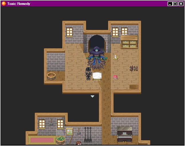
Hey guys long time :) Still working on my game and making sure it has no bug. Its almost finished and working on the ending. This is an expansion of that 'military castle' which is basically a room for treating soldier with casualties. So ive tried to make it look like a busy infirmary where the doctors are treating injured soldiers.Just wanted to know if anythings missing or upside down xD
I am wondering why there's weaponry in an infirmiry for one.
Just some notes on tiles, though:
- The bottom things aren't tables but wall shelves. They should be only put on walls (the bottles/jars/pouches/books)
- The helmets and arrows are table/floor items. They look a little odd on the walls (how would you mount them in that position on a wall? They have depth remember XD )
- The shields are fine on walls as you can always add something behind them to hold them up and they don't have a bunch of depth.
I'd recommend moving the weapons/armour off the top area and replacing with some shelves there. Put a table near the bottom of the screen and put the helms/weapons there if they must be kept in the room.
Also look in to overlapping stuff with the ceiling tile at the bottom. So if you take the top part of bed tiles and put them against the bottom it will look like the ceiling overlaps the rest of the beds, making them look as though they're hidden behind the wall (since this is a 3/4 view and not top-down, it works fine like that).
I'd also recommend looking in to a few minor edits that exist out there for cabinets/shelves/bookcases and making your own Tile E for inner areas which have them on it. (I've got some in the site resource section if you're wondering where to find stuff). You can, with the right edits, make the room look like it has more shelving. Also, maybe replace one of those bookshelves with some of the shelf types?
Here's a quick example map to give you an idea of what I mean:
Hello everyone
So I was denied a page due to "big mapping issues" and was told to come to this thread to get help, so here goes:
The concept for my game is you are playing a blind person. As such you are starting with a black screen, and slowly have to fill it in to figure out what is where. The following screen shots are from my game and are the ones that got me denied, so any help is appreciated in figuring out what I can do better:
LockeZ
I'd really like to get rid of LockeZ. His play style is way too unpredictable. He's always like this too. If he ran a country, he'd just kill and imprison people at random until crime stopped.
5958
Screenshot 1: Your walls just aren't assembled correctly, they have two bottom-halves of a wall stacked on top of each-other. What the heck kind of building has three fireplaces side by side? Why are crumbling thousand year old stone pillars in a warehouse? What is that even supposed to be in the center there? The "walls" surrounding the edges of the map are inconsistend and look like shit. RPG Maker has black void tiles to use around the outsides of interior maps so they'll look like every other RPG you've ever played in your life; use those so you can make your interior maps whatever size and shape you want instead of always having to fill the entire screen.
Screenshot 2: What even is happening just below the fireplace in the upper right? It looks like there's a giant tablecloth on the floor, with two kiln stoves sitting on it with people's severed heads inside the stoves looking out. Your fireplace looks like it's emitting a cloud of dust instead of light, because you don't understand how lighting works; you shouldn't ever use a colored overlay or sprite on top of a map to represent light, you should always darken all the other areas and just leave the lighted area alone. None of your walls make any sense. There might be other problems but it's too dark to see.
Screenshot 3: Either come up with a vastly better-looking way of representing the undiscovered parts of the maps, or abandon this game concept and come up with something else. These solid black boxes with no transition or anything are shit. You didn't need anyone to tell you they look like shit, you were just too lazy to develop a better way. Imagine what you'd do if you weren't lazy, and then do that thing. Also you have vast swaths of empty, identical ground tiles; this would look ugly even if you weren't doing your weird blindness system. I should also point out that I have no earthly idea what all those things in the map are supposed to be; I presume they're some kind of unidentifiable arcane machinery, but if the player is supposed to be able to recognize them without being told, then you probably want to redo the sprite.
Screenshot 4: I can't tell you how to do this map better, because I'm not even sure what it's supposed to be. Is that some kind of structure, or a cave, or what? What are the walls supposed to be made of? What's with all the weird horizontal lines covering the walls? Why doesn't it have a ceiling? Why are there crossbeams if there isn't a ceiling? The tint is a nice color for a flashback, so I guess it has that going for it... unless it isn't a flashback, in which case you should get rid of the tint.
@tawman: Aside from the problems Liberty mentioned, I feel like an infirmary room would be inside. Why is this outdoors?
Screenshot 1: Thank you for the walls, I will look for a better combination. I was hoping to give the feel of a militaristic concrete, but it sounds like that doesn't read, so I will look into other options. The room is supposed to be a furnace room for a steel mill, and the three fireplaces are meant to be the furnace. I want it to be three across because your objective is to push the enemy in, and in play testing, having just one was really hard for the player. The thing in the center is meant to be a blast protector, as well as give the player something to maneuver around to protect them from the enemy.
Screenshot 2: The image is meant to be the two main characters under a blanket trying to warm themselves by the fire. If you have any recommendations to make the sprites more blanket like that would help. I can try adjusting the lighting as well
Screenshot 3: The blind mechanic, hiding the map until your character can "feel" what is in the location. The black covers everything until you can find it. I can try to create a gradient on the sides of it, but I do need that mechanic for the concept. The monsters are not meant to be recognizable, just large bloody teathed beasts. I would like the player to not know what they are, only that they are dangerous
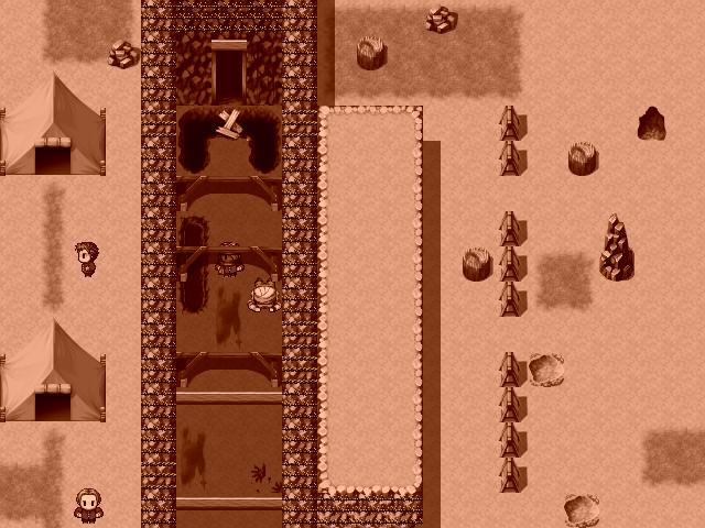
Screenshot 4: This is meant to be a WW1 trench, with barbed wire on the sides of the trench. the walls are made of dirt, which is why I was using the cliffside sprite.
Screenshot 2: The image is meant to be the two main characters under a blanket trying to warm themselves by the fire. If you have any recommendations to make the sprites more blanket like that would help. I can try adjusting the lighting as well
Screenshot 3: The blind mechanic, hiding the map until your character can "feel" what is in the location. The black covers everything until you can find it. I can try to create a gradient on the sides of it, but I do need that mechanic for the concept. The monsters are not meant to be recognizable, just large bloody teathed beasts. I would like the player to not know what they are, only that they are dangerous
Screenshot 4: This is meant to be a WW1 trench, with barbed wire on the sides of the trench. the walls are made of dirt, which is why I was using the cliffside sprite.
LockeZ
I'd really like to get rid of LockeZ. His play style is way too unpredictable. He's always like this too. If he ran a country, he'd just kill and imprison people at random until crime stopped.
5958
I understand how the blindness mechanic works, and it's an interesting idea, I just think the black tiles look really bad. A gradient would probably help. Take a look at how games like Warcraft 2, Starcraft, and Diablo 3 handle the Fog of War.
Depicting a large trench like that is really hard from an overhead view; no matter what you do it's gonna be pretty difficult to create a good way of showing the slope of the hills. However, if that's what this is supposed to be, then it makes no sense for there to be tents and people walking around above the trench! They're gonna get blown to smithereens in ten seconds flat! My best advice is to make the trench curved and slightly diagonal, with multiple changes in height along its walls, so that the player can see two or three tiles worth of cascading cliffs. Sort of like this except narrower:

Depicting a large trench like that is really hard from an overhead view; no matter what you do it's gonna be pretty difficult to create a good way of showing the slope of the hills. However, if that's what this is supposed to be, then it makes no sense for there to be tents and people walking around above the trench! They're gonna get blown to smithereens in ten seconds flat! My best advice is to make the trench curved and slightly diagonal, with multiple changes in height along its walls, so that the player can see two or three tiles worth of cascading cliffs. Sort of like this except narrower:

