NEW DEVELOPER MAPPING HELP THREAD
Posts
author=Liberty
Well, for one the punctuation is mangled. You need to add a space after , and .
Also the word revenge is kinda hard to read. But otherwise, well, it's alright as a character blurb I guess?
Thanks for the advice.
Hi everyone! I'm trying to salvage my game after learning about the extent of what was needed in map design (I got denied twice and was redirected to this forum as well as to tutorials on map design). This is a cave I remade based on information I found in the tutorials in regards to making maps. I want to make sure I'm on the right track before I start fixing my remaining ones.
FYI: Had to use 10 images to fit majority of the map. Might not be conventional, but I'm trying to keep in mind the amount of terrain I need to generate enough random spawns to allow players to reach the levels they need to be when arriving at certain bosses. My other main dungeon maps are also relatively large.


FYI: Had to use 10 images to fit majority of the map. Might not be conventional, but I'm trying to keep in mind the amount of terrain I need to generate enough random spawns to allow players to reach the levels they need to be when arriving at certain bosses. My other main dungeon maps are also relatively large.
eot25: a couple of things to look at
- long straight walls don't look like a natural cave. Some areas of your map suffer from this. Other parts are looking better.
- In the third image, the wall tiles on top of the ceiling tiles look strange and inconsistent.
- try mixing up the floor a bit using the "dark ground" tile (two to the right of the ground autotile you're using), and some of the broken ground tiles near the bottom of the A tile section. Perhaps a tiny amount of the moss / dirt autotile. This will make the large areas more visually interesting.
LockeZ

I'd really like to get rid of LockeZ. His play style is way too unpredictable. He's always like this too. If he ran a country, he'd just kill and imprison people at random until crime stopped.
5958
A few long straight walls are okay. They're certainly better than the zig-zag walls you get when you try to make curves or diagonals with the RTP graphics. My #1 recommendation would be to find different cave graphics that actually have curved corners instead of perfect right angles, and preferably also diagonal and curved walls.
Using just one ground tile everywhere, combined with no changes in height and almost no doodads, also doesn't look great.
Also, this should be obvious, but you need to erase the shadows along the edges of the walls. There's no light source to cast those shadows like that. This is indoors. I assume those are only there because you forgot the engine made them automatically.

Just try to think of a single location you would like to recreate and start there. You probably will need to divide it in several maps to make everything work and to reduce empty space. So, you can continue with that. Divide it in points of interest and think about how you want to link them together to recreate emotions of the original game.
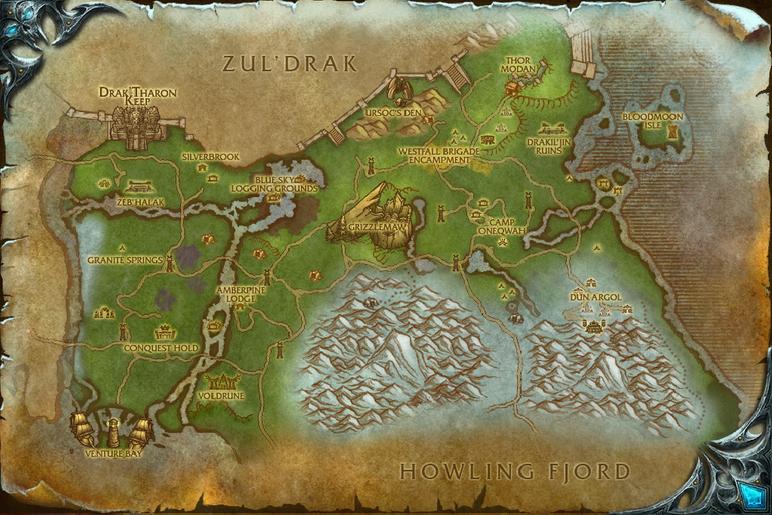
I only played wow for few years, but I remember the starting are being too big to be a single map. You had a village,several areas with monsters, an outpost of the village.
Take this map as an example. It could be a whole rpg maker game. Basically every point of interest is worth its separate map.
I only played wow for few years, but I remember the starting are being too big to be a single map. You had a village,several areas with monsters, an outpost of the village.
Take this map as an example. It could be a whole rpg maker game. Basically every point of interest is worth its separate map.
its true. my maps don't look amazing. My focus was more on game play and to make the player know there were secret to be found without me having to say they were there directly. Like how you see a chest on the other side of the wall but you dont know how to get there. Or how you see a cat running on top of the walls and when you find out u can be there has well, he vanishes!


I tried to make the charecters has expressive has i could with there faces and actions.


I tried to make the charecters has expressive has i could with there faces and actions.
there is always something new in the corner. You do walk around but its to find optional things. If you always go on the main path you quickly find new events and interactions


@Springleaf: Your first and last screen caps have issues with it's walls. The "ceiling" tile only exist at the doorways, making the south cells look taller than they should, and making the north cells just look awkward.
The second screen-cap is definitely better. However, if you forgive the nitpick, there is a piece of wall missing near the ladder!
Third one looks fine to me!
Fourth one has height issues again. Look at the wall right next to the east exit. That's a two-tile high wall. The east exit probably should also have a two-tile high wall, and the exit to the north probably should be similar in that respect. The walls to the south... well, I would make those two-tiles high as well, for the sake of consistency. However, I can see an argument for leaving them as-is.
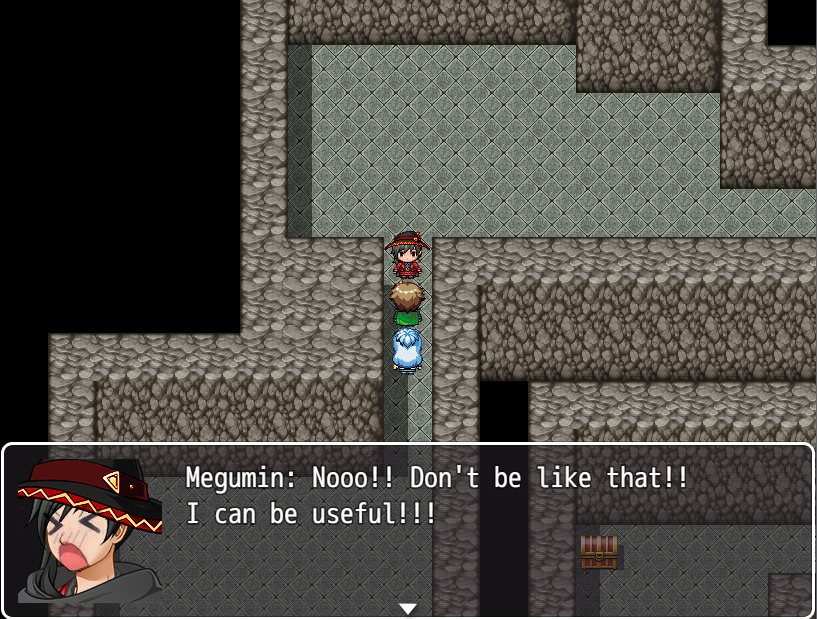
The expressions in those dialog boxes could be considered cute. Though, if you're using the face generator of MV, they would probably be wildly inconsistent with their normal faces. I guess how well they actually work might depend on the kind of game you're looking to make.
*Edit:
The second screen-cap is definitely better. However, if you forgive the nitpick, there is a piece of wall missing near the ladder!
Third one looks fine to me!
Fourth one has height issues again. Look at the wall right next to the east exit. That's a two-tile high wall. The east exit probably should also have a two-tile high wall, and the exit to the north probably should be similar in that respect. The walls to the south... well, I would make those two-tiles high as well, for the sake of consistency. However, I can see an argument for leaving them as-is.
The expressions in those dialog boxes could be considered cute. Though, if you're using the face generator of MV, they would probably be wildly inconsistent with their normal faces. I guess how well they actually work might depend on the kind of game you're looking to make.
*Edit:
 | Say, Megumin. Do you have it? A Wand of Blasting? |
 | Ba-da boom ba-da boom ba-da boom! |
thanks for the feedback : ) i'm not to experienced with maps. They don't look amazing. At least the first ones. i focused more on how it would feel to explore them but its not ez. it doesn't take long to explore them sense they are small. They have optional paths but not to complicated cuz i didn't want the player to feel lost at any point. It got tight in the areas you mention. I guess i can fix that one next to the ladder.
My characters are more on the comedic side. The main ones have more expressive faces and the common ones have the generator ones with some added details
And the combat sprites for the heroes are also with a generator but edited to look unique. There are some that took me a lot of hours just to look right
So I was recommended this thread after having my game denied. While things changed throughout the waiting time (gameplay and storywise a bit), I still inexperienced with mapping.
Although I do have a couple that I would consider decent. Also, the tileset is going to change after I have the good mapping of the game, I'm using the original tilesets as placeholders.
I considered this one decent because It's one the maps I have a very detailed idea of its purpose. it's kinda a tutorial of the game. it would show you how to use the flashlight, the items, the menu etc.
One thing I considered is having a table and desk, just so there be a place for the main character's laptop so it can explain the main character's motivation. but I did plan on making some sort of intro to the game so that might be scrapped.
It's also the one exception to my 'placeholder tilesets' rule. It's just the colours of it I'm keeping.
---------------------------------
This one I also considered decent but with the only reason I have is that it looks a bit better in comparison to the next to maps. It looks bare but that's intentional because it's an abandoned ghost town.
---------------------------------
Now onto the ones that I want to improve on.
This is the first map the player is dropped in after leaving the hotel room. I now realized how claustrophobic it somewhat looks, and it should be a bit bigger since my game would be a survival horror game with entities chasing after you.
---------------------------------
While not the whole map, I do see a couple of problems, firstly is the claustrophobic issue again. secondly is how while I tried to make the map look less generic, I somewhat made it look more lively than it should when the area supposed to be abandoned.
---------------------------------
I may be missing more issues. It's not all of the maps, it's just that the rest are too incomplete to show.
Edit: had to edit my post a bit because it was as messy as my mapping XD
text size is bigger because my eyesight is not the best.
Although I do have a couple that I would consider decent. Also, the tileset is going to change after I have the good mapping of the game, I'm using the original tilesets as placeholders.

I considered this one decent because It's one the maps I have a very detailed idea of its purpose. it's kinda a tutorial of the game. it would show you how to use the flashlight, the items, the menu etc.
One thing I considered is having a table and desk, just so there be a place for the main character's laptop so it can explain the main character's motivation. but I did plan on making some sort of intro to the game so that might be scrapped.
It's also the one exception to my 'placeholder tilesets' rule. It's just the colours of it I'm keeping.
---------------------------------

This one I also considered decent but with the only reason I have is that it looks a bit better in comparison to the next to maps. It looks bare but that's intentional because it's an abandoned ghost town.
---------------------------------
Now onto the ones that I want to improve on.

This is the first map the player is dropped in after leaving the hotel room. I now realized how claustrophobic it somewhat looks, and it should be a bit bigger since my game would be a survival horror game with entities chasing after you.
---------------------------------

While not the whole map, I do see a couple of problems, firstly is the claustrophobic issue again. secondly is how while I tried to make the map look less generic, I somewhat made it look more lively than it should when the area supposed to be abandoned.
---------------------------------
I may be missing more issues. It's not all of the maps, it's just that the rest are too incomplete to show.
Edit: had to edit my post a bit because it was as messy as my mapping XD
text size is bigger because my eyesight is not the best.

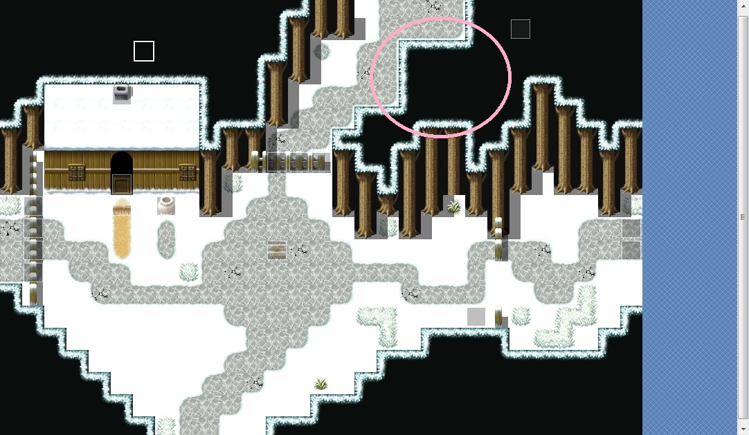
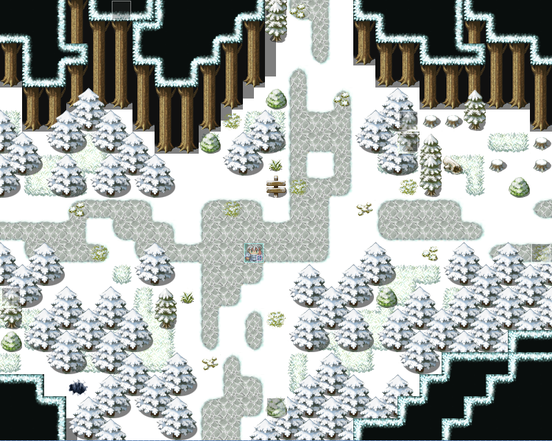
@xSydRowex - Pretty solid maps! Although where the door event is on that inner map, maybe have an outer wall?

And I like how you have different sized tree trunks for those snow maps but might have to adjust the canopies?

Also, extend the shadow on this part, if the trees are meant to extend farther back.

And I like how you have different sized tree trunks for those snow maps but might have to adjust the canopies?
Also, extend the shadow on this part, if the trees are meant to extend farther back.
SydRowex : The maps you show look correct to me. Interiors don't look too big nor empty (aside from the empty bathroom in your first map).
The ideaof the outer wall inside to match the door sprite might be an idea, but it's a style choice. I can only say that if you have two tiles high walls inside, you would have to go for the same for the outside walls and door.
The trees of different size are an idea, but you have to differentiate foliages (you might want to play with shift). A good advice for mapping is to have smaller groups of trees and discontinue your road (we can imagine it's snowing and the place is somewhat isolate).
Also, you miss some upper tiles for your trees near the sign.
An example (for VX Ace, and with a little bigger map) :
And with a tint and snow (well, we don't see the snow and it's not pretty because too much blue, but you see what is intended) :
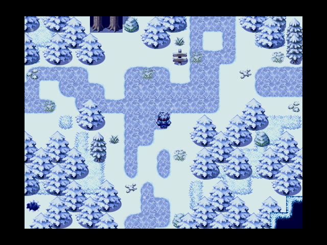
I changed it a bit, but it's just to let guess one of the leaves is probably inhabited (visual hints).
I liked your town alley, but houses lack at least doors (and maybe smoke, unsure if you put the events on the chimney), and you might want to play a bit with the foliage autotiles so that it's less "squary" with the roofs.
You have a good starting base anyway. Hope that helped a little.
The ideaof the outer wall inside to match the door sprite might be an idea, but it's a style choice. I can only say that if you have two tiles high walls inside, you would have to go for the same for the outside walls and door.
The trees of different size are an idea, but you have to differentiate foliages (you might want to play with shift). A good advice for mapping is to have smaller groups of trees and discontinue your road (we can imagine it's snowing and the place is somewhat isolate).
Also, you miss some upper tiles for your trees near the sign.
An example (for VX Ace, and with a little bigger map) :
And with a tint and snow (well, we don't see the snow and it's not pretty because too much blue, but you see what is intended) :
I changed it a bit, but it's just to let guess one of the leaves is probably inhabited (visual hints).
I liked your town alley, but houses lack at least doors (and maybe smoke, unsure if you put the events on the chimney), and you might want to play a bit with the foliage autotiles so that it's less "squary" with the roofs.
You have a good starting base anyway. Hope that helped a little.

Made a project a few years back, and worked on it for a week or two. Now, since I'm stuck working from home until at least August, perhaps I can finish it. I think I'm getting to a point where I can release a beta version, but I need some expert guidance. It's an open world real-time action rpg, so the clutter does serve purpose (albeit my untrained eye cannot tell if it is too much. Thanks in advance.


@ten_blue_egyptians @Gari Thanks for the advice. I didn't get a notification that you guys replied so I didn't know if I got a response, so I decided in the meantime to edit the map a bit.
But after seeing your response, I edit it further (note: the image is outdated but it close to what it is now.)
Also, I tried the shift method, while it works for some tiles, it didn't work for this one
the pictures look bland but as of typing this, I did added a bit more.
So here what it looks like in-game.

But after seeing your response, I edit it further (note: the image is outdated but it close to what it is now.)

Also, I tried the shift method, while it works for some tiles, it didn't work for this one

the pictures look bland but as of typing this, I did added a bit more.
So here what it looks like in-game.

@theloathableone : I'm no no specialist, but it looks good. The cliffs edit is nice !
@xSydRowex : for the shift tool, you can copy an existing tile with shift + mouse right click, and paste with shift + left click. If you didn't use this part of the autotile, you will have to draw it on a free space (example : enlarge your map to have a space for that kind of stuff, and put the properties to original size once you're done). You can find several videos on the matter : https://www.youtube.com/watch?v=yCuo0dXyYOY.
Your corrected map has a big right angle (editor) on the upper right (it's better to try to avoid them as it hightlights the squareness of the RTP). For the night view, I can't see too much but adding variety to your road (using two autotiles for it) was a good idea, and you seem to have gotten the main idea with groups of trees and adding some small elements. Looking to other (good) game maps and pratice should help you to improve even more :)
author=Gari
Your corrected map has a big right angle (editor) on the upper right (it's better to try to avoid them as it highlights the squareness of the RTP).
Sorry, but can you circle where you see it because I can't find the angle.