


SUMMER SCREENSHOT SPECTACULAR!
Posts


author=Fallen-Griever link=topic=3962.msg80196#msg80196 date=1244889764
Maps should teleport you somewhere whenever a map hasn't got a defined edge!
Maps with edges that go nowhere/aren't blocked off are annoying...
Oh well.

@Lennon: it looks very interesting. I like the "clean" feeling it has but on the other hand it bugs me a little that the map is so empty and closed.
@Blindmind: Love it! Great use of the chipsets, the scenes look like they really have some forest/outdoor atmosphere.
I wonder, which setup should I use for the skills in my ABS?

On this (above) setup you cast spells with the "Z" key and you change your selected spell with the "C" key. This is what I currently have in my game and it's very minimal which is good in my opinion.

On this one, all possible spells are in front of your eyes so you have a better idea which one is on cooldown, how long 'till it's ready and so on. I'm still not sure how I will make the controls with this setup - maybe use the number keys? Or maybe just like the first setup with "C" to browse between skills and "Z" to cast one.
What do you think?
@Blindmind: Love it! Great use of the chipsets, the scenes look like they really have some forest/outdoor atmosphere.
I wonder, which setup should I use for the skills in my ABS?
On this (above) setup you cast spells with the "Z" key and you change your selected spell with the "C" key. This is what I currently have in my game and it's very minimal which is good in my opinion.
On this one, all possible spells are in front of your eyes so you have a better idea which one is on cooldown, how long 'till it's ready and so on. I'm still not sure how I will make the controls with this setup - maybe use the number keys? Or maybe just like the first setup with "C" to browse between skills and "Z" to cast one.
What do you think?
I can't read the numbers/text on either screen. It hurts my eyes trying to discern the tiny little numbers over the trees now... while actually fighting? Yeah, no thanks.
Also, the skill pictures are too small. They're not right in front of the player; they're so far away from the action that looking at them could hurt you.
Also, the skill pictures are too small. They're not right in front of the player; they're so far away from the action that looking at them could hurt you.

Agree with the numbers thing, notice how in SD3, the numbers are HUGGEEE. Assuming your game is fought in tight passages most of the time, you have a lot of space for the UI.
inb4 someone thinks this is an RM game somehow
I would also suggest making the skill icons bigger and more.. iconish. They are way too detailed. The best way IMO is to give them a simple 2 color, where the foreground and background are easily noticed. Then again that is just me, they could be easier to define if they are simply bigger.

256x224: king of resolutions
on this note since you have a lot more room for your UI than they had also!
on this note since you have a lot more room for your UI than they had also!
A game in production.
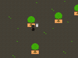
The first screenie is a dynamic active battle system. Second is just a playground I'm currently working on. The last one is the test map. All custom graphics by me except the RTP in the test map.
The first screenie is a dynamic active battle system. Second is just a playground I'm currently working on. The last one is the test map. All custom graphics by me except the RTP in the test map.


@drgn_lord50: Looks really nice. The green color is kinda strong, and I think it looks a little weird in the second screen with the playground, but it still works. By the way, what do you mean by "dynamic active battle system"? How does it work?
@SDHawk - I love to see your progress and I'm happy to hear about the demo. :D
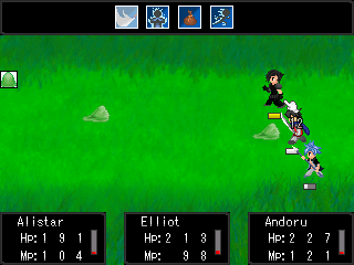
Also, after the comments about the small numbers and all that, new UI:

I caught the stab skill at just the right frame. 8)
As you can see, I went with the numbers setup for the skills.
I also changed the energy system mechanics. I have noticed that in the previous state I was just walking around, waiting for my skill cooldowns to clear, using them over and over again and nothing more. The melee fighting part of the system had no real use. So I changed it a little - you start the fight with 0 energy, and as you hit your enemy with melee attacks, you get energy based on the damage you deal. I should probably rename it from "energy" to something else too.
I'm still not sure whether I should use this system for the energy, or maybe go for the good old traditional MP system...
@SDHawk - I love to see your progress and I'm happy to hear about the demo. :D
Also, after the comments about the small numbers and all that, new UI:
I caught the stab skill at just the right frame. 8)
As you can see, I went with the numbers setup for the skills.
I also changed the energy system mechanics. I have noticed that in the previous state I was just walking around, waiting for my skill cooldowns to clear, using them over and over again and nothing more. The melee fighting part of the system had no real use. So I changed it a little - you start the fight with 0 energy, and as you hit your enemy with melee attacks, you get energy based on the damage you deal. I should probably rename it from "energy" to something else too.
I'm still not sure whether I should use this system for the energy, or maybe go for the good old traditional MP system...
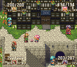
@drgn_lord: It looks pretty nice, but it would look better if the HP/ MP numbers were a little bit closer together. Andoru looks a little bit familiar; is your game related to Starless Umbra, by any chance?
@SDHawk: Are those graphics custom? I like the cave walls a lot, but the other graphics look a little ugly. Still, it has a unique style and it really stands out.
@East: The HP looks much better now. The skill pictures could stand to be a bit bigger, though.
@SDHawk: Are those graphics custom? I like the cave walls a lot, but the other graphics look a little ugly. Still, it has a unique style and it really stands out.
@East: The HP looks much better now. The skill pictures could stand to be a bit bigger, though.

author=East link=topic=3962.msg81284#msg81284 date=1245316217
@drgn_lord50: Looks really nice. The green color is kinda strong, and I think it looks a little weird in the second screen with the playground, but it still works. By the way, what do you mean by "dynamic active battle system"? How does it work?
@SDHawk - I love to see your progress and I'm happy to hear about the demo. :D
Also, after the comments about the small numbers and all that, new UI:
I caught the stab skill at just the right frame. 8)
As you can see, I went with the numbers setup for the skills.
I also changed the energy system mechanics. I have noticed that in the previous state I was just walking around, waiting for my skill cooldowns to clear, using them over and over again and nothing more. The melee fighting part of the system had no real use. So I changed it a little - you start the fight with 0 energy, and as you hit your enemy with melee attacks, you get energy based on the damage you deal. I should probably rename it from "energy" to something else too.
I'm still not sure whether I should use this system for the energy, or maybe go for the good old traditional MP system...
Looks good to me. I really like how it looks now, much better than before. The Energy system seems great to me, can't see a problem there.
@East:
I think that energy system works well with ABS too. Sorta reminds me of that DBZ fighting game where you can charge up via meleeing, heheh. Perhaps you'd be able to get some from being hit too, but that'd pretty much make it a limit break system.
I think that energy system works well with ABS too. Sorta reminds me of that DBZ fighting game where you can charge up via meleeing, heheh. Perhaps you'd be able to get some from being hit too, but that'd pretty much make it a limit break system.

@SDHawk - Andoru.. Starless Umbra cameo?
@East - Damn that just looks sexy man seriously, just keep doing what your doing and I know it's going to be something great. Seriously looking forward to it more and more.
@East - Damn that just looks sexy man seriously, just keep doing what your doing and I know it's going to be something great. Seriously looking forward to it more and more.

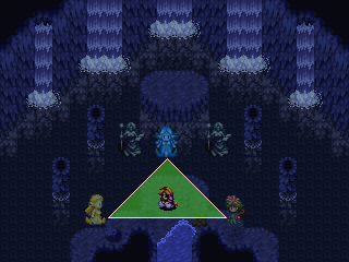

author=Dis link=topic=3962.msg81390#msg81390 date=1245365854
Have mercy... it's a WIP.
East - That looks great, keep at it.
I'm so glad you're still working on this.
@Dis:
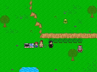
Looking nice. c: But shouldn't the waterfalls end one tile lower, as right now it's splashing in mid-air? (I may be misinterpreting what the tiles are representing though).
Looking nice. c: But shouldn't the waterfalls end one tile lower, as right now it's splashing in mid-air? (I may be misinterpreting what the tiles are representing though).
author=Reives link=topic=3962.msg81945#msg81945 date=1245562068You may be right... that will probably look better.
@Dis:
Looking nice. c: But shouldn't the waterfalls end one tile lower, as right now it's splashing in mid-air? (I may be misinterpreting what the tiles are representing though).


Figure'd I'd throw this up for critique before hittin' the sack.

