SHOW ME YOUR SCREENSHOTS - FALL EDITION
Posts

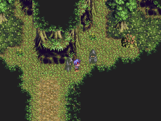
post=103702Oh liberty that's just VX's grass tile xD
Oh, nice. The colour scheme is very fresh. Though the green background is a bit... um. Maybe it's the texture or perhaps the colour, I'm not sure. ^.^
post=103704
@Nessiah: Interesting! Makes me think of Persona 4. Good work with it, though. I like the design, look, and colors! really shows that you can make something "complex" (don't know if that's the right word, but whatever) looking with just a few simple things.
Thanks! Persona 3 was the main inspiration, but I can't wait to see persona 4 (hurryupshippingfff)
EDIT: Oh dang first page <_<
post=103698
:3
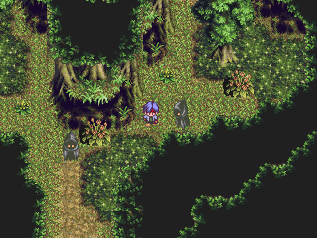
I borrowed Ocean's Overworld for the meantime.


:U
The overworld looks better there in your game than it does in miiiiinnnneeeeee. I really need to redo it sometime.
The overworld looks better there in your game than it does in miiiiinnnneeeeee. I really need to redo it sometime.


I feel like I should center the text in the main area of the page to match the map.
And now I disappear again from this topic.


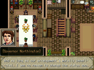
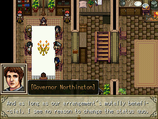
Yeah, I was planning on darkening the message box, but I wanted feedback on the layout before I did that.
put the picture on the opposite side to the name text. we should know what he looks like anyway, though?
No particular reason to see what he looks like, I just like it that way. But thanks for the suggestion, I'll see what it looks like.

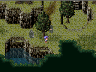
Looks good JMAN. One suggestion I have is to add layers of leaves to the solid black treetops. Basically add more edging in the dark areas to remove the perception that all the trees in the forest are of uniform height.