


NEED MORE ART TOPICS <____<;
Posts


I noticed there's not enough replies here, what happened? D:
Here:
Very nice. It's Yggdra Union isn't it? You've certainly improved by miles. I personally haven't done the whole pencil to paper thing in a long time (at least drawing-wise)
And I depart *teleports away*
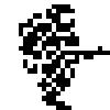
Here:
Very nice. It's Yggdra Union isn't it? You've certainly improved by miles. I personally haven't done the whole pencil to paper thing in a long time (at least drawing-wise)
And I depart *teleports away*
I'd love to give some criticism but its good already.

I can give some criticism! XD
I absolutely love this drawing, but there's just one itsy-bitsy thing. I had to look at it for 1 minute to figure out what was where and what the main focus of the pic was. I'm assuming the stars of this are the fighter and the dragon, so you might want to darken their lines. Whatever's on the front row should have darker, thicker lines and whatever's in the background - lighter and thinner. Here you might just have confused lighter and thinner with sloppy. :D
I absolutely love this drawing, but there's just one itsy-bitsy thing. I had to look at it for 1 minute to figure out what was where and what the main focus of the pic was. I'm assuming the stars of this are the fighter and the dragon, so you might want to darken their lines. Whatever's on the front row should have darker, thicker lines and whatever's in the background - lighter and thinner. Here you might just have confused lighter and thinner with sloppy. :D
Actually in the sketchbook, Gulcasa's (The Dragon Knight) outline is soo much thicker and he stands out, the forest barely stands out, well you can say that the scanner and contrast adjustment messed it up =_=;


That's... actually kinda rude.
I know I'd be angry if someone took my game and sent an "improved" version to me.
I know I'd be angry if someone took my game and sent an "improved" version to me.
No rudeness/offense intended. Just using my photoshop skills to hopefully make it look closer to real life, since people were bothered about it.

post=101140
That's... actually kinda rude.
I know I'd be angry if someone took my game and sent an "improved" version to me.
dude all he did was make it more clearer.
post=101143
CP I'm rewriting the scripts to all your games brb
You have a what in your mouth?
Serious: You shouldn't expose yourself to databases like SnE's. At least, if you value your sanity you shouldn't.
Haha sweet, I actually appreciate edits :P (love them actually) Thanks Tardis :)
I was inking this a day ago for CGing purposes but Persona 3 FES owns my soul right now XD
I was inking this a day ago for CGing purposes but Persona 3 FES owns my soul right now XD


Haha thanks, one told me he didn't like the face and the hair and that the old one was better, so here's an alternate that sticks to the original more, I'll just leave it to people which one they prefer in the game 'w'b


drill hair is definitely superior. i'd definitely be interested in those screws if you know what i mean
The hair design of anime characters kinda dictates how outlandish the concept in its entirety really is. That is to say, the crazier the hair is, the less people are expected to take things seriously.
I wouldn't have a problem with either one, but the conservative story lover in me leans towards the alternative. Maybe I'd pick drill hair if this were a fighting game =)
I wouldn't have a problem with either one, but the conservative story lover in me leans towards the alternative. Maybe I'd pick drill hair if this were a fighting game =)
Well the character's name is Marian and she's a Pyromaniac, Stubborn, Hot Headed, Smart Ass Witch. Her story is pretty much, "I want to raid a village for my personal magic purposes" and that it's focused around cutesy stuff and burning... things. It's very light hearted and shouldn't be taken seriously story wise haha.
It's a good thing though that there's an alternate in case you want someone to look normal :)
It's a good thing though that there's an alternate in case you want someone to look normal :)

