HARMONIC ART THREAD
Posts
Pages:
1
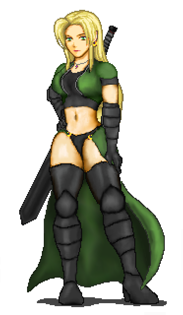
I don't do a ton of major pixel art besides small rm2k3 functional graphics, but here's a supersprite of one of the major LoD2 characters I did just for fun:
And this is her in-game battle graphic:

Will post more later.

And this is her in-game battle graphic:

Will post more later.
I'm sure you're asking for advice and feedback so:
There's a lot of pillow shading going on, which artists generally discourage, but you definitely get the idea and show a lot of potential. Her head and face are particularly good. While it's clear that you understand shapes and how shapes are conveyed by how light falls on them, you are using way too many "transitional" shades of color in-between. This is called "pillow shading" because it makes everything look like a pillow.
Because I'm also a complete novice to art, I'll recommend a method that I've found helps a lot to get started out: In general, try to only use three or four shades of color at the most (especially with anime or cartoon styles). In the real world, objects generally have places that light reaches and places where light doesn't reach (shadows). If the object is very close to the light source, there will often be a third, brighter shade where a lot of light reaches. Cartoon art such as what you are making is usually much more effective if you use only a few shades of each color. Shading gets much more sophisticated once someone is a good artist (which I am certainly not), but when starting out it's best to try and use a smaller number of more effective shades.
Also it's pretty awesome that she looks exactly like your girlfriend.
I like the functional in-game sprite. It's really good! If you used it in-game, I'd recommend that you add more motion that a cape blowing in the wind; it's more interesting if the character is bouncing up and down or whatever. It's a lot more work, but the main characters are the most-used graphics in the game and should always get a little extra attention.
Anyway I came across as pretty negative, but really I'm impressed. Your pixel art is definitely good (especially functional game art). I just wanted to give you the advice that I am currently trying to follow since we seem to have the same shortcomings when it comes to art.
I take it you aren't planning on upgrading to XP or VX or something because your sprite is low-res?
LoD2 won't upgrade to VX. There's already a few hours of gameplay and 100% of the database and systems done in 2k3. Although VX's capability makes me a jealous panda, but I'll probably just make another one in VX down the road.
And yeah the pillow shading is a result of using the "smudge" tool in paint shop pro. For certain things, like the underside of the butt cape, the pillow shading style works. TBH I probably could have spent a lot more time on it, but since I'm not using it for anything, and I haven't taken an art class in my life, I figured meh, this is fine.
Thanks re the in-game battle graphic. The other characters bounce/move in their idle stance but this character's personality lends to being subtle, reserved, quietly majestic, so she merely stands in the ubiquitous wind while her hair and butt-cape flow.
That looks quite good Harmonic. I don't have any criticism or anything as i couldn't come close to designing something like this.
I don't think the pillow shading takes away anything from this picture. I think it looks good how it is. Of course, having said that, I can't do this kind of stuff, so my opinion is really equivelant to a pat on the back.
Thanks!
Karsuman actually mentioned the pillow shading in his own words. TBH all I did was use 3 different shades of a certain color then smudge it. Shrug can't expect much more from a mid-grade artist :)
A lot of the credit goes to Karsu anyway since before he offered constructive advice regarding anatomy, it didn't look nearly as good. Although I still opted for extremely ample hips/breasts because that's just my style. ;D
The quality's quite awesome, as something I'd expect from an old school commercial game. The only thing that seems a bit off I guess would be that the thighs seem to have a frontal perspective, while the body is tilted slightly sideways. Which is actually just a common pose, but for some reason it looks slightly awkward. No biggie none the less, great stuff. :)
author=Reives link=topic=632.msg8439#msg8439 date=1201930609
The quality's quite awesome, as something I'd expect from an old school commercial game. The only thing that seems a bit off I guess would be that the thighs seem to have a frontal perspective, while the body is tilted slightly sideways. Which is actually just a common pose, but for some reason it looks slightly awkward. No biggie none the less, great stuff. :)
Thanks. I tried to make her crotch face the same way as her belly button, as her torso is twisted to her right, and her hips are slightly jutted out to her right, which makes her left leg stick out a bit.
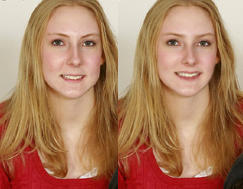
Some photo-manipulation of my fiancee: (after on the left, before on the right...)
Her cleavage is real though. No need to mess with that.

More of the same for a friend: (before on left, after on right this time)
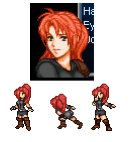
Lydia's sprite from LoD2:
Her cleavage is real though. No need to mess with that.

More of the same for a friend: (before on left, after on right this time)

Lydia's sprite from LoD2:

Pages:
1


