


THE SCREENSHOT TOPIC RETURNS
Posts

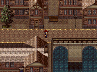
@dethemetal: http://rpgmaker.net/media/content/users/658/locker/colhaven.PNG
The mapping looks good, a bit systematic maybe, but I can understand that. There's only so much you can do with a chipset... One thing does bother me though, is that yellow 'line' neatly delimiting the streets. It would be better if it didn't stood out so much. Try making it less bright somehow, or try sectioning it a little, that may do the trick as well.
@stardust: http://www.imagesload.net/img/temple.png
That's a very nice map, it's all made with the rtp? Anyway, if there's a full moon on the sky, I think there should be more light on that roof. Things can get very bright on a full moon night, and shadows tend to be darker as well. I guess there are supposed to be some clouds on your screen, but even so... Also, a couple of moonlight rays would look neat too.
@Dyhalto: http://rpgmaker.net/media/content/games/3665/screenshots/ItsCleah.PNG
I agree, with LockeZ. I think you should take all your graphics from the same source and use the same resolution for them, to avoid those jarring visual inconsistencies... I'm particularly worried about those blur-filtered sprites. I believe you did that in a hurry for some event? But you no longer have a deadline, take your time and fix those graphics.
@Ocean: http://i.imgur.com/PMyEE.png
Is that a finished map, or it's only a test map? I mean, I like the tiles and especially those little charas. But the map is rather big and empty. The size of the door and those very tall walls also give the impression that the room is bigger than it perhaps should be...
@Link_2112: http://rpgmaker.net/media/content/users/9179/locker/FFc.png
I really like the color version the most. But if you going to go that route, I suggest you to use less saturated colors. And to standardize? the number of colors you use in every thing. Some tiles have three to four colors, while others, like the grass have only two...
@Avee: http://rpgmaker.net/media/content/users/15964/locker/Avee_screen_07.PNG
The HUD is simple but it's looking pretty neat. Are you planning on putting something at the right end, though? If not, maybe you could arrange for the portrait to show in that spot, so it doesn't look as stacked on top of everything else... Another thing. That pattern on top of the HP circle is somewhat distracting. Try making it a bit subtler somehow.
author=alterego
@Link_2112: http://rpgmaker.net/media/content/users/9179/locker/FFc.png
I really like the color version the most. But if you going to go that route, I suggest you to use less saturated colors. And to standardize? the number of colors you use in every thing. Some tiles have three to four colors, while others, like the grass have only two...
Hmm, I dunno, I like the vibrant colors. Mainly in the grass and water, right? It's an outdoorsy, tropical looking area. Wouldn't it be fitting in this case? If it were a cave I wouldn't say that, but I will keep saturation in mind. I'm going to see if I can "appease" you on this concern, just as an exercise.
Here's the result: http://rpgmaker.net/media/content/users/9179/locker/FFc4.png
Better compare it to this: http://rpgmaker.net/media/content/users/9179/locker/FFc2.png
I actually do like that...It's a subtle change but it has a big effect on the water. I could keep the brighter colors for tropical areas and use this toned down one for the normal regions. Does that address saturation, or is there something more I should do?
As for a standard on colors... you may know, but I didn't draw any of these graphics. I could always edit them, but now they are all straight recolors of the gameboy graphics so I didn't consider amounts of colors. However, I don't see how having only 2 colors in the grass in a bad thing. Care to explain why? Is it something about depth? I looks fine to me, considering the style. I know next to nothing about art/colors, so I'm eager to learn.
I also made some changes earlier to make the oulines on tiles more uniform
http://rpgmaker.net/media/content/users/9179/locker/FFc2.png
It does a decent job at making the sprites stand out and generally helps the terrain blend together. I find. Meh, it could just be cause I have half/half in one image. What do you think of the outlines? Black or colors?
(thanks for your feedback, btw!)

@alterego:
It is a test map. It's actually been size reduced since I noticed that as well. I did make it slightly empty still because I need the player to be able to run around, no use having very cramped spaces with encounters chasing you. I will see if I can tighten up the spaces a little but I don't want to squeeze it too much.
It is a test map. It's actually been size reduced since I noticed that as well. I did make it slightly empty still because I need the player to be able to run around, no use having very cramped spaces with encounters chasing you. I will see if I can tighten up the spaces a little but I don't want to squeeze it too much.
LockeZ

I'd really like to get rid of LockeZ. His play style is way too unpredictable. He's always like this too. If he ran a country, he'd just kill and imprison people at random until crime stopped.
5958
@Link_2112: Your desaturated version isn't actually desaturated, just darkened (I think). I took it and desaturated it for real in photoshop and the result is way less tropical looking. Of the two versions you had, the lighter one also does look more tropical. The brightness and saturation seem to mimic the effect of a bright tropical sun.
http://rpgmaker.net/media/content/users/6579/locker/FFcdesat.png
I do like the version with colored outlines on everything more than the version with half the objects having colored outlines and the other half having black outlines.
I'm kind of curious what those pine cones floating in mid air are supposed to be.
author=LockeZ
@Link_2112: Your desaturated version isn't actually desaturated, just darkened (I think). I took it and desaturated it for real in photoshop and the result is way less tropical looking. Of the two versions you had, the lighter one also does look more tropical. The brightness and saturation seem to mimic the effect of a bright tropical sun.
http://rpgmaker.net/media/content/users/6579/locker/FFcdesat.png
Looking at your version...I don't see the difference between desaturating and making it darker(that is pretty much all I did). Yours just looks darker, too dark in fact. Me no likey. In my version I only changed the water and grass though, and by a miniscule amount at that.
Maybe I don't "get it". If a blue has less blue in it, does that make it desaturated? Wouldn't desaturation involve reducing the colors? Which is the same as making it darker, no? My map probably looks more tropical because of the objects in the water. Let me kill those, I threw random stuff on the map as a test.
http://rpgmaker.net/media/content/users/9179/locker/FFc5.png
Let's just stop talking tropics xD
In my view, it's not every color that is "too bright". I think that toning down the grass will balance it out better. Maybe you put too much saturation, but those colors look drab. I'll mess with it further some other time I'm not tired, but if not being saturated means dark colors I'll live with full on saturation. I want the game to be bright and crisp.
I do like the version with colored outlines on everything more than the version with half the objects having colored outlines and the other half having black outlines.
Well, the alternative to colored outlines isn't half/half. I would put a black outline to everything. It's just that by default, the gameboy graphics were half/half. So when I recolored that's how it turned out.
I'm kind of curious what those pine cones floating in mid air are supposed to be.
haha They are rock formations. You don't recognize those tiles? They are classic..I expected more from you.
http://rpgmaker.net/media/content/users/6507/locker/FFcdesat.png
I was thinking something more like this. Except, you know, less hastily done... And when I said 'less saturated' I didn't mean by messing with the actual saturation handler in Photoshop, because that will technically desaturate all the colors uniformly, resulting in an ugly mess of greys if you take it too far. -I meant it in a more 'colloquial' way of just picking a color somewhere to the left of the ones you currently have; according to what you think will work best for the kind of thing you're going for.
Also, I didn't mean to say that having only two color for the grass was a bad thing; I like it too. Just that everything else should have only two colors as well, you know, for consistency's sake.
author=Link_2112I'm kind of curious what those pine cones floating in mid air are supposed to be.haha They are rock formations. You don't recognize those tiles? They are classic..I expected more from you.
Classic or not they look way floaty. It's probably because the tip of them is level to the tip of the palm trees, which are (supposedly) tall, the dark line underneath them doesn't really help either (it's probably just a tile error but it can be mistaken for a shadow)
But I like both versions. Although if the red guy is the Main Character I'll feel like I'm playing as SegNin D:
It's floaty because they are floating. It's from Final Fantasy adventure. They were in the area called Floatrocks. It should be fixed if he doesn't intend for them to be floating, but if he does then... they're fine.
Edit- Also, anyone who hasn't played Final Fantasy adventure should do so.
Edit- Also, anyone who hasn't played Final Fantasy adventure should do so.
author=Ocean
It's floaty because they are floating. It's from Final Fantasy adventure. They were in the area called Floatrocks. It should be fixed if he doesn't intend for them to be floating, but if he does then... they're fine.
Edit- Also, anyone who hasn't played Final Fantasy adventure should do so.
LockeZ
I'd really like to get rid of LockeZ. His play style is way too unpredictable. He's always like this too. If he ran a country, he'd just kill and imprison people at random until crime stopped.
5958
@Link_2112:
Darkness is how much black is in the colors. An image with 100% darkness will be solid black, and an image with 0% darkness will be solid white.
Saturation is how vibrant the colors are. An image with 100% saturation will contain only three colors - 0000FF, 00FF00, and FF0000. An image with 0% saturation will be in grayscale.
author=alterego
http://rpgmaker.net/media/content/users/6507/locker/FFcdesat.pngI was thinking something more like this. Except, you know, less hastily done... And when I said 'less saturated' I didn't mean by messing with the actual saturation handler in Photoshop, because that will technically desaturate all the colors uniformly, resulting in an ugly mess of greys if you take it too far. -I meant it in a more 'colloquial' way of just picking a color somewhere to the left of the ones you currently have; according to what you think will work best for the kind of thing you're going for.
Also, I didn't mean to say that having only two color for the grass was a bad thing; I like it too. Just that everything else should have only two colors as well, you know, for consistency's sake.
I'll play with it. I like some of the colors in yours.
Yes they are supposed to be floating rocks.

Ok i went ahead of myself and Started to merge my Miracles of Ether in something i call
F.O.E.V. (Forces of Extreme Valor) i only did the title screen so far and working on the battle system... which in mind, an Active Time Battle like FF13.. or something similar
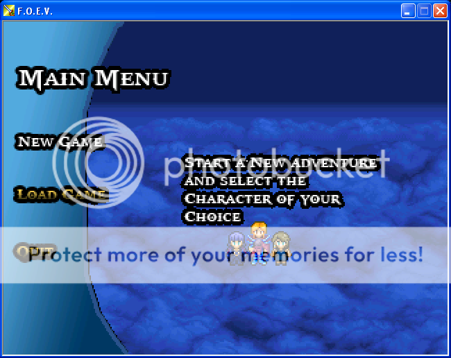
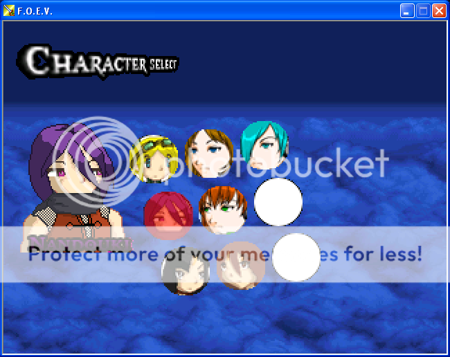
at least it's an original name :) but i'm trying to figure out how to show the HP bar and the .. "numbers" on the screen, kinda struggling here..
oh the current mugshots are just temporary, i'm planning on drawing them all out later, its not so important as the battle system currently
F.O.E.V. (Forces of Extreme Valor) i only did the title screen so far and working on the battle system... which in mind, an Active Time Battle like FF13.. or something similar
at least it's an original name :) but i'm trying to figure out how to show the HP bar and the .. "numbers" on the screen, kinda struggling here..
oh the current mugshots are just temporary, i'm planning on drawing them all out later, its not so important as the battle system currently


oh wow looks good, and oh my...custom HP and MP system, did you do it in Rm2k3?
wait if we do a custom HP/MP gauge do we have to do a picture for EACH number? that would be so...irritating :/ cause i'm trying to do something similar myself ..
wait if we do a custom HP/MP gauge do we have to do a picture for EACH number? that would be so...irritating :/ cause i'm trying to do something similar myself ..

Just have numbers 0-9 (that's ten pictures) that go in whatever spot. (So, the 68 would be Picture 1 = 6, Picture 2 = 8, etc, and change them via conditional branch.
IF Variable (Health by tens)= 60
Show Picture 1 (6)
END
IF Variable (Health by tens)= 70
Show Picture 1 (70
END
Of course you;d have to do the same for the hundreds, tens and singular number spots, but once it's all set out all you'd have to do is change the variables.}
IF Variable (Health by tens)= 60
Show Picture 1 (6)
END
IF Variable (Health by tens)= 70
Show Picture 1 (70
END
Of course you;d have to do the same for the hundreds, tens and singular number spots, but once it's all set out all you'd have to do is change the variables.}
thank you so much for that, i actually mean't the actual lifebar though, sorry i worded it wrong, was really confused.., kinda getting hammered with that, woops hear me saying lifebar from fighting games.. i mean Health Bar
@Aqua:
And so this isn't all tutorial, something from me.

This is where you can find your team mates and change your party. You can have up to six people in your party, but in battle you can only have three fighters. You can change the team every turn.

The first dungeon - the maze-like Heart Woods.

World map. Places of interest that can be accessed have their names above them. You can't unlock certain places until later in the game. Others can be unlocked by visiting them.
You can have it go down by percentage - say checking to see whether you have x amount of life, divide by Max HP, times by 100, then average it out. That way you only need ten Bar pictures per bar. So... 68/114 would be 59.64, rounded up is 60%. Then just show the 60% bar.
Or you could do the full thing. (If so, an easy way is to have something block one side of the bar - say it's against the edge of the screen, or there's the hud blocking at least as long as the bar is. Then instead of having 100+ pictures, just slide the bar back and forward pixel by pixel. One picture.)
I would recommend having at least some kind of numerical value somewhere, though, since our minds are trained from a young age to process numbers better than guesstimates.
Or pips. Pips would work too. (Pips being like stages of health. One hit takes one point and you have five damage points total. Think hearts in Zelda games.)
And so this isn't all tutorial, something from me.
This is where you can find your team mates and change your party. You can have up to six people in your party, but in battle you can only have three fighters. You can change the team every turn.
The first dungeon - the maze-like Heart Woods.
World map. Places of interest that can be accessed have their names above them. You can't unlock certain places until later in the game. Others can be unlocked by visiting them.
yeah thanks Liberty, i was gonna have both (trying to mimic FF13 a bit with this, so i think i'll have the percent err...in the lifebar or on top of it, might fail at this)
i'll try it now
Seriously this helps me completely!!! :)
EDIT: ok so i'm using the first suggestion for the bar,should i only calculate that part only once and for when i do damage calculations? cause it just empties out after i run the game
also for the number part, i'm all new to this(Custom Battle Systems, but i got the menu stuff down), so its confusing..
What do you mean it "empties out"? Can I see your event coding, per chance?
This is a battle system and menu system I made about a year ago. The enemies are animated.

And best of all, it's really simple to use. If I ever released it, with some simple instructions, it could even be used by those RM twits who don't know left from right. Maybe.
This is a battle system and menu system I made about a year ago. The enemies are animated.
And best of all, it's really simple to use. If I ever released it, with some simple instructions, it could even be used by those RM twits who don't know left from right. Maybe.
author=AquaXranoX
yeah thanks Liberty, i was gonna have both (trying to mimic FF13 a bit with this, so i think i'll have the percent err...in the lifebar or on top of it, might fail at this)
i'll try it now
Seriously this helps me completely!!! :)
EDIT: ok so i'm using the first suggestion for the bar,should i only calculate that part only once and for when i do damage calculations? cause it just empties out after i run the game
also for the number part, i'm all new to this(Custom Battle Systems, but i got the menu stuff down), so its confusing..
Make a help topic about it in the Help Forum instead of putting it in the Screenshot thread, okay? You'll get a lot more help there.
@The Rexion: Not bad, though you can really tell the numbers are events.

