


THE SCREENSHOT TOPIC RETURNS
Posts

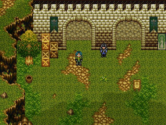
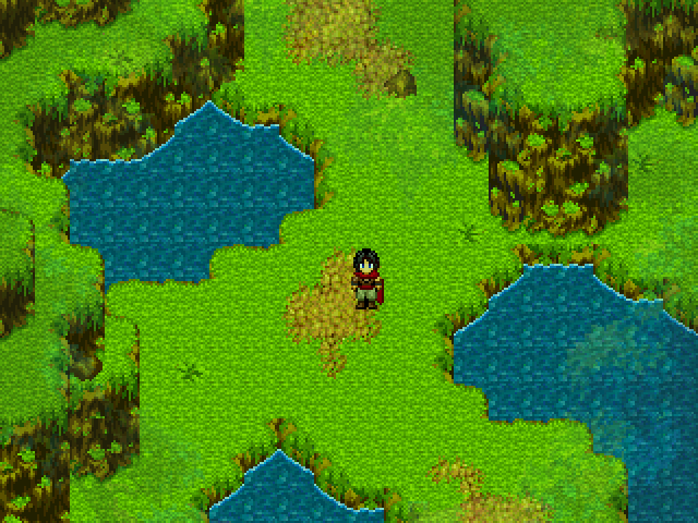

I really like them, Tau. The second screen has a strange yellowish tint though; I'm not sure I like it.


@Nessy Porcupine Pricess=Awesome. Also, I think the crystal on the wall looks kind of odd, but it's probably just me.

author=Sauce
I believe that Tau's second screenshot is supposed to be a marsh. Swampy kind of place.
you don't need saturation for that though... that just kills the color. just a simple greenish tint is better i guess. usually you'd want to change the actual chipset if you want to get the environment sense across.
author=Darkenauthor=Sauceyou don't need saturation for that though... that just kills the color. just a simple greenish tint is better i guess. usually you'd want to change the actual chipset if you want to get the environment sense across.
I believe that Tau's second screenshot is supposed to be a marsh. Swampy kind of place.
What Darken said. It destroys the color balance of the screen and destroys graphical consistency 8'D;;;
Needs more screenshots...

LockeZ

I'd really like to get rid of LockeZ. His play style is way too unpredictable. He's always like this too. If he ran a country, he'd just kill and imprison people at random until crime stopped.
5958
Hey, that looks about as clean as my apartment. My wall scrolls aren't torn (just crumpled) but otherwise it makes a pretty convincing bachelor pad.
Oh, I don't have slimes or dragons in my place though. (Though I've had a few spiders that size, one of which I actually killed with a morningstar because it survived being smashed by a textbook three times without even seeming stunned)
Oh, I don't have slimes or dragons in my place though. (Though I've had a few spiders that size, one of which I actually killed with a morningstar because it survived being smashed by a textbook three times without even seeming stunned)
author=LockeZ
(Though I've had a few spiders that size, one of which I actually killed with a morningstar because it survived being smashed by a textbook three times without even seeming stunned)
You should make a game about this. "Smashin' Spideys" or (possibly controversial) "Widow Wrecker" could be the title.


From my project Numina, where the first scenes of the game take place. And although it looks quiet and peaceful, some really bad things are going to happen here

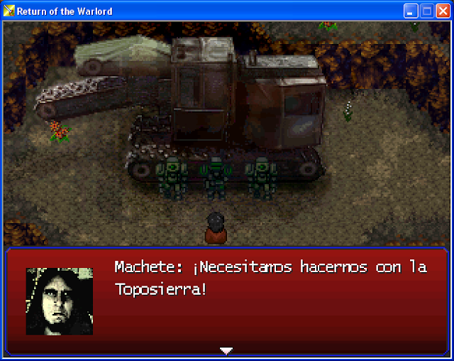


I've been doing other stuff, but anyway i getting back on my project.
I changed the Tales of name since its already some commercial game.
I'm calling it Exochallengers- Miracles of Ether instead, and Made my own theme song now and system sounds with FL studios marimba and xylophone i think lol, not too many things done on the game itself though...
also i recovered from errors keeping Rpgmaker 2003 from opening up...yeah
A comparison, because I'm too damn self-conscious for my own good.
Which is better (tree shadow-wise), and any suggestions for graphical improvement are welcome :x


Which is better (tree shadow-wise), and any suggestions for graphical improvement are welcome :x
LockeZ
I'd really like to get rid of LockeZ. His play style is way too unpredictable. He's always like this too. If he ran a country, he'd just kill and imprison people at random until crime stopped.
5958
The mismatched resolution on the face would destroy the screenshot if the mismatched-and-then-blurred-to-hide-it resolution on the sprites didn't already do so even more effectively. Also a horse is standing on a tree. Also the top edges of your diagonal cliffs don't line up with the vertical ones. Also the entire tileset is crazy saturated.
The shadows look way better on the lower screen though.
If you're going to take both sprites and facesets from the SNES Fire Emblem game, have you considered just taking all your graphics from it? It would match way better that way. It's definitely possible to just make the entire game use 16-bit graphics in RPG Maker XP or VX. I bet you could find the tilesets easily enough. (I think the SNES and GBA Fire Emblem games all share most of their graphics, actually.)

Hell, here's the Fire Emblem font, if you want it. It doesn't seem to pixellate correctly at any given size though, kind of a shitty half-finished font. Look through the Game Font Database for one that works better, perhaps. I am partial to the Chrono Trigger font on account of I'm the one who meticulously pixelled it, but there are a lot of other good ones.
The shadows look way better on the lower screen though.
If you're going to take both sprites and facesets from the SNES Fire Emblem game, have you considered just taking all your graphics from it? It would match way better that way. It's definitely possible to just make the entire game use 16-bit graphics in RPG Maker XP or VX. I bet you could find the tilesets easily enough. (I think the SNES and GBA Fire Emblem games all share most of their graphics, actually.)
Hell, here's the Fire Emblem font, if you want it. It doesn't seem to pixellate correctly at any given size though, kind of a shitty half-finished font. Look through the Game Font Database for one that works better, perhaps. I am partial to the Chrono Trigger font on account of I'm the one who meticulously pixelled it, but there are a lot of other good ones.

