THE SCREENSHOT TOPIC RETURNS
Posts


@obsorber- Great map! The perspective and textures are nice.
What project is this for?
What project is this for?
Um not decided yet, just another side project to express my creative self. Cheers buddy. They are all my original designs. :)
(Well aside from obviously the minor use of some default stuff.)
(Well aside from obviously the minor use of some default stuff.)
Ah, okay. I feel that, I do the same thing.
Yeah, nice designs although I would try something to replace the dark green bricks, they stand out now that you mention it. :P
Yeah, nice designs although I would try something to replace the dark green bricks, they stand out now that you mention it. :P

author=BanditoI posted this on the other page I am looking for the height ratio of the sprite to everything in that room. You guys think is ok or not?

I don't want feedback about how he is naked or how the room is empty and stuff plz...
I think it's too small compared to the rest. The lower part of the locker is almost as tall as the whole body. the desk gives the impression that it's suited for a big conferenc, not a little one that you'd put in yout kitchen (don't know what you intended it to be). you can see that the vending machine is too tall. the person could barely reach the highest shelf.
LockeZ

I'd really like to get rid of LockeZ. His play style is way too unpredictable. He's always like this too. If he ran a country, he'd just kill and imprison people at random until crime stopped.
5958
@obsorber: I like how big the character is. The perspective on the chairs is off - they have a vanishing point, while the rest of the room doesn't. The white orbs look odd - it looks like maybe the top part of them is being cut off, because I can't tell what they're supposed to be. If this is RMXP, I can basically tell you exactly why that's happening, too. (Stuff on layer 2 gets put on top of stuff on layer 3 if the layer 2 tile is set to a higher priority.)
@bandito: table comes almost up to the character's knees, while bookshelf's cabinet doors come up to his eyes. I don't necessarily think the shelf and vending machine are too tall - they're about 20% taller than the character, which is potentially realistic depending on how tall he is. If he's not much over 5' tall then it's perfect. The, uh, microwave oven or whatever on the table is waist-high, but since I can't tell what it is, I have no idea if that's proper or not.
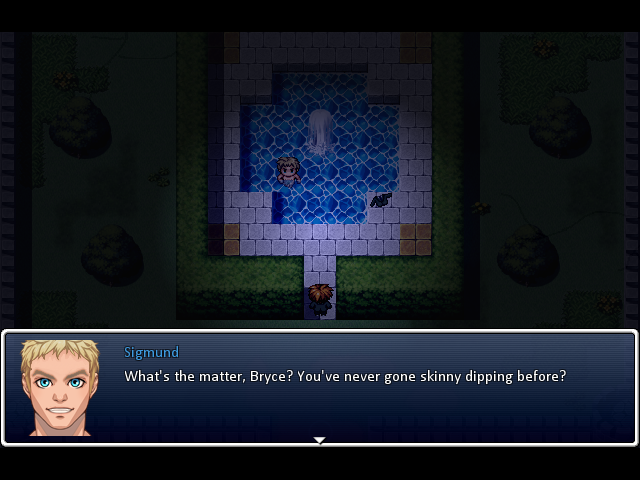
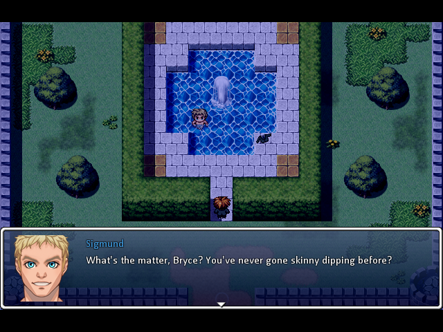
@vox-humana: First try, really? You have a natural knack for creating good maps out of the tilesets you're given. Only thing I'd really even change is the way the water flows off the north end of the cliff like that - when you put something interesting on your map like a waterfall, it's almost always best to have it facing towards a direction where the player can see it. Right now I can deduce that there must be a waterfall back there because the water turns into sky, but I can't see it. Some clouds of steam would at least help. And, like a lot of people, I don't like the VX RTP (especially for outdoor maps), but you did a good job assembling it into a very solid map. Whatever tileset you use, you'll go far with.
@Itaju: Not sure what that metal fence is supposed to be blocking, since it seems to just stop at a random point along the sidewalk, but maybe I'd be able to tell if the screen were scrolled to the right. Hmm, I know I've seen maps of dungeon areas you've done. You did those before doing your game's intro? That's... probably smart, since every time I do my maps sequentially, the early parts of the game end up the worst. But having a playable game up to point X is so useful in helping me figure out what exactly point X+1 should look and feel like that I can't seem to stop doing it, heh. To what extent are you making the areas "out of order"?
@bandito: table comes almost up to the character's knees, while bookshelf's cabinet doors come up to his eyes. I don't necessarily think the shelf and vending machine are too tall - they're about 20% taller than the character, which is potentially realistic depending on how tall he is. If he's not much over 5' tall then it's perfect. The, uh, microwave oven or whatever on the table is waist-high, but since I can't tell what it is, I have no idea if that's proper or not.
@vox-humana: First try, really? You have a natural knack for creating good maps out of the tilesets you're given. Only thing I'd really even change is the way the water flows off the north end of the cliff like that - when you put something interesting on your map like a waterfall, it's almost always best to have it facing towards a direction where the player can see it. Right now I can deduce that there must be a waterfall back there because the water turns into sky, but I can't see it. Some clouds of steam would at least help. And, like a lot of people, I don't like the VX RTP (especially for outdoor maps), but you did a good job assembling it into a very solid map. Whatever tileset you use, you'll go far with.
@Itaju: Not sure what that metal fence is supposed to be blocking, since it seems to just stop at a random point along the sidewalk, but maybe I'd be able to tell if the screen were scrolled to the right. Hmm, I know I've seen maps of dungeon areas you've done. You did those before doing your game's intro? That's... probably smart, since every time I do my maps sequentially, the early parts of the game end up the worst. But having a playable game up to point X is so useful in helping me figure out what exactly point X+1 should look and feel like that I can't seem to stop doing it, heh. To what extent are you making the areas "out of order"?

author=LockeZWell, first try since playing the Playstation RPG Maker when I was about 13. Also that's not supposed to be a waterfall, it's just a bit of the map I didn't bother finishing :p The water was mostly there for experimenting with it, I was just messing around really. Thanks though. I just found some nice trees to add to the RTP but if I want to get away from it completely and have really nice maps, is parallaxing pretty much necessary or are there some much nicer and more flexible tilesets I could look at?
@vox-humana: First try, really? You have a natural knack for creating good maps out of the tilesets you're given. Only thing I'd really even change is the way the water flows off the north end of the cliff like that - when you put something interesting on your map like a waterfall, it's almost always best to have it facing towards a direction where the player can see it. Right now I can deduce that there must be a waterfall back there because the water turns into sky, but I can't see it. Some clouds of steam would at least help. And, like a lot of people, I don't like the VX RTP (especially for outdoor maps), but you did a good job assembling it into a very solid map. Whatever tileset you use, you'll go far with.
author=vox-humanaParallaxing certainly isn't necessary, and completely optional. They help to improve maps greatly sure, but it's up to you whether you want to do it or not, as like you did, you can still make some good looking maps with rtp~ :)
Is parallaxing pretty much necessary?
LockeZ
I'd really like to get rid of LockeZ. His play style is way too unpredictable. He's always like this too. If he ran a country, he'd just kill and imprison people at random until crime stopped.
5958
There are tons of tiles out there you can use, and basically any of them will work in VX Ace (or, with a lot more work, in VX). Rpgmaker.net doesn't host graphics resources, but a lot of other RPG Maker sites do. Look around.
To start you out, here's a link to Mac & Blue tiles (also called Theodore tiles) for VX: http://rpgmakervxace.eu/ressource/pack/macandbluevx.rar They're freeware tiles created for RPG Maker, not rips from a commercial game. They don't have that boxy look. A lot of people mix and match Mac & Blue or RTP with other tilesets - just try to find ones that have similar kinds of outlines and shading, if you do that.
To start you out, here's a link to Mac & Blue tiles (also called Theodore tiles) for VX: http://rpgmakervxace.eu/ressource/pack/macandbluevx.rar They're freeware tiles created for RPG Maker, not rips from a commercial game. They don't have that boxy look. A lot of people mix and match Mac & Blue or RTP with other tilesets - just try to find ones that have similar kinds of outlines and shading, if you do that.
author=Darken
rip in peace
this topicJude, if you're going to be that involved in the map design process in the first place, you should really just do parallax mapping.
Please think back to why the tile/map editor was made in the first place. Because you might be now realizing that Jude is referring to a limitation that ironically... rm2k3 didn't have.
Two steps forward one step back. Enterbrain.
Enterbrain has forever been doing that and the faster people learn this the better. I don't have an issue with RM per se but some of the dumb limitations it has is mind boggling. They basically alienate a lot of serious indie game developers from using RM seriously. I find their map editor to be outright garbage.
With that said, RMVX Ace is pretty powerful but even menu games can be limited by some of the botched decisions made by Enterbrain. Jude is right, it takes effort to remove the blocky looking maps and that is clearly something people aren't motivated enough to do. I don't blame them considering the engine was designed like that.
I'm assuming this will be taken as an offensive attack to RMVX in general so let me just prepare.
*Ghost uses harden.
if anybody attacks you for that it's not going to be me, i agree entirely
EDIT: Thanks #shump now can we please start posting screenshots again and/or killing this topic
EDIT: Thanks #shump now can we please start posting screenshots again and/or killing this topic

Well, if you are disappointed in the new versions of RPG Maker, there are other RPG making engines available. And some are free, so there's no reason not to at least try them.
WIP. Still need to add some pants. May tweak the tinting or add a radius of darkness picture on top to reflect that it's nighttime.
EDIT: With darkness radius.