THE SCREENSHOT TOPIC RETURNS
Posts
I got it after I was told. If you had a lighting effect that subtly drew the eye to the part where the mesh overlaps the underlying crates, it'd succeed. (That's the part that clued me in.)
@LockeZ - i think the stacked creates look weird because of the shadows on the front side. it goes light-dark-light-dark...
maybe if you have a part before this that requires the player to do something with stacked crates it will be clear what needs to be done here
maybe if you have a part before this that requires the player to do something with stacked crates it will be clear what needs to be done here
What is this...
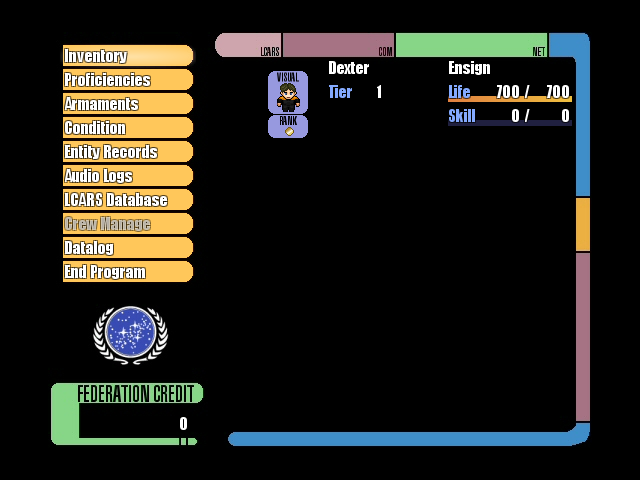


"What are you doing UPRC?" would be a very valid question right now because I'm just having fun messing with the menu and don't know if I'm even going anywhere with this.


"What are you doing UPRC?" would be a very valid question right now because I'm just having fun messing with the menu and don't know if I'm even going anywhere with this.
It's a nice start and I suggest you continue doing it. You should think more about how you space things to keep it from looking chaotic.
edit: I think I might write a tutorial on this if there isn't one when I have time.
edit: I think I might write a tutorial on this if there isn't one when I have time.
Absolutley loving the Star Trek theme :D

A town I'm working on for my game, thoughts? comments? suggestions? all welcome and appreciated.

A town I'm working on for my game, thoughts? comments? suggestions? all welcome and appreciated.
It looks good for what it is, a small village. That little elevation looks a bit off, maybe if the tiles were in different colour? Townspeople also spice it up a lot!
@UPRC - Hnnng! That is the sexiest menu I have ever seen in my life! The text is a little squishy in places, but I am otherwise in love. I also lol'd that within the sci-fi theme, the icons for the items are pretty feathered hats and jewelry.
@Pyramid - Looks pretty nice so far! My only concern is the amount of empty grass around the houses. I like that you've given the houses some realistic shapes and spread them out well, but maybe a little bit of fencing here or there to show who owns what property would be nice. Like, I can't tell who owns that washing line on the left there. Otherwise I really like! Keep up the good work!
@Pyramid - Looks pretty nice so far! My only concern is the amount of empty grass around the houses. I like that you've given the houses some realistic shapes and spread them out well, but maybe a little bit of fencing here or there to show who owns what property would be nice. Like, I can't tell who owns that washing line on the left there. Otherwise I really like! Keep up the good work!
Thank you you two, the map isn't finished, I've yet to add the people, I know the elevations looks a little weird... but I was gonna shoehorn that shit in somewhere XD thanks for the feedback though, I'll get to work on making changes right away.
Where people walk a lot, dirt paths form, so you'd probably have paths to any house that was occupied. I'd also like to point out that wells are only added to areas where there isn't much free-flowing, clean water.
@UPRC - Those menus are just cool!
@UPRC - Those menus are just cool!
Thank you for those pointers, I'll post up the new shiny map when it's done, still tweaking a few things.
Decided to test the stuff I've made so far in VX Ace to see how it is meshing and such.
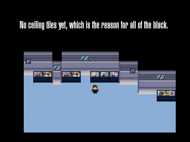
I'll probably do doorways next and work on making the carpeting better. I will also move the small wall-mounted touch pads down a bit so that they're not overlapping any dark lines on the walls. There will be diagonal walls as well, so final maps won't be so blocky looking.
I will most likely switch to tall characters too.
What do you all think? Just a basic grass area to show what I have. Any errors or ugliness my eye can't catch? My vision behind this map is a town that supplies its own little magically controlled super magic plumbing system. The canal is meant to run into the elevated area and flow just underneath all the homes. With this in mind, is this setting being achieved visually...?
Here are two side projects I've been working on since 2011.
Mine Fu is currently in beta testing phase. It's a minimalistic puzzle/action game with typical Anime humor and cutscenes.
The other game is only a piano tech demo for now (probably the most advanced ever made on 2k3). I haven't decided what kind of gameplay I'll include yet.


Mine Fu is currently in beta testing phase. It's a minimalistic puzzle/action game with typical Anime humor and cutscenes.
The other game is only a piano tech demo for now (probably the most advanced ever made on 2k3). I haven't decided what kind of gameplay I'll include yet.


This is work in progress
and nope, I don't change the dithering. :)
Puzzle pieces will float in circles around Laura (but I add a few more so it will be like 3-4 in the front and 20 or so in the BG.
@Avee - that title screen is downright adorable. I am also very intrigued by the piano. I love how you've done the reflection, and that the keys actually reflect when pushed down. And I would also very much like to see how it plays ingame.
@Itaju - I for one like the dithering. It gives her clothing appropriate texture (her clothing seems to have a fabric-feel to it, unlike her skin which is smooth) and flows from colour to colour very well. I often find block colours to be a bit of an eyesore (especially with such vastly differing shades). But that title screen is very much a delight to look upon!
That said, I'm quite fond of every screenshot on this last page.
author=Caz
It gives her clothing appropriate texture (her clothing seems to have a fabric-feel to it, unlike her skin which is smooth) and flows from colour to colour very well.
Except for those hairy arms and legs!
Those large puzzles pieces look awful
Hm, they don't look hairy to me. It might be best that they're not perfectly smooth: it gives her appearance a bit more substance and makes her different to most other game characters who apparently either have neck-down alopecia or carry a razor with them everywhere. XD
I like it. I can understand why people hate the dithering, but I quite like it. I'll maybe agree with Link that the puzzle piece edges are a little too spiky, but you did say they'd be moving! I don't think my eye is quite so good as to catch little details like that on moving objects.
And perhaps her hair. It closely resembles the fabric of her clothes, makes it look a bit matted. I'm not saying it should be sheen and smooth, but another texture may suit it better.


