


THE SCREENSHOT TOPIC RETURNS
Posts

author=Sated
Is Detective posting every single map from their game in here or what..?
I've been thinking the same thing...feels like people are making the game for him.
But, he is skipping the step of demos and players criticisms. So that's good.
What's the screenshot topic for then, if not to help?

The same people giving advice will hopefully be playing the game, too, so I can see how that can worsen the experience then.

Perhaps because he requests thoughts on his maps, he gets them? And he's still learning how certain tiles work, design and such, so he's open to ideas. It's actually nice to see a new person who does listen and experiment. He's learning a lot from playing around with what people suggest - you can see it easily from looking at the first maps he showed much earlier in the topic, and the new maps he's been showing. He learned from asking and listening to the answers, but still retains his own ideas for his maps and game.

The Symmetry is a bit off-putting, especially with the way the statues are set out. It looks mostly like you're just trying to fill space and sticks out as such. Also, this is inside a building, right? Two tiles tall? The walls should be higher or at least the same height as the arches, otherwise they'd be interfering with the ceiling.
It's a neat start, though. ^.^
It's a neat start, though. ^.^
nothing wrong with detective asking. This topic would be only half as alive without him :)
kory_toombs, pretty much what liberty said. I wouldn't mind symmetry that much if you didn't have so many statues. It really looks like you're just filling up empty space. Those arches however are really nice.
kory_toombs, pretty much what liberty said. I wouldn't mind symmetry that much if you didn't have so many statues. It really looks like you're just filling up empty space. Those arches however are really nice.

Those arches are a different color from the rest of the walls. The rest is grayscale, the arches are a mix of green and blue. The wood also stands out, as there are no wood in the rest of the walls anywhere.
I followed some of the suggestions.
1) Less symmetrical.
2) Walls are one tile higher.
3) No statues.


@kory
It'd look better if the pillar at the top was lowered a tile because it still looks like it's going in the ceiling a bit.
The bottom one is good though.

The events in the lava are fire bubbles and pillars. Otherwise the events are just for the lavafalls, transfer events and chests.
What I want to know is how that canyon looks. I tried to make it seem like you were going over it.
EDIT: I'll be making that pic bigger.....
It'd look better if the pillar at the top was lowered a tile because it still looks like it's going in the ceiling a bit.
The bottom one is good though.
The events in the lava are fire bubbles and pillars. Otherwise the events are just for the lavafalls, transfer events and chests.
What I want to know is how that canyon looks. I tried to make it seem like you were going over it.
EDIT: I'll be making that pic bigger.....
LockeZ

I'd really like to get rid of LockeZ. His play style is way too unpredictable. He's always like this too. If he ran a country, he'd just kill and imprison people at random until crime stopped.
5958
Gonna disagree with Liberty somewhat; I preferred the symmetry. I also think removing the statues was a bad call; the placement of them was weird, but having decorations was a good idea.
I meant that I didn't like how the statues were symmetrical and that you should remove one or two, not all of them. ^.^;
Symmetrical buildings are fine, especially old ruins built by civilised hands because they're usually carefully planned to be symmetrical. It was the filler statues being lined up perfectly in the same order and place that I had issue with.
But I agree that you might want to move the above arch down one tile so it has the edge of the roof behind it like with the second one. As it stands, the wall behind it would be two tiles high, since it starts one tile up from the bottom of the arch-bottom tile. ^.^
@seiromem: Yeah, it's a bit hard to see as it is. ^.^
There's gotta be a way to easily do this ;_;
right now I'm uplaoding it to google and using the "Image" thing to put the screeny up. What's a better way?
right now I'm uplaoding it to google and using the "Image" thing to put the screeny up. What's a better way?
LockeZ
I'd really like to get rid of LockeZ. His play style is way too unpredictable. He's always like this too. If he ran a country, he'd just kill and imprison people at random until crime stopped.
5958
Use ur rpgmaker.net locker dawg
author=LockeZ
Use ur rpgmaker.net locker dawg
Then use the little chest image when you post to choose the picture from your locker. It's easy as pie! ^.^

author=seiromem
There's gotta be a way to easily do this ;_;
right now I'm uplaoding it to google and using the "Image" thing to put the screeny up. What's a better way?
imgur.com too
Okay. Here's what I have done.
The room is back to being symmetrical.
The archway has been fixed. Still no statues.
But since its a dark area I put in some wall lamps
with some lighting effects.


The archway stands out too much, even if it's supposed to be made of a lighter-colored material (marble, maybe?) I think it should look darker, specially under that light. (Speaking of light, you can seriously improve those light effects. Use overlay pictures or something, not tiles) Also, I think the top of the arch should be black just like the rest of the ceiling tiles, it is weird that you can see it... And just to nitpick. Is there a reason for the shape of the rooms not to be more 'straight'? They're oddly irregular.
LockeZ
I'd really like to get rid of LockeZ. His play style is way too unpredictable. He's always like this too. If he ran a country, he'd just kill and imprison people at random until crime stopped.
5958
Although it's odd to be able to see the tops of the arches, I also sort of like it.
Agree that those lighting effects are lolzy. If overlays are too much work fpr you to learn, then just get rid of the lighting effects and leave the candles on the dark wall, IMO.
Agree that those lighting effects are lolzy. If overlays are too much work fpr you to learn, then just get rid of the lighting effects and leave the candles on the dark wall, IMO.
@Kory Yeah, either use an overlay for those candles, or just don't use lighting effects..blocky lights aren't really eye appealing~
Here's a WIP for a small map I'm building atm, any thoughts? :o
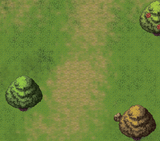
Here's a WIP for a small map I'm building atm, any thoughts? :o
Corfaisus

"It's frustrating because - as much as Corf is otherwise an irredeemable person - his 2k/3 mapping is on point." ~ psy_wombats
7874
Well, it's empty, I'll give it that much.
What do you plan on doing with this field to make it significant?
What do you plan on doing with this field to make it significant?

