


THE SCREENSHOT TOPIC RETURNS
Posts
Itaju, your screen obviously is awesome. Very moody! :) though i presume people want constructive feedback when posting their stuff, no? Anyways, your shading is a bit blurry at places. Bolder shading and colour using would be the next step, it's something i struggle in as well.
lockez, that's a cool map for something as simple as it is. I'm liking the different terrain/floor tiles.
lockez, that's a cool map for something as simple as it is. I'm liking the different terrain/floor tiles.

I am thinking about moving the table and chairs in the kitchen down 1 tile, so it is overlapped by the roof. But I think it looks better this way, so I'm not sure. :P

Oh, and I had to change the carpet for the other maps because of some tileset issues. :(
Oh, and I had to change the carpet for the other maps because of some tileset issues. :(
keep the table as it is. Map is looking good otherwise as well, don't overwork your maps. Even picasso had to call it quits with mona lisa at some point. "looks too much of a man but whatever man"

Normally, it's considered bad architecture to have a toilet adjoining a kitchen. There should be at least one room or hallway between them.


Can we see the outside shape of the house? You should make them alike. As it stands, it's far to spread out. I think your previous, more square look, was a lot better. (And who paints stars on their walls?)
The other houses also look similar to this. :P

You have a point. I was also aware of that, but I was trying to make it different. :D
And the stars looked kinda cute, I think. ;)
You have a point. I was also aware of that, but I was trying to make it different. :D
And the stars looked kinda cute, I think. ;)
So basically a square house. You should make a square then divide the space for each room. A fast few examples:


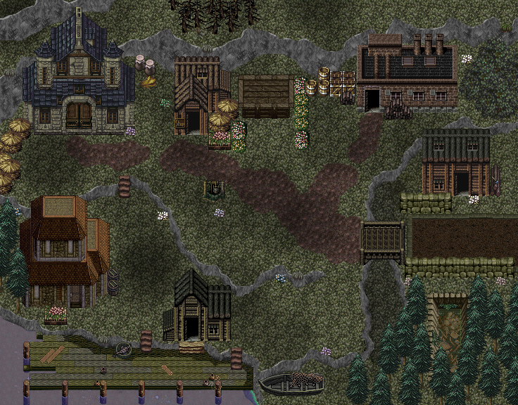
My first attempt at a town ever, I think.
I guess I haven't ever needed a town before.
So how is it?

Why is there a bridge over such a small ditch... walking around it would take a couple more seconds. The cliffs don't show depth very well, but I guess it's easier to see ingame. I don't really understand why the water in the left bottom corner is lighter in the deeper part, and the bright blue line along the cliff doesn't go with the rest of the shade of the water. What is the wooden thing supposed to be that's between the 2 houses in the northern part of the village? I also don't know the the thing in the south east bottom is supposed to be... is it another ditch but with walls made of wood and plants growing in it?


Bajunica is the biggest city in the Thistle Swamp. Some time ago it lost to the constant attempts of the wilderness to take over the constructions. Now it is abandoned and up to you to discover its secrets.
Please no RM2k3 vs. the rest discussions this time. :)

Looks amazing Itaju. Not inherently because its 2k3, but because the look and atmosphere has charm. HUD is cool, and the Layout makes everything look natural and not-snapped to a grid.
keep up the great work, if these are 100% custom tiles i cant wait to see some other areas of the game.
others= I've noticed a lot of other maps have been looking super sterile. Plastic. Fake. Again, nothing to do with the maker. Dont blame the tiles you use, learn to edit/make your own.
keep up the great work, if these are 100% custom tiles i cant wait to see some other areas of the game.
others= I've noticed a lot of other maps have been looking super sterile. Plastic. Fake. Again, nothing to do with the maker. Dont blame the tiles you use, learn to edit/make your own.
How's this then?
The wooden thing between the houses at the top is a stage.
The thing at the bottom is a ditch indeed. I guess it kinda stood out being in the middle of nowhere without anything around it so I added some trees around it.
I kinda think it's odd that the road into the town is clearly created and designed by human hands, but that the main area of the town - the centre and such - is just grass. You'd think the parts where people walk the most would also be more defined, especially if they took the effort to create that road to begin with.

author=Caz
Normally, it's considered bad architecture to have a toilet adjoining a kitchen. There should be at least one room or hallway between them.
Isn't that against sanitary codes? "Mmmm, I just took a dump, now to eat."
Snowy that's completely awesome. The only issue is that that mountain ridge section just suddenly cuts off short of that river.
Liberty, head to an old town with dirt roads and such (or an area under construction). It actually is about like this. Heck, even modern towns that aren't wall to wall pavement have grassy areas. Our own town has roads dividing the blocks, but most people's lawns are heavily wooded.
I've lived in old towns like that - the town centre is always either hard-packed dirt or cemented. The roads in and out of town are usually dirt. I'm talking a 2-block town here, btw. Literally 2 blocks to the town. In-town the roads were tar. Out of town they are dirt. That makes it easier to get around in town for those who live there.
LockeZ

I'd really like to get rid of LockeZ. His play style is way too unpredictable. He's always like this too. If he ran a country, he'd just kill and imprison people at random until crime stopped.
5958
You lived in a two-block town?
You lived in an RPG town?
Were... were you the town greeter?
You lived in an RPG town?
Were... were you the town greeter?

washing machine in the hallway?
rooms with only 3 walls?
red throne room rug? doesnt look good to me.
this place looks like a germaphobes house or maybe a lifeless hospital
rooms with only 3 walls?
red throne room rug? doesnt look good to me.
this place looks like a germaphobes house or maybe a lifeless hospital

