


THE SCREENSHOT TOPIC RETURNS
Posts


@Xychosis - That looks great man, especially the sprite style, I so wanna steal it haha. No really I don't see anything really wrong with it, just maybe place the steps a pixel down or so.
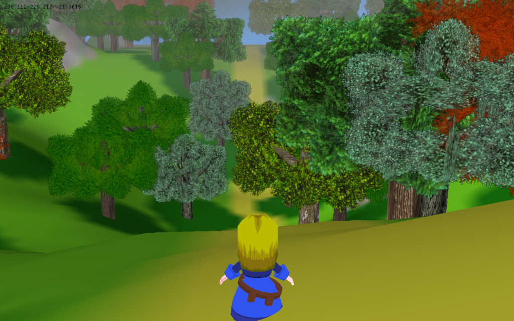
@Mr_Detective - I'm more confused as to why you would need torches lit up in what seems to be an open volcano. Also why is the cliff face so perfectly symmetrical, natural landscapes don't usually adhere to such logic. One more thing, of all the places to well.. Place those monitors, why would you place then right on the edge of the platform they're standing on that's surrounded by lava?
@Mr_Detective - I'm more confused as to why you would need torches lit up in what seems to be an open volcano. Also why is the cliff face so perfectly symmetrical, natural landscapes don't usually adhere to such logic. One more thing, of all the places to well.. Place those monitors, why would you place then right on the edge of the platform they're standing on that's surrounded by lava?

author=goldenroy
@Xenomic: Haha, a change indeed. The bottom screens looks way better, even though RTP can look nice (But not the 2k3 one >3<). Even though you said you wouldn't change the dimensions, the big part of water on the bottom of the map looks rather empty. Also, that plant on the water is not supposed to be placed.. on water, I think. But yeah, looks cool. huge improvement. :0
2k3 Standard Battle System (+ DynRPG of course) - Please ignore the background and testgraphics. 0:
I heard you were talking shit...
That's some pretty nice battle shit going on there. Not sure about the abundance of red and yellow, myself, but it looks pretty neat.
@Xenomic: It's fine. Water isn't supposed to be full of shit. I guess, if you feel that it's a big too blank, though, you could add a small island/cliff jutting out of the water, but yeah... water is supposed to be straight-up flat anyway. Unless you're in a swamp. Oh! How about some animals like swans and flies/mosquitos (black buzzing dots) and ripples? That can help 'liven' it up a little.
Hmm...ripples could work. I haven't actually messed with those yet so I don't know how to really deal with those (I MAY have some animations I can use, meaning I'd have to test them but hey, if they make it look better!). Animals could work too...I'd have to figure out which ones would be suitable for this area. Hmm...
Corfaisus

"It's frustrating because - as much as Corf is otherwise an irredeemable person - his 2k/3 mapping is on point." ~ psy_wombats
7874
author=Libertyauthor=goldenroyI heard you were talking shit...
@Xenomic: Haha, a change indeed. The bottom screens looks way better, even though RTP can look nice (But not the 2k3 one >3<). Even though you said you wouldn't change the dimensions, the big part of water on the bottom of the map looks rather empty. Also, that plant on the water is not supposed to be placed.. on water, I think. But yeah, looks cool. huge improvement. :0
2k3 Standard Battle System (+ DynRPG of course) - Please ignore the background and testgraphics. 0:
*Sarcastically coughs so hard he begins to wheeze*
To you, Xenomic, I would suggest above all things to start making the river's edge more curvy instead of straight for more than one to two tiles at a time. Once that's done, you could start mixing up the grass decoration so it doesn't appear like long brushstrokes of the same graphic.
author=Tau
@Mr_Detective - I'm more confused as to why you would need torches lit up in what seems to be an open volcano. Also why is the cliff face so perfectly symmetrical, natural landscapes don't usually adhere to such logic. One more thing, of all the places to well.. Place those monitors, why would you place then right on the edge of the platform they're standing on that's surrounded by lava?
The volcano (which is not exactly a volcano) is inside an underground cave, so I thought it should be dark a bit. Those cliffs aren't really natural, since the entire area was supposedly built for a televised competition. I guess I could still change those cliffs a bit, though.
Where else would be a better place to put those monitor? I put them there so they won't take up much space.


LockeZ

I'd really like to get rid of LockeZ. His play style is way too unpredictable. He's always like this too. If he ran a country, he'd just kill and imprison people at random until crime stopped.
5958
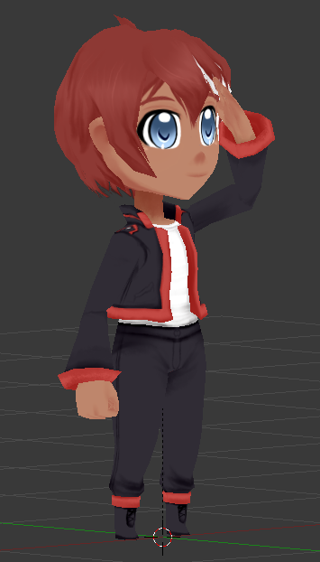
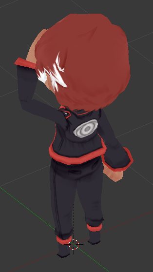
Her eyes are so massive and her feet are so tiny.
I really like the outfit though.
I really like the outfit though.
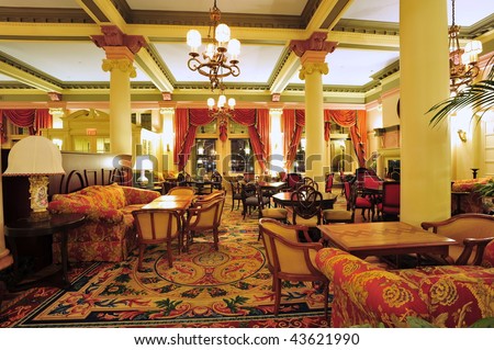
This is still WIP. I'm working on adding new things to the tileset. I'm still undecided regarding the pipes however.

I don't understand why there would be those pipes in a house/hotel. What exactly is this map? I think you should get rid of them. :)
I put them in because I'm trying to create something Steampunk-ish. I suppose I could find other features to implement instead.
LockeZ
I'd really like to get rid of LockeZ. His play style is way too unpredictable. He's always like this too. If he ran a country, he'd just kill and imprison people at random until crime stopped.
5958
I'd just make it look Victorian.
Victorian Hotel 1
Victorian Hotel 2
Victorian Hotel 3
Victorian Hotel 4
Steampunk is about Victorian aesthetics, and about steam engine technology used to create modern or futuristic levels of machinery. But a hotel isn't likely to have much of the second part, especially not on the inside. Unless the building transforms into a gundam or something. All you really need is a regular fancy hotel from 1880 with a couple vents on the roof.
Uh, what exactly is wrong with this map?
I know that the middle part looks really weird, but I was basing it off of this map.
http://www.sprites-inc.co.uk/files/EXE/EXE3/Maps/Real%20World/EternalHades.gif
Either it doesn't work well in RPG Maker or I didn't do a good job. :O

I know that the middle part looks really weird, but I was basing it off of this map.
http://www.sprites-inc.co.uk/files/EXE/EXE3/Maps/Real%20World/EternalHades.gif
Either it doesn't work well in RPG Maker or I didn't do a good job. :O
LockeZ
I'd really like to get rid of LockeZ. His play style is way too unpredictable. He's always like this too. If he ran a country, he'd just kill and imprison people at random until crime stopped.
5958
honestly the main problem is that the map you're basing it on is just as terrible as your version
but also a futuristic glass floor being suspended in midair and being only a few inches thick makes a lot more sense than a cobblestone floor being suspended in midair and being only a few inches thick.
The weirdest thing is actually at the top, where the wall just stops midair and then there's black void underneath. That wall should be going all the way down, don't you think? Maybe it should gradually get darker as it goes down.

author=LockeZ
Her eyes are so massive and her feet are so tiny.
I really like the outfit though.
That's a he! @Anaryu when/where are you posting about these exciting new developments?
@LockeZ: We used full-size before, but the effort wasn't really worth it, especially since animations needed to look more realistic too. So we modeled it after the sprites from the game and stylized it a bit to an approach that remains easy to use but high quality looking (hopefully!)
Since the art style is heavily anime-ish, makes sense to go with models that suite the same style. Gotta play off your strengths!
View is going to be similar to this:

We haven't posted much except those images on our blog.
A few 'inside' updates I still have URLs for though:
http://screencast.com/t/tPucP3CS
http://screencast.com/t/qIlECm0ly1v
and I've been finishing some tools for the 'tile' style editor we're using:
http://screencast.com/t/DSJ4hLrQSPu
http://screencast.com/t/bKP5uEKa4
Those were from about a week ago, lot of progress since then. : )
In particular I've got an event system very akin to an RM one working now, just finished parallel handling (so any 'event' can run it's own interpreter instead of going through the main one.)
Next is the culling and handling of switching floors so that you only see your floor and down and only see inside when you're inside a building. Once that's automated I'll start on the combat system.
Alaria's one is almost done, takes a bit over a day to 1.5 days to finish one of these guys (minus animations) now that we've got the base done and rigged (female and male base):

just finishing the hair and then seeing about using soft bodies to move her tie and hair.
We were going to wait until we had a working tech demo before posting the new project and maybe taking it a bit further!
Since the art style is heavily anime-ish, makes sense to go with models that suite the same style. Gotta play off your strengths!
View is going to be similar to this:
author=NewBlackauthor=LockeZThat's a he! @Anaryu when/where are you posting about these exciting new developments?
Her eyes are so massive and her feet are so tiny.
I really like the outfit though.
We haven't posted much except those images on our blog.
A few 'inside' updates I still have URLs for though:
http://screencast.com/t/tPucP3CS
http://screencast.com/t/qIlECm0ly1v
and I've been finishing some tools for the 'tile' style editor we're using:
http://screencast.com/t/DSJ4hLrQSPu
http://screencast.com/t/bKP5uEKa4
Those were from about a week ago, lot of progress since then. : )
In particular I've got an event system very akin to an RM one working now, just finished parallel handling (so any 'event' can run it's own interpreter instead of going through the main one.)
Next is the culling and handling of switching floors so that you only see your floor and down and only see inside when you're inside a building. Once that's automated I'll start on the combat system.
Alaria's one is almost done, takes a bit over a day to 1.5 days to finish one of these guys (minus animations) now that we've got the base done and rigged (female and male base):
just finishing the hair and then seeing about using soft bodies to move her tie and hair.
We were going to wait until we had a working tech demo before posting the new project and maybe taking it a bit further!

Xycosis- The floor pattern is at the wrong angle. Make those diagonal lines parallel to all the other straight lines on the map. Not like this "/" like this "|"
The isometric angle only works if the whole map is like that imo
The isometric angle only works if the whole map is like that imo


