


THE SCREENSHOT TOPIC RETURNS
Posts

Looks fine to me, games like SD3 had pretty jumbo sprites, (though slightly less taller) Also is this in XP or something? I am deeply interested.

author=Cray
I'm really not a fan of that title, and I mean the title, not the screen, It's way too long. I would just use "Keepers" in big letters and "of souls" (without restless) in a smaller font.
I'm practicing with some biggher sprites and tilesets for my next project (now that lost king is close to being finished) The sprite is a WiP but still I?m liking how it is going.
Do you like how a game looks with bigger sprites? I'm kinda getting tired of small ones...
maybe his head is too big though...

Looks good, but keep in mind a few things:
* Those trees are way too small. They are like the equivalent of a sapling to him.
* You are going to need much more detailed animations for those sprites. I hate when people use large sprites but don't do anything with them.
* The sprites will overlap when next to each other unless handled through scripting (although I haven't ever taken the time to look and see how difficult this is)
* +1 for non-white sprite


Thanks for the comments, I don't think the trees are too small, I based the ratio on breath of fire 1 and 2 where the character is 24 pixels high and trees are 32 pixels high. in here, the character is 65 pixels high and trees are around 90 pixels high so the ratio is more or less the same.
You are probably right about the animation, but's it's such a pain in the ass to do ;_;
so far I haven't had any trouble with the sprites overlapping eachother.
thanks for the +1.
You are probably right about the animation, but's it's such a pain in the ass to do ;_;
so far I haven't had any trouble with the sprites overlapping eachother.
thanks for the +1.
Those trees are too small dawg. I could try to explain it to you but I always feel somewhat like an ass afterwards so I will just leave it at that.
The trees are kinda small. Normally that type of tree is one that someone could stand straight up under. He would have to crouch to dodge the leaves and branches.
The guy himself looks good though. But as has been mentioned, big attractive sprites are wasted if you do minimal animation.
The guy himself looks good though. But as has been mentioned, big attractive sprites are wasted if you do minimal animation.
About half the RPGs you played probably have disproportioned trees, houses, etc. not sure why this is a big deal.
The trees really don't bother me at all, but since everyone has said they think they are too small I'll try and make them bigger...

Wait, is the guy meant to be huge? Because if the guy is meant to be huge (in D&D terms, size "Large") then leave the trees as is.
@Felipe: I don't like how the bottom of the trees just kind of sit on the grass without really seeming at all rooted in the grass. Know what I mean?
@Felipe: I don't like how the bottom of the trees just kind of sit on the grass without really seeming at all rooted in the grass. Know what I mean?
Felipe, I agree with the bottom of the trees, it's too plain, try to add some grass to and I bet they will look better, also adding some sort of shadow to the tree (even if it doesn't go exactly with the lightning of the wscreen would make them look less flat.
Lots of people said the trees were too small for the character, so I made them bigger.

I'm still working at the character, but it's more complete now :)
Lots of people said the trees were too small for the character, so I made them bigger.
I'm still working at the character, but it's more complete now :)
Cray, your logic is flawed. The human-tree size ratio is not static. The smaller the character, the smaller the trees can be compared to him. Why? Because the bigger the sprite the more realistic proportions he has and every piece of scenery has to be more realistic too. When you have a 16x16 sprite you can get away with 32x32 trees, or even smaller, because he's essentialy a big head with legs and arms. The trees can thus be stylized too. When you go up to 32x64 or so, the sprite starts to look like a real human, and the trees need have more real sizes too.
When I was working on a post-apocalyptic MMORPG with 32x56 (roughly) sprites we made some 192x192 trees and they were still too small! So we had to make additional ones, 300 or so pixels tall, maybe more. Compared to those your trees are TINY. But that's the problem with bigger scales - double the size of a sprite and you quadruple the amount of work.
Oh, and such large sprites look like shit with just 3 frames per direction. Just saying. 6 frames is a minimum IMO.
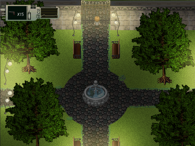

I think it looks weird that the darker spot of a park is its center. Overall the lighting looks weird to me.
I think they are right, i even used layers to iluminate the trees o-oo (for example, the upper light posts doesnt iluminate the trees, the post at the side jsut iluminate the trees that is above them)
mm I don't see any roots Felipe =P
DE your post makes sense. But for now the trees will stay like in the second version.
DE your post makes sense. But for now the trees will stay like in the second version.
LockeZ

I'd really like to get rid of LockeZ. His play style is way too unpredictable. He's always like this too. If he ran a country, he'd just kill and imprison people at random until crime stopped.
5958
Cray, you might have to refresh the image. It looks good to me.
Felipe, not to nitpick, but those trees still don't look right to me. The roots are just kind of...perhced on the grass like some kind of tentacle monster. They don't seem integrated with it. Then again, it's a minor point and you can probably ignore me.

Felipe, this is what they mean:

This is a horrible job, but it's just to show that a little bit of grass/dirt around the treetrunk will make it look like there is grass growing around it, rather than the roots just being placed on top of it. Get it?
This is a horrible job, but it's just to show that a little bit of grass/dirt around the treetrunk will make it look like there is grass growing around it, rather than the roots just being placed on top of it. Get it?
Making this custom tile set which you might notice is heavily influenced by gba zelda games. I'm not making a zelda game but rather taking the elements I like and adding in some of my own. The char sprite is a placeholder.


