


THE SCREENSHOT TOPIC RETURNS
Posts

Simply beautiful, Momeka. I'm envious of how smooth that walking animation is (and basically the whole thing BUT). Reminds me of the animation in M&L Superstar Saga.
EDIT: Wow I always page snipe the good stuff:
EDIT: Wow I always page snipe the good stuff:
author=MomekaThe intro scene where you wake up in the ruins.
And this is the room where you will first see the ghoulish creatures that inhabits them.


Hi, I'm new to the boards my into post is at the top of the intro forums. I was directed here for showcasing my work for feedback and possible collaboration, help, or pointers. I'd be glad to know what you guys think. Note I am very noob when it comes to pixel art (just started) so I have not yet mastered or learned many techniques. Working name for my game in progress is currently Epic2D (may be changed later).


I like those trees! My complaint though is that they don't match anything else on the screen. Including the character.
author=Gourd_Clae
I like those trees! My complaint though is that they don't match anything else on the screen. Including the character.
Yeah, I was just thinking that they look out of place now that I have a good working tilesheet going. I don't know how to make them go with the scenery though. Any thoughts on what I might change to make them fit in so to speak?
LockeZ

I'd really like to get rid of LockeZ. His play style is way too unpredictable. He's always like this too. If he ran a country, he'd just kill and imprison people at random until crime stopped.
5958
Do yourself a favor with that grass:
- Open it in photosop or gimp
- Decrease the contrast by about 50
- Increase the saturation by about 50 (to undo the graying side-effect of the decreased contrast)
This will make it less "loud". Specifically, it will make the shades of green be closer together. You may also consider only increasing the saturation by 40 or 45 instead of 50 to gray out the grass a little, as it's extremely vibrant right now.
Generally, vibrant colors and high amounts of contrast are great for foreground objects, since it makes them stand out, but a bad idea for background textures like the ground and inner-building walls, since it makes it hard to see where the edges of objects are and where the player can walk.
I have no real advice on the trees. They look painted while everything else looks like pixel art. I'm not sure how to solve that without just redoing them.
momeka, that looks super interesting! That guy banging his head on the wall especially. What kind of game is this?
chaosvine, it's pretty decent for a beginning pixel artist. You already got some shading there and such. Trees do standout now but if you create more stuff similar, such as bushes or something, they might mesh better with the rest of tiles.
chaosvine, it's pretty decent for a beginning pixel artist. You already got some shading there and such. Trees do standout now but if you create more stuff similar, such as bushes or something, they might mesh better with the rest of tiles.
Ok, so I went and reworked the trees, this time using pixeling only techniques instead of painting. I also took LockeZ suggestion about the background tiles and reduced their vibrancy a little using the method described. Tell me what you think.

My biggest concern is the trees look a little fake or like they are not detailed enough.
My biggest concern is the trees look a little fake or like they are not detailed enough.
Sooz

They told me I was mad when I said I was going to create a spidertable. Who’s laughing now!!!
5354
If you want more realistic trees, you should do some studies of actual trees. Collect a few photos of various sorts of trees, and then try to copy them in pixel form.

author=chaosvine
My biggest concern is the trees look a little fake or like they are not detailed enough.
For a beginner I actually think they're pretty good! You seem to have a basic handle on the shading. My only suggestion would be to reconsider the actual structure/outline of the object, and work your way inward with the coloring.
Here's a pretty common tutorial you could reference:
Oh thanks for the tutorial, it's very good. I'm going to do a third version of the tree and upload it later based on trying these techniques.
I have a question though about pixel art, how do you get so much variation in the fine details of the pixel art you create? Like I have looked at the prepackaged tilesets and character sheets that come with rpg maker vx ace and I'd like to know why when I zoom in there is so much variation in the strokes and lines the artists have used yet they still maintain a crisp look. Is this some kind of painting technique or do they just go back over the lines and shapes and add in layer upon layer manually? Is there a trick to doing this or is it just time and effort?
I have a question though about pixel art, how do you get so much variation in the fine details of the pixel art you create? Like I have looked at the prepackaged tilesets and character sheets that come with rpg maker vx ace and I'd like to know why when I zoom in there is so much variation in the strokes and lines the artists have used yet they still maintain a crisp look. Is this some kind of painting technique or do they just go back over the lines and shapes and add in layer upon layer manually? Is there a trick to doing this or is it just time and effort?

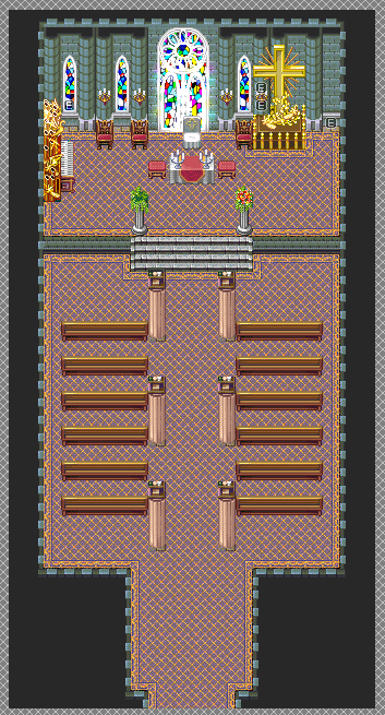
Safe to say, something doesn't feel completely right...this is what I could get out of the current tileset (this is the ONLY room of which even uses this tileset. The rest will be underground. Here's the tilesets I'm using for this dungeon.
For the shrine part itself:

For the actual dungeon:

So now the question becomes, what to do with the actual dungeon? Originally, the gimmick of this dungeon dealt with money. Enemies dropped a lot of money in here, but any money made or lost in this dungeon will not transfer to outside the dungeon. Whatever you came in here with is what you come out with. I remember doing away with this gimmick and going with something else, but I forgot what now...of note, who'd a thought there'd be a church-like area in Makai? :v
So yeah, I need to come up with a good gimmick for this dungeon that isn't used in any of the previous dungeons, and figure out if the tileset I'm using for the actual dungeon will work...oi vey. @_@;
LockeZ
I'd really like to get rid of LockeZ. His play style is way too unpredictable. He's always like this too. If he ran a country, he'd just kill and imprison people at random until crime stopped.
5958
author=chaosvine
I have a question though about pixel art, how do you get so much variation in the fine details of the pixel art you create? Like I have looked at the prepackaged tilesets and character sheets that come with rpg maker vx ace and I'd like to know why when I zoom in there is so much variation in the strokes and lines the artists have used yet they still maintain a crisp look. Is this some kind of painting technique or do they just go back over the lines and shapes and add in layer upon layer manually? Is there a trick to doing this or is it just time and effort?
Maybe I'm just art dumb, but I've at least edited a decent amount of pixel art, and I legitimately have no idea what you're talking about. Obviously there is no painting, and there are no strokes, no lines, and no shapes in pixel art... there are just pixels. I also don't know what a "crisp look" means. So really I guess I'm just really confused by how you worded the question.
The ground looks much better now IMO, by the way.

@Xenomic: I highly recommend getting rid of the carpet and using a stone floor instead. Carpets do not work in that shape. :/ Do, however, feel free to have a runner up the middle of the church.
@Liberty: Yeah, I was debating on whether or not to use a carpet for the entirety of this map or stone floor. Runner carpet sounds like it'd work nicely though. And I just realized I'm missing a glass window on the right side behind the cross. Oops...
Update number 3! I've made significant progress in my journey to become a pixel artist (well a good one anyways). Here's what I've done with my game thus far:
Reworked the bricks and shingles many times until I was more satisfied. Shingles are still iffy looking.
Added a custom door. It needs to be shaded and detailed though.
Door now takes you inside to an all new custom inside tileset! Wall and flooring tiles are mine and original.
And last but not least 3rd try at making a decent tree. Followed the guide above somewhat (because it wasn't really in the style that I was looking for). I think this iteration of tree looks significantly better than my previous trees. Let me know what you think!
Below are the two relevant screenshots:
author=LockeZauthor=chaosvineMaybe I'm just art dumb, but I've at least edited a decent amount of pixel art, and I legitimately have no idea what you're talking about. Obviously there is no painting, and there are no strokes, no lines, and no shapes in pixel art... there are just pixels. I also don't know what a "crisp look" means. So really I guess I'm just really confused by how you worded the question.
I have a question though about pixel art, how do you get so much variation in the fine details of the pixel art you create? Like I have looked at the prepackaged tilesets and character sheets that come with rpg maker vx ace and I'd like to know why when I zoom in there is so much variation in the strokes and lines the artists have used yet they still maintain a crisp look. Is this some kind of painting technique or do they just go back over the lines and shapes and add in layer upon layer manually? Is there a trick to doing this or is it just time and effort?
The ground looks much better now IMO, by the way.
I'm not really sure what I mean either. :3


Hello everyone, here a screenshot from my first completed game. It's called The Last Hour of Fairfield.

It was also my first time using the Zombie pack from the official store.
It was also my first time using the Zombie pack from the official store.


