


THE SCREENSHOT TOPIC RETURNS
Posts

Hi there!

Here's a screenshot of the town in my game. I feel that it's a bit lacking, but I can't tell on what exactly. Anything you guys could say?
(and no, I did not add npc's yet)
Here's a screenshot of the town in my game. I feel that it's a bit lacking, but I can't tell on what exactly. Anything you guys could say?
(and no, I did not add npc's yet)
LockeZ

I'd really like to get rid of LockeZ. His play style is way too unpredictable. He's always like this too. If he ran a country, he'd just kill and imprison people at random until crime stopped.
5958
It has everything it needs, but it would be possible to make it look nicer.
I think the two bigger houses at the top look the best. The smaller houses are not only absurdly small, but also I like the way the top two houses and the leftmost small house are nestled into the trees, it really adds a lot and mames the elements of the town feel like they work together instead of just placing them next to each-other. I wonder if those other three small houses could be moved and the edges of the forest could be reworked so that more of the houses are covered in trees. Then the town would really feel like it's built into the woods instead of just in a clearing in between two wooded areas. Also, some patches of tall grass and some bushes would probably help.
I think the two bigger houses at the top look the best. The smaller houses are not only absurdly small, but also I like the way the top two houses and the leftmost small house are nestled into the trees, it really adds a lot and mames the elements of the town feel like they work together instead of just placing them next to each-other. I wonder if those other three small houses could be moved and the edges of the forest could be reworked so that more of the houses are covered in trees. Then the town would really feel like it's built into the woods instead of just in a clearing in between two wooded areas. Also, some patches of tall grass and some bushes would probably help.
Thanks LockeZ! I'll work on it.
Ah about the small houses, I am a bit confused by what you mean. Are you saying I should resize them and move the forest edges closer? Because you said:
Ah about the small houses, I am a bit confused by what you mean. Are you saying I should resize them and move the forest edges closer? Because you said:
author=LockeZ
The smaller houses are not only absurdly small, but also I like the way the top two houses and the leftmost small house are nestled into the trees,it really adds a lot and mames the elements of the town feel like they work together instead of just placing them next to each-other.
Sooz

They told me I was mad when I said I was going to create a spidertable. Who’s laughing now!!!
5354
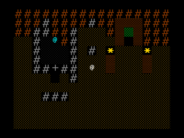
author=facesforce
This is a screenshot of a crashed space ship with the dazed engineer trying to figure out what happened, in the middle of a canyon wall in a desert next to a portal.
Yup. Ascii requires some imagination.
Should I change any of the tileset, or does it look like it will work?
Remember, it is supposed to look like a pseudo-ascii style(The brick-walls I made betray this a little, but they work well in my eyes.
Boy does that bring on the nostalgia!
I have a bit of a problem with the difference in line weights- the ASCII stuff is considerably thicker than the patterns, which makes things look a little more disordered. It might be better to have everything a single line weight, keeping in common with the original ASCII game aesthetics.

This isn't a screenshot, but I thought that maybe I can post this here anyway. I'm planning on composing custom music tracks for all the dungeons in my game, Exile's Journey. Here's an example:
http://rpgmaker.net/media/content/users/658/locker/Exile_Shrine_of_Llyr.mid
It's for a water themed dungeon, so hopefully you get that kind of vibe. Let me know what you think.
http://rpgmaker.net/media/content/users/658/locker/Exile_Shrine_of_Llyr.mid
It's for a water themed dungeon, so hopefully you get that kind of vibe. Let me know what you think.

@JosephSeraph: Since you brought it up, I decided to take a screenshot of the area in-game!
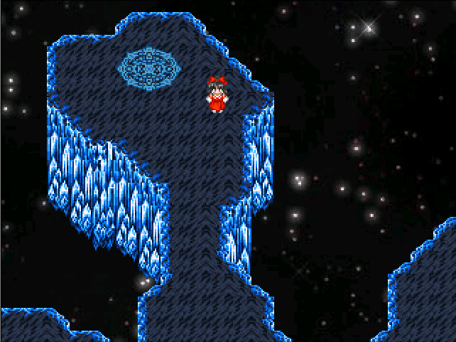
I think it looks pretty neat! I'm liking how this map is turning out (I'm still working on finishing it off, I'll post the finished version when it's done), and all of the rifts I think use this background too (bar the SDM and Myouren Temple rifts, which uses another panorama instead). And yes, this background does scroll too~
I think it looks pretty neat! I'm liking how this map is turning out (I'm still working on finishing it off, I'll post the finished version when it's done), and all of the rifts I think use this background too (bar the SDM and Myouren Temple rifts, which uses another panorama instead). And yes, this background does scroll too~


@Karins: The town looks pretty good, but the main thing that sticks out in mind is the house with no windows in the center and in front of the lake. The lower left house looks a bit suspect as well, but not shabby at all!
@Xenomic: Is that a touhou sprite I spy? The tileset choice reminds me of the final dungeon in ff5 for some reason.
Well, after sitting down and trying to figure out how to solve the floor issue. (Yellow on black does not irritate my eyes, but my sister repeated the same sentiment as Tungermanu). So, I decided to slim up the wall tiles by one line, and then I created a wave texture with a slightly darker shade of yellow so it would not clash as bad. Besides, I feel like waves look more like sand either way. Do you think these changes work well? (The torches by the portal change colors btw)
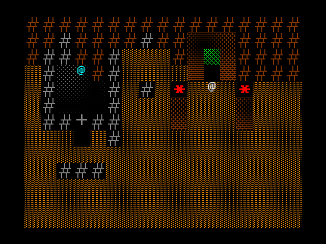
Oh, and thank you guys for giving me some good criticism. It's hard to work out some of these things by yourself sometimes.
@Xenomic: Is that a touhou sprite I spy? The tileset choice reminds me of the final dungeon in ff5 for some reason.
Well, after sitting down and trying to figure out how to solve the floor issue. (Yellow on black does not irritate my eyes, but my sister repeated the same sentiment as Tungermanu). So, I decided to slim up the wall tiles by one line, and then I created a wave texture with a slightly darker shade of yellow so it would not clash as bad. Besides, I feel like waves look more like sand either way. Do you think these changes work well? (The torches by the portal change colors btw)
Oh, and thank you guys for giving me some good criticism. It's hard to work out some of these things by yourself sometimes.
Sooz
They told me I was mad when I said I was going to create a spidertable. Who’s laughing now!!!
5354
The main problem with the yellow floor is that it's way too high contrast. If you can darken it up a few shades (closer to the value of the brown) it'll be a lot less painful.

I always wanted to make a game where everyone is buffed, like He-Man universe. Maybe even a He-Man game. Finally got myself to try and make a sprite template. How does it look?

@calunio: Hm...you may want to readjust the waist/legs as it looks very awkward. Head looks fine, and arms might be ok. That's about all I can say on that ^^;;
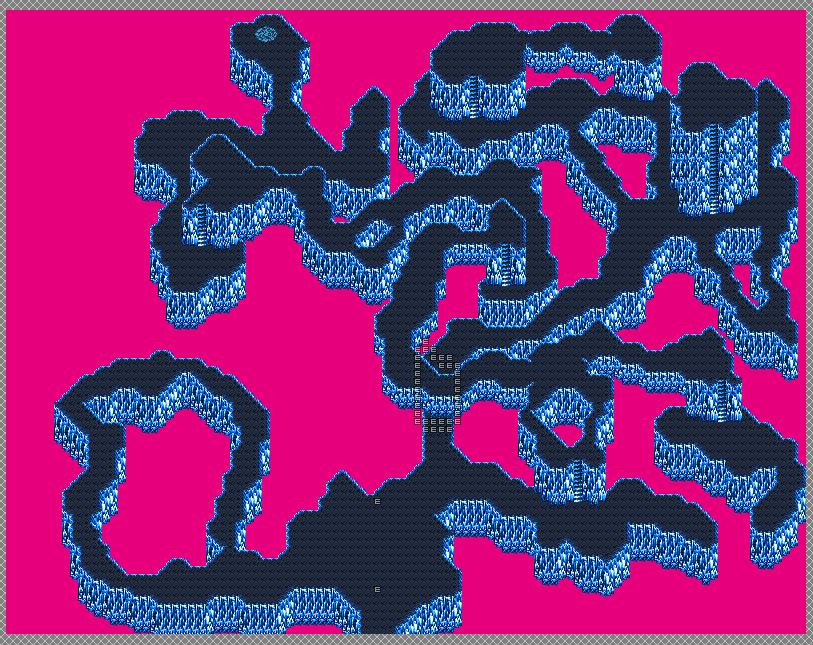
And done I think! This is the last revision of this map, 100% done (perhaps). Decided to make some holes between some paths to spice it up a bit and prettify the Void area. Not much else I can do with this other than add in the treasure chests and the missing events (to code for later). After this, 2 more maps and the Ruins of Vina Dimensional Rift will be done! And that'll leave I think 4 more dungeons for beta5 to fully map out (and one to remap)! Excite!!!
And done I think! This is the last revision of this map, 100% done (perhaps). Decided to make some holes between some paths to spice it up a bit and prettify the Void area. Not much else I can do with this other than add in the treasure chests and the missing events (to code for later). After this, 2 more maps and the Ruins of Vina Dimensional Rift will be done! And that'll leave I think 4 more dungeons for beta5 to fully map out (and one to remap)! Excite!!!

@Calunio: I think they are perfect. Kind of gives me this fist of the north star vibe a little bit.
@Xenomic: And that is what I call a good dungeon. I am kind of interested to see where your eventing will come in play, but yes, adding in those holes makes it feel much more organic. Ahaha, I am glad I could guess where the tileset was from. XD
I seriously don't see any real flaws with it at all; It does not look repetitive for a single section.


@calunio If that's for a top-down game, I'd change the perspective a bit so that the sprite doesn't look flat.

@Dookie: I love that Earthbound-like appearance of those screens. :D

One more bridge to cross, Laine. One more bridge to cross...
One more bridge to cross, Laine. One more bridge to cross...


