


THE SCREENSHOT TOPIC RETURNS
Posts


author=benos
Magic.
Most characters in games I play usually don't really need to match the hair and charset anyway, though at least has too, your right, though I enjoy it the way it is.
Fashion police on the prowl....
Well, for the purpose of identification, yes they do. And to counter your argument:


obviously, these two images look completely different, but you can tell it's the same character. Why? Because the major features of these characters are the same. They have the same type of hat, same skin coloration, and more specifically, they have the same short cut of hair, roughly the same proportions with the green antenna thing in relation to the head, same blue eyes, etc. The point is that even when a character transitions to a different style of art, they still feel "identical" due to having the same sort of design features.
The problem with your character sprite is that it looks like a separate character from the face graphic, due to it having longer hair.


That looks nice, Nessiah. I would do the following with that horizon line, however:
1) Lower it just so that it doesn't create a tangent with the umbrella
2) lighten the color of the line so that it doesn't stand out so much compared to the midground. It would give this image a lot more depth.
1) Lower it just so that it doesn't create a tangent with the umbrella
2) lighten the color of the line so that it doesn't stand out so much compared to the midground. It would give this image a lot more depth.
author=Ratty524author=benosWell, for the purpose of identification, yes they do. And to counter your argument:
Magic.
Most characters in games I play usually don't really need to match the hair and charset anyway, though at least has too, your right, though I enjoy it the way it is.
Fashion police on the prowl....
obviously, these two images look completely different, but you can tell it's the same character. Why? Because the major features of these characters are the same. They have the same type of hat, same skin coloration, and more specifically, they have the same short cut of hair, roughly the same proportions with the green antenna thing in relation to the head, same blue eyes, etc. The point is that even when a character transitions to a different style of art, they still feel "identical" due to having the same sort of design features.
The problem with your character sprite is that it looks like a separate character from the face graphic, due to it having longer hair.
Alright. :0 I get your point. I know I'm the big leagues to impress much. Though there are roco faces that can match the character. And roco is overused, and I don't really care as long as the character has red hair and has poses to match the character nearly as possible.

CAVE STORY IS AMAZING!!!
What is this? did u do it all urself? Because everything (except the rods holding up the sign) looks sweet!
author=Felipe_9595Opinions?
What is this? did u do it all urself? Because everything (except the rods holding up the sign) looks sweet!
author=Felipe_9595
Opinions?
Why did you make this?
edit: zaeran that is one of the arenas from super smash bros
Yes, is saffron city from SSB 64
Is not enterely mine, the textures belong to bad randalph, i used them to build the buildings (lol)
EDIT: I did it to replace the ugly current saffron city sprites of SSB Crusade, Falcon88 is gonna swap them with this one.
A ingame preview:
Is not enterely mine, the textures belong to bad randalph, i used them to build the buildings (lol)
EDIT: I did it to replace the ugly current saffron city sprites of SSB Crusade, Falcon88 is gonna swap them with this one.
A ingame preview:
Seems like fox is op in that game as well.

@Adon237: http://rpgmaker.net/media/content/users/15157/locker/Logo.png
That’s nice for a start. Now try rearranging the symbols in a more organized way, and bring down the title a bit more to an “eye level” if you know what I mean. Also, yes, brightening up the title is a good idea too.
@Demicrusaius: http://rpgmaker.net/media/content/games/706/screenshots/Tardis.PNG
Not bad. But you can still improve this screen quite a bit. First of all, clean up the phone cabin a little because it has too many ‘garbage’ pixels. Also, I suggest you to use a picture for the message box so you don’t have to deal with those awful black corners in the system skin... Lastly, those bananas look odd just pasted on top of the palm tress, but if the player can knock them down or something, I guess it can pass.
@Kentona: http://rpgmaker.net/media/content/users/105/locker/dokidoki_worldmap.png
The visual discrepancy between the graphics of SMW and the Snes version of SMB2 is quite noticeable, so why don’t you use the graphics from the original Nes version of SMB2 instead? They may still need to edited a bit, but I think they’ll make a much better match for the SMW graphics, at least in the world map.
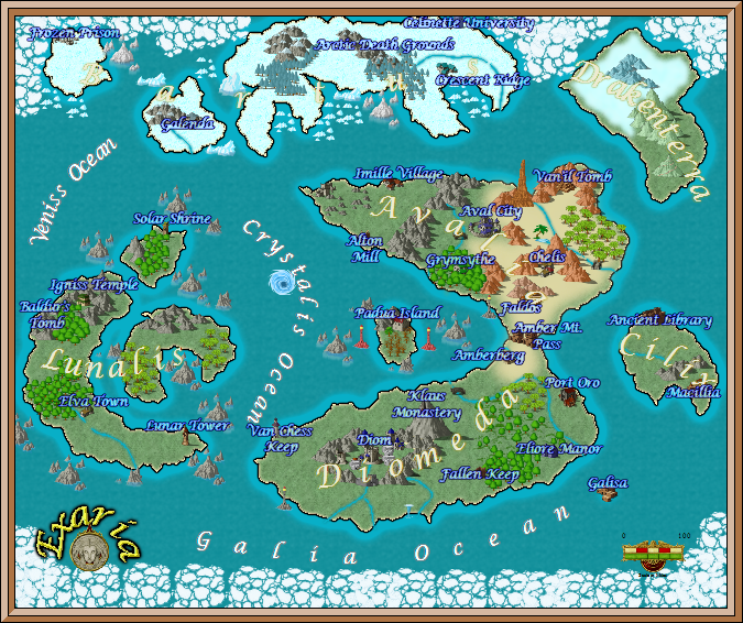
@zaera: http://i942.photobucket.com/albums/ad270/Zaeran/Eternal%20Dusk%20Screenshots/Exaria.png
That’s a very nice map, but how will it be displayed in-game? I’m afraid some things may be rather difficult to see at this level of zoom. I suggest you to remove the inner glow from the names of locations and use proper outlines instead so they become easier to read, and so they don’t blend with the snowy fields. Also, try to aim for a more consistent look, right now some things have shadows and some others don’t, some things have saturated colors and others don’t, and that’s quite jarring.
@Melkino: http://i.imgur.com/BfWTR.png
Whoa! What a beautiful map. I love how everything is arranged and the overall mood of it. The lights could be a little brighter but they don’t look bad as is. ...There seems to be something odd with the walls though. Some walls are three tiles high, and others are five tiles high, the columns also are five tiles high. I know not all ceilings are even, but if that’s the case here it’s not very well represented.
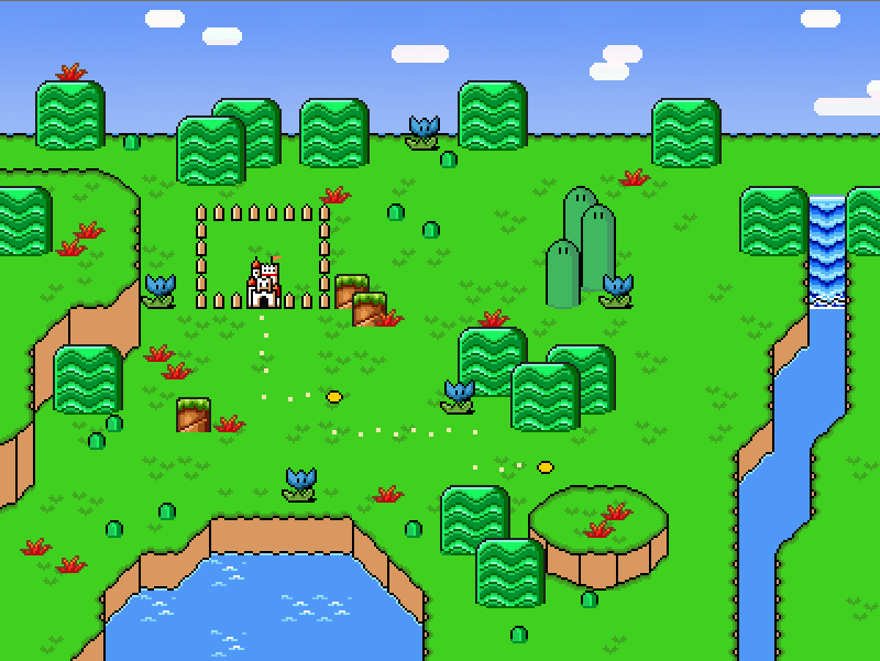
@Archeia_Nessiah: http://i.imgur.com/mrMyY.png
No offence but, Damn you! Damn you to hell!! >=8 ...On a more serious note. I don’t like how everything, even the grass has a brown lineart, which btw is not very consistent with the chara's sellout, but I guess that’s a matter of taste. Also, what is that line doing up there? Wait, is that really the horizon!?
That’s nice for a start. Now try rearranging the symbols in a more organized way, and bring down the title a bit more to an “eye level” if you know what I mean. Also, yes, brightening up the title is a good idea too.
@Demicrusaius: http://rpgmaker.net/media/content/games/706/screenshots/Tardis.PNG
Not bad. But you can still improve this screen quite a bit. First of all, clean up the phone cabin a little because it has too many ‘garbage’ pixels. Also, I suggest you to use a picture for the message box so you don’t have to deal with those awful black corners in the system skin... Lastly, those bananas look odd just pasted on top of the palm tress, but if the player can knock them down or something, I guess it can pass.
@Kentona: http://rpgmaker.net/media/content/users/105/locker/dokidoki_worldmap.png
The visual discrepancy between the graphics of SMW and the Snes version of SMB2 is quite noticeable, so why don’t you use the graphics from the original Nes version of SMB2 instead? They may still need to edited a bit, but I think they’ll make a much better match for the SMW graphics, at least in the world map.
@zaera: http://i942.photobucket.com/albums/ad270/Zaeran/Eternal%20Dusk%20Screenshots/Exaria.png
That’s a very nice map, but how will it be displayed in-game? I’m afraid some things may be rather difficult to see at this level of zoom. I suggest you to remove the inner glow from the names of locations and use proper outlines instead so they become easier to read, and so they don’t blend with the snowy fields. Also, try to aim for a more consistent look, right now some things have shadows and some others don’t, some things have saturated colors and others don’t, and that’s quite jarring.
@Melkino: http://i.imgur.com/BfWTR.png
Whoa! What a beautiful map. I love how everything is arranged and the overall mood of it. The lights could be a little brighter but they don’t look bad as is. ...There seems to be something odd with the walls though. Some walls are three tiles high, and others are five tiles high, the columns also are five tiles high. I know not all ceilings are even, but if that’s the case here it’s not very well represented.
@Archeia_Nessiah: http://i.imgur.com/mrMyY.png
No offence but, Damn you! Damn you to hell!! >=8 ...On a more serious note. I don’t like how everything, even the grass has a brown lineart, which btw is not very consistent with the chara's sellout, but I guess that’s a matter of taste. Also, what is that line doing up there? Wait, is that really the horizon!?
I knew that screen looked familiar, I just knew it wasn't a direct rip
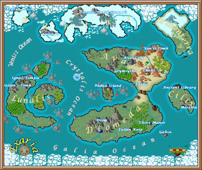
New update of the map,
@alterego, thanks for the input, I had already received some complaints about the legibility of some names already, and I had also noticed it myself. Hopefully this will resolve that. Also, as of right now the map will be used simply to display your location in the world. When your cursor hovers over an area, it will bring up the name and such. I may use it later for the teleportation system, but that's still debatable.

A lot of maps made in campaign cartographer wind up looking a lot like that. I've downloaded ones online for potential use in my D&D games that were very, very similar.
Of course, the good news is that one is particularly pretty. : )
Of course, the good news is that one is particularly pretty. : )

@Kentona: http://rpgmaker.net/media/content/users/105/locker/dokidoki_worldmap.png
The visual discrepancy between the graphics of SMW and the Snes version of SMB2 is quite noticeable, so why don’t you use the graphics from the original Nes version of SMB2 instead? They may still need to edited a bit, but I think they’ll make a much better match for the SMW graphics, at least in the world map.
Mostly because in the game we are using the graphics from the SNES version of SMB2 and SMW.
author=Little Wing Guy
Benos, you must have used MS Paint to decrease the colour depth of your title screen, because it's got that awful quality that only MS Paint can pull off.
I know exactly what you mean, but I actually find that quality can work well in certain circumstances. Which is, I admit, an odd thing to say.


author=Max McGeeauthor=Little Wing GuyI know exactly what you mean, but I actually find that quality can work well in certain circumstances. Which is, I admit, an odd thing to say.
Benos, you must have used MS Paint to decrease the colour depth of your title screen, because it's got that awful quality that only MS Paint can pull off.
It is a title screen, and not many people would stay long, unless you wanna listen to music or anything that. You could use F5 to make the rm2k/3 window smaller. So it doesn't glare too much at all.
Of course the title itself was abit glitchy and have to get rid of those dots to make it clearer. Whatever works. Some of the red head facesets, I have properly don't use much. I do have mikoto sets which has a long red haired girl, the graphical style is cool, but I want use it for this. I wanted a full set with lots of emotions, even if it didn't match the charset.
Then again, I could just edit the hair to make it look long. Not great of artist, it'll do.

