


THE SCREENSHOT TOPIC RETURNS
Posts


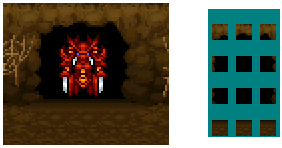
Oop, you saved in the same file, All I get is the charset pieces of mr boss and the cave door charset zoomed in squished. I just put it in seperately :p

author=benos
Oop, you saved in the same file, All I get is the charset pieces of mr boss and the cave door charset zoomed in squished.
Huh? Well, yeah, I made the cave, then formatted it in charset form, but I also added a preview of it just so you would know what I was posting. I saved it as one image to save on locker space? I was kind of planning on you putting into a charset yourself xD
author=benos
I just put it in seperately :p
I'm guessing you mean you put it into an actual charset? If not, the charset you would use in-game is right here : http://rpgmaker.net/users/Miracle/locker/Benos_CaveThing.png

That does look very good Miracle.
And I think the temple also looks better now chana. I've found from my own experience that more saturated colours are better suited to characters rather than environments, or at least environments the player will be spending a great deal of time in. It's just easier on the eyes, imo.
And that custom system looks great Adon237, though I am guessing a background or two still needs to be added. Cool stuff. :)

A game in which I combine Zelda: A LttP graphics with Dragon Quest. Everything is custom by me.
It's going to be like two awesome games uniting explosively. Will get a project page up after I do far more work.
It's going to be like two awesome games uniting explosively. Will get a project page up after I do far more work.
LockeZ

I'd really like to get rid of LockeZ. His play style is way too unpredictable. He's always like this too. If he ran a country, he'd just kill and imprison people at random until crime stopped.
5958
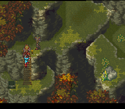
While it's true you could see a little bit of the backs of cliffs in Link to the Past, you couldn't see nearly as much of them as you could see of the front. It was still an angled perspective, somewhat viewed from the front, not looking straight down.
Meanwhile your cliffs look like a straight top-down perspective from directly overhead. You can see as much of the back walls of those hills as you can of the front walls. But your houses and trees and everything else clearly aren't at that perspective - they're at a normal RPG perspective where you can see a lot of the front and none of the back.
Maybe it's just me but it looks odd. Almost like you combined graphics from two games with clashing styles... hmmmmm...!
Also, are those graphics actually ripped from the games you mention, or are they actually done by you and just made to look like the games you mention? Your post seems to contradict itself.
author=LockeZ
While it's true you could see a little bit of the backs of cliffs in Link to the Past, you couldn't see nearly as much of them as you could see of the front. It was still an angled perspective, somewhat viewed from the front, not looking straight down.
Meanwhile your cliffs look like a straight top-down perspective from directly overhead. You can see as much of the back walls of those hills as you can of the front walls.
Maybe it's just me but it looks odd.Almost like you combined graphics from two games with clashing styles... hmmmmm...!
Also, are those graphics actually ripped from the games you mention, or are they actually done by you and just made to look like the games you mention? Your post seems to contradict itself.
Only jealous people put that much thought on some random dudes art. ;) But... You are right. My reference image for the cliffs didn't contain the back-sides of the cliffs so, I should rework that which is fairly easy to do. The houses on the other hand were kinda added in, from another abandoned project of mine they'll most likely get reworked.
But your houses and trees and everything else clearly aren't at that perspective - they're at a normal RPG perspective where you can see a lot of the front and none of the back.
If you play ALttP, the houses in that game follow a traditional RPG style (the back of a house is not so easily seen) the hills/cliffs seem to have more of an exception... Even that games' sprites adhere to the more classic style and not the perspective used in the game.
These graphics are custom but made in the style of ALttP.
Edit: Happy now?


That does look really nice Radnen! I especially like the detail on the cliff faces.
It's true that perspective is pretty hard to judge when there is no vanishing point and the game engine requires rather dubious proportions of things. I find this is especially true with outdoor elements, where it is very difficult to indicate the slope of the ground. Your revision looks okay to me, though some of the smaller trees look a bit like they are lying flat against the ground. I recommend perhaps changing the position of the tree stump.
I admire you for making all of the sprites yourself, as I have undertaken a similar task with my game and know just how much work is involved.
LockeZ
I'd really like to get rid of LockeZ. His play style is way too unpredictable. He's always like this too. If he ran a country, he'd just kill and imprison people at random until crime stopped.
5958
Yeah LttP isn't exactly perfect either. It's even worse indoors. Oh well. Commercial games being shitty is no excuse for indie games being shitty!
Yeah, Nintendo really needs to get their act together, lol! I'm guessing they were trying to capture the feel of the NES games, the problem being those games had simple perspective due to graphical limitations (such has having to have Link crawl across the world on his side).
Still, when it comes to a game like an old-school RPG, you can only get perspective so accurate, and chances are you'll end up 'fudging' things a bit. I've noticed that even the RPG Maker RTP fudges things a bit. I suggest an old rule of comics I read once for this issue, "If it looks good at a glance, it's good enough."
And now that I've set myself up for criticism, here is the latest version of my forest tile set:

Once again I'd love some feedback (I promise I won't post a bunch of the same images with slight variations like I did last time). How does the canopy look? Is it too hard to see the map? Do the tree trunks look good? Is there too much grass?
Thanks in advance!
Still, when it comes to a game like an old-school RPG, you can only get perspective so accurate, and chances are you'll end up 'fudging' things a bit. I've noticed that even the RPG Maker RTP fudges things a bit. I suggest an old rule of comics I read once for this issue, "If it looks good at a glance, it's good enough."
And now that I've set myself up for criticism, here is the latest version of my forest tile set:
Once again I'd love some feedback (I promise I won't post a bunch of the same images with slight variations like I did last time). How does the canopy look? Is it too hard to see the map? Do the tree trunks look good? Is there too much grass?
Thanks in advance!
the tree trunks look good, the grass looks fine. the canopy looks like butt. I'm not sure how to fix it, but it looks incredibly inconsistent with the tree trunks. I'd focus on making the canopy more leafy and full, as opposed to a 'dark grass tile' as it looks right now. if you compare your canopy to the blades of grass on the ground, the grass is actually thicker. it should be the other way around. i'm not saying you should change the grass, because it looks pretty good.
my earlier reference to a canopy from chrono trigger:
see how the leaves are full and puffy? i would aim for a style more closely related to that. would work with your tree trunks alot better.
my earlier reference to a canopy from chrono trigger:
see how the leaves are full and puffy? i would aim for a style more closely related to that. would work with your tree trunks alot better.
First glance(!) : the foliage is too square on the front (as well as the earth patches on the ground) and too compact (also) behind, the light is nice though.
Eit : yes, more "leafy", make some leaves appear (though that must be some work custom made!).
Eit : yes, more "leafy", make some leaves appear (though that must be some work custom made!).
Ah, I thought the canopy could use some work. You can probably tell it's a graphic I didn't spend that much time on in order to get the map assembled.
Thanks guys! I shall work on a much nicer canopy next. Artist away!
Thanks guys! I shall work on a much nicer canopy next. Artist away!


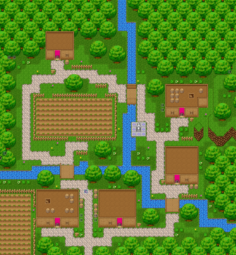
Edited RTP! First map in game directory!
Going to throw in a few silly things like being able to squish flowers when you walk on them, access rooftops, etc. Not sure what else, but I'll think of something.
Going to throw in a few silly things like being able to squish flowers when you walk on them, access rooftops, etc. Not sure what else, but I'll think of something.

