


THE SCREENSHOT TOPIC RETURNS
Posts

author=Yellow Magic
But where is the audience?
The outer rim of the arena. You'll hear them roaring with sound effects.

Hi everyone.
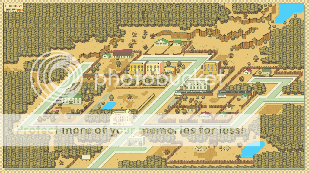
This is a mockup of the town of Scrubby, I think everyone recognizes what game the graphics are from & etc. There are some weird imperfections and artifacts left over from splicing it together, but I'm pretty pleased with how it turned out. If anyone is interested in getting a closer look they can check it out on my Deviantart here:
http://nemojovitarbatkastle.deviantart.com/art/Scrubby-203105894
*I've switched to photobucket, so hopefully that'll fix any problems*

You might want to use imgur/photobucket/tinyimage(?) for distributing pics because imageshack blocks other countries :) if by anything tho that DA map is awesome

Looks great, NJB. I'd suggest though opening up some of the side walls. I know some are probably setup to keep the player from getting there early, but some of the walls will just result in the player having to walk WAY around something to get somewhere quite close. Still an awesome map, though.
hmm, I see what you mean...expect a later iteration with more connecting alleys. I want to keep some of the fences because Scrubby is very much a 'me and mine' sort of place, the kind of town where walls for horrible neighbors make, as it were.

author=Yellow Magic
But where is the audience?

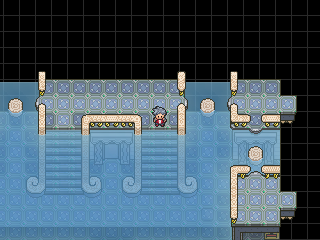
There. I will properly end up using the full system set, so it won't cover the hero. This is the first battle against a Smogual Summoner. I made too hard, but now it's pretty easy, but a HP hit grind, so you won't easily die.
There are two people who look suspicious in the crowd, you just have to guess. They'll become prominent a little later in a interruption event for a losable boss fight.
author=benos
There are two people who look suspicious in the crowd
i count two black/ethnic charsets what gives

The arena needs to be filled with some little stuff like little plants or stones. Also some of the chars in the crowd seem to have lost some colors... left side, fifth person from the bottom. What happened to her? She does not look that crappy in RTP. The same with the red-haired gurl next to her.
author=tardisauthor=benosi count two black/ethnic charsets what gives
There are two people who look suspicious in the crowd
That's racist, man. That's not what I'm talking about, it's not the spoon that bends. :p
author=Deacon Batista
The arena needs to be filled with some little stuff like little plants or stones. Also some of the chars in the crowd seem to have lost some colors... left side, fifth person from the bottom. What happened to her? She does not look that crappy in RTP. The same with the red-haired gurl next to her.
I edited some rtp, so it's bound to be out of sync a little. I'm not talking about the black chick.
Edited RTP: Red haired with yellow shirt, silverish black head with red shirt.
Unrelated to the rtp, the top corner of the left area with the red head with the blue bandana does seems out of place though, so I'll change that, I just randomized the crowd, so it is temporary.


The Dream World is essentially the first playable environment (where the player takes control of the protagonist). I use the excuse of the dream to explain how the game works, referencing to video games concepts à la Earthbound. I thought it would be a good idea to justify explaining some more complex elements of the game.
I just noticed there was some white left around the cloud but I'll fix that later.
alterego mentioned that my linework needed some work so I took extra care about that.

C&C welcome and encouraged as always, I always take feedback. I for one am not sure about the Elvis looking star. I'm also under the impression that the sky is empty.

Very awesome graphics, Creation. :]
I think the sky looks fine, almost feels if there was any more it might get cluttered.
And I think the text bubble is too long on the right side, cutting it down to correspond with the left side would make it look better imo.
I think the sky looks fine, almost feels if there was any more it might get cluttered.
And I think the text bubble is too long on the right side, cutting it down to correspond with the left side would make it look better imo.

@Creation: Oooh, looks very nice, all those stars look great imo
The background also looks nice, the character's eye seems a bit weird though
If you think it looks too empty i suggest adding more defined shapes sticking out from the cloud.
The background also looks nice, the character's eye seems a bit weird though
If you think it looks too empty i suggest adding more defined shapes sticking out from the cloud.
A new batch of screenshots from Oniromancie:
Ocean Kronika - Drizzt

??? - AVM

??? - Daxter

??? - Gaetz

Gold Fever - Karreg
Ocean Kronika - Drizzt
??? - AVM
??? - Daxter
??? - Gaetz
Gold Fever - Karreg
Man are these people pros or are they just very dedicated MakgamLADs?
This is why I love the screenshot topic. I get so many cool ideas.


