


THE SCREENSHOT TOPIC RETURNS
Posts

@ LockeZ
Thanks!
I think I need to adopt a new personal mantra: Copy paste in haste, look like a mental waste.
@ supremewarrior
The tiles are from the old future chipsets that came with Rm2k, so I probably should have pumped the resolution up some when I did the scaling and perspective work instead of leaving them in indexed color.
@ Chana
It is supposed to be a secret lab... and the floor and ceiling bits have been driving me insane. When I get them smoother and make the edges of the tiles line up with the walls, it just looks... weird for some reason. This was actually the least offensive of about twenty variations I came up with so far.
Re-posting Arcan's shot from the previous page:
author=arcan

No need to worry about me, I pretty much got all the feedback I needed. I think you should change the font color to match the scheme better.
edit: Or the color scheme all together. If you are making a game with a lot of violence red might be a good color but if it's more of a mysterious/creepy type of setting I don't think having red as the main color would work well. Well here is an example:

edit: Or the color scheme all together. If you are making a game with a lot of violence red might be a good color but if it's more of a mysterious/creepy type of setting I don't think having red as the main color would work well. Well here is an example:

Been revamping a port town, but I'm not sure what to do with the little "cliff" at the bottom where it's meant to transition to the sea...


Melkino: That's really nice. One thing that kinda bugs me is that the bottom support breaks off mid-arch. It'd be more realistic if it stopped at the end of the post. Maybe use a little parallaxing on that part?
Apart from that, it's really nice.
Apart from that, it's really nice.

Arcan: I would go with the red, it makes a better contrast against the area screen.
Melkino: I like it! But that hanging arch at the edge of the map bothers me as well, but it should be fine.
And now, for a picture from the news section of my project. Note this is still WIP and might get released depending if I think it is good enough (I rarely release anything due to me disliking most of my work) The sprite will be replaced when I draw a new one for Smoke James, but here we are:
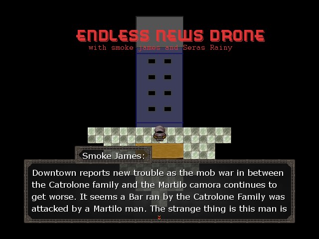
I'm debating if I should only show the logo at the very beginning or to keep it up there. I like it both ways... The idea is for it to be simple, by the way.
Melkino: I like it! But that hanging arch at the edge of the map bothers me as well, but it should be fine.
And now, for a picture from the news section of my project. Note this is still WIP and might get released depending if I think it is good enough (I rarely release anything due to me disliking most of my work) The sprite will be replaced when I draw a new one for Smoke James, but here we are:
I'm debating if I should only show the logo at the very beginning or to keep it up there. I like it both ways... The idea is for it to be simple, by the way.
@Liberty: Thanks, I didn't even notice that cutoff. I'll go fix it soon.
@facesforce: Thank you :)
As for your map, were you going for a modern setting? In my opinion, the default RTP tiles don't seem to fit with the dialogue or the building in the background. (But if they're placeholders, feel free to disregard this) I think the logo would be fine just staying up there.
The setting is modern, and the rtp is a placeholder... I'm not quite sure what to put in the background, so I stuck one of my buildings there. It is like a news show that comes on, so I am having some trouble with deciding how it should look.
Yeah the red is certainly more interesting but it doesn't go with the text. I think I made the image too desaturated so it looks boring otherwise I always go with the "cleaner" look.

@facesforce : IF you can do that, you could have a big screen behind, showing the 2 mafia heads (for example)... ? The floor should definitely look less like a kitchen floor,imo, also the table should look more like a bureau, or just think of something from here on, tv news screen-like?
Hmm... Yeah, a big screen would work well. I'll redesign this as soon as possible.
EDIT: That is easily Possible, as I am drawing most of this by hand. I'll just do some profiles for them, and it will work out fine.
EDIT: That is easily Possible, as I am drawing most of this by hand. I'll just do some profiles for them, and it will work out fine.

author=arcan
edit: Or the color scheme all together. If you are making a game with a lot of violence red might be a good color but if it's more of a mysterious/creepy type of setting I don't think having red as the main color would work well. Well here is an example:
Stick with the 'cleaner' style, it goes with it much better. Very nice. Me like the 3D version of the RM Future Chipset. :D
Nice port town, as well, Melkino. :D

Yessss I like arcan's colour scheme, it works well with the overall scheme of things. That is a very intriguing screenshot!
Even though I was dead set on using my red&black system, the gray version really looks great. What I think I might do now is make a couple of different system color schemes that change with the area to let the player know how much danger they're in. I also think I'll give the player the option to turn that function off and pick whichever system scheme they would like.

@Killer Wolf
I also prefer the blue to the black and red, as I think it is easier on the eyes. However, changing the system graphics under different circumstances sounds like a neat idea.
@Melkino
The town looks good, but I notice that the bridge struts seem to terminate immediately when they hit the water, which makes the water seem very shallow. It's not a big deal, but if possible I suggest having the architecture extend further below the water's surface. As others have suggested, I would also shuffle the arches around to avoid breaking off mid-arch.
@facesforce
The plot seems interesting. Knowing that those are placeholder graphics, it is hard to give feedback. However, I would do something to make the building look larger (such as placing it further away from the sprites so that it appears in the background), or just make it larger. The RTP tiles also seem out of place, but I imagine you're already planning on changing those.
And now, after quite a bit of pixel-pushing and head scratching, here is my new tree canopy:

As you can see, it is much more diagonal and natural-looking than before, but since RPG Maker XP's autotiles don't handle diagonal sprites that well, you'll notice a slight blockiness to the border if you look closely. I'm curious as to whether you guys think the overall effect looks good.
I also prefer the blue to the black and red, as I think it is easier on the eyes. However, changing the system graphics under different circumstances sounds like a neat idea.
@Melkino
The town looks good, but I notice that the bridge struts seem to terminate immediately when they hit the water, which makes the water seem very shallow. It's not a big deal, but if possible I suggest having the architecture extend further below the water's surface. As others have suggested, I would also shuffle the arches around to avoid breaking off mid-arch.
@facesforce
The plot seems interesting. Knowing that those are placeholder graphics, it is hard to give feedback. However, I would do something to make the building look larger (such as placing it further away from the sprites so that it appears in the background), or just make it larger. The RTP tiles also seem out of place, but I imagine you're already planning on changing those.
And now, after quite a bit of pixel-pushing and head scratching, here is my new tree canopy:
As you can see, it is much more diagonal and natural-looking than before, but since RPG Maker XP's autotiles don't handle diagonal sprites that well, you'll notice a slight blockiness to the border if you look closely. I'm curious as to whether you guys think the overall effect looks good.
The overall effect looks good; would it be possible just to lighten the foliage a bit? (Also the plantation with the round things is big and special, maybe reduce it a bit?), the house looks great, characters, earth and grass also, great job!
Thanks for the feedback. I kind of want to keep it fairly dark, as it makes the square parts a bit less obvious, but I will experiment with a few additional colours.
The garden is actually part of a game-long sidequest. Rud can return home to visit his mother (yes, a hero with parents!), and one of the things he can do while there is plant seeds in the house garden. The seeds then grow into plants which yield healing and other items. Rud can buy generic seeds at stores, but he can also find rare ones in dungeons or by competing in contests. I wanted to make sure that the player had plenty of patches of earth to experiment with, but since this sidequest is still in development the number isn't fixed.
I'm thinking of adding a straw roof to the house. What do you think of the idea?
I dont think it's necessary, but if you want to try..? (I see what you mean with the canopy, maybe a little lower then on the trunks, from the right up to where it is lower ?)

