


THE SCREENSHOT TOPIC RETURNS
Posts
@Felipe The title screen reminds me of Matrix.


It's not the RTP. It's a mix of Mack tiles with a few RTP ones thrown in. Sheesh!
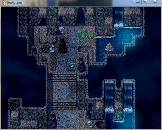
One error - which you've at least kept constant :P - is that of the cliff heights when it comes to the lighter cliffs. Example: bottom right. It should extend one tile lower for those parts with a lighter 'roof'.
One error - which you've at least kept constant :P - is that of the cliff heights when it comes to the lighter cliffs. Example: bottom right. It should extend one tile lower for those parts with a lighter 'roof'.


Honestly, I can't tell the difference either, Chana.
Good work by the way, Yuna!
Don't see too much wrong with it.
Good work by the way, Yuna!
Don't see too much wrong with it.


@yuna21
They are very nice tiles, and that is some good mapping. In addition to the height error Liberty mentioned, I notice that the lower staircase appears to have lines separating the individual sections, whereas the upper one does not. I think the upper staircase looks much more natural, so I would recommend redoing the lower one in the same way.
They are very nice tiles, and that is some good mapping. In addition to the height error Liberty mentioned, I notice that the lower staircase appears to have lines separating the individual sections, whereas the upper one does not. I think the upper staircase looks much more natural, so I would recommend redoing the lower one in the same way.
Ah, I'd knew there'd be an error regarding the elevation. I'll fix that up then. I didn't even spot those lines on the lower staircase. Some of you guys have real sharp eyes. ^^
@tpasmall: It's Woratana's Multiple Fog script. :)
@tpasmall: It's Woratana's Multiple Fog script. :)


Fixed. Not much difference, apart from the elevation. ^^

And here's another screen, this time using lighting overlays, screen tints and weather effects. I should probably get rid of that light beam in the upper left corner.

The line of bushes on the right is weird, because it's darker than the one on the left, in spite of receiving light from many sources...

My issue with that lower screen is that the wooden bridge looks a little out of place. Maybe use some shift key mapping with that same stone tile to make it blend in?
Or 'borrow' the stone bridge from the VXA RTP. Also, perhaps get rid of the side pieces for it, since you've a railing. Otherwise it looks quite nice. ^.^
I think the bushes on the right are darker because of the lighting, not because they are different bushes.
And I like the bridge except for the bottom of it. I think the wood look adds something to it.
And I like the bridge except for the bottom of it. I think the wood look adds something to it.
author=slashphoenix
he goes boom
Is that the exploding bird from Angry Birds?

