


THE SCREENSHOT TOPIC RETURNS
Posts


Yes, I know I just posted this on my game page, if only because it's an update to an image I've already got there to better reflect what the ACTUAL game is like, rather than, you know... what there was four years ago. :P
... and as if on cue, right as I look at it for more than five minutes, I realize one GLARING flaw. Which has been rectified. (see if you can guess what I'm thinking of)

Very nice, trance. Seems like it'd be an epic battle.
let me go
let me go i say
sorry
can't take you seriously you have a british accent
bollocks. you're a bloody git, you hear me
snerk
bollocks
let me go
let me go i say
sorry
can't take you seriously you have a british accent
bollocks. you're a bloody git, you hear me
snerk
bollocks

author=trance2
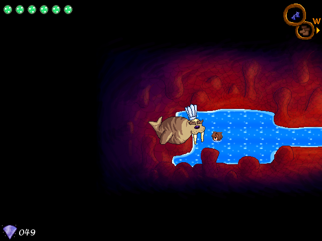
http://rpgmaker.net/media/content/games/9/screenshots/update_boss_fight.png
I really really really like the style of the enemy sprite. It's such a shame the character sprites don't follow that and crash terribly.
author=calunioHow so? Perhaps my eyes aren't exactly trained for that, but the only thing I could possibly think is different is that the enemy sprites MIGHT be flatter in color, but looking between the two, I can't tell any difference in color depth. :x
I really really really like the style of the enemy sprite. It's such a shame the character sprites don't follow that and crash terribly.
author=SorceressKyrsty
Very nice, trance. Seems like it'd be an epic battle.
Considering it's an end-of-chapter fight, I would hope so. :P
There's more colours on the other sprites, and the enemy graphic has a black outline rather than a coloured one.
I think he means more of the sprite style. IF your characters looked like the enemy sprites in that style.
author=SorceressKyrsty
There's more colours on the other sprites, and the enemy graphic has a black outline rather than a coloured one.
I definitely see the outline thing you're talking about... That's easily remedied at least. It'll be easier to just modify the monster sprites so they have colored, rather than black, outlines, because if I did the characters, then every single thing, from the charasets to the bcharas would have to be changed. And I'm only willing to fix one thing, if you know what I mean. Either way will bring the two more in-sync.
Still can't see there being more colors on the party, though, other than the fact that their outfits are more interesting and have more parts to them...

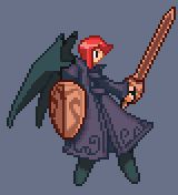
This is what I've done so far with it. Like I said, as nice as they are, it's easier to increase detail on 200 sprites as opposed to decreasing detail on 1800. Pretty sure the only other thing I'd have to do is... change the shading? Gotta figure out where the extra shading would go, though.
The glaring flaw I noticed actually WAS the eye = black line thing. First thing I did after posting was go into iDraw and fix that.
I didn't think it was a flaw, I think it was a style thing. And though your edit still looks good, I like the previous style better. But yeah, changing 200 is better than changing 1800.
trance trance trance nooo
noooo
BANDING
DON'T JUST BAND THE EDGES
can you give me the base file please
I'll give you an example so you can make any other edits yourself :)
edit: can you also give me one of the mack sprites, preferably one with a purple palette on it.
noooo
BANDING
DON'T JUST BAND THE EDGES
can you give me the base file please
I'll give you an example so you can make any other edits yourself :)
edit: can you also give me one of the mack sprites, preferably one with a purple palette on it.
Band...ing? o.o
Dammit Jim, I'm a writer, not a spriter. ^^;
I'll PM you a link from my locker.
Also, I assume you mean FSM sprites. I'll look through my folder, see if I have something with a decent amount of purple and stick it in my locker.
Dammit Jim, I'm a writer, not a spriter. ^^;
I'll PM you a link from my locker.
Also, I assume you mean FSM sprites. I'll look through my folder, see if I have something with a decent amount of purple and stick it in my locker.
Sprite:

Comparison:

I think you'll have to possibly change the sprite's mode back because it wasn't letting me add colours.
The wings were a bitch. Feel free to edit them back to their original state if you so wish.
(if the images don't show up, the links are:
http://rpgmaker.net/users/SorceressKyrsty/locker/mon_100redit.png <- sprite
http://rpgmaker.net/users/SorceressKyrsty/locker/comparison.png <- comparison)
Comparison:
I think you'll have to possibly change the sprite's mode back because it wasn't letting me add colours.
The wings were a bitch. Feel free to edit them back to their original state if you so wish.
(if the images don't show up, the links are:
http://rpgmaker.net/users/SorceressKyrsty/locker/mon_100redit.png <- sprite
http://rpgmaker.net/users/SorceressKyrsty/locker/comparison.png <- comparison)
Yeah, I did have to index it.
At first I thought it was TOO complex, but then I went and put one of the sprites in RGB mode, then indexed it with exact colors (as opposed to 256, which RM2k* needs) and... the enemy sprite has 56 colors; the party sprite has 55 colors. So... I guess my eyes are just silly.
Thank you, though. I'll definitely take a close look at the shading to see if I can apply it to other sprites. ^^

Who's up for some foreign screenshots?
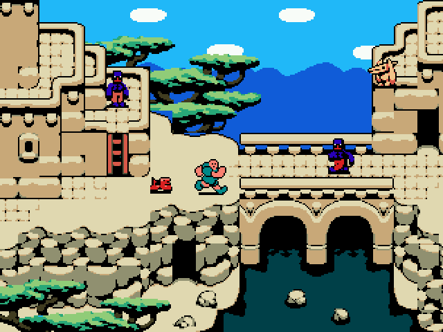
by Simonbarbarie
Not really my cup of tea but it's definitely original.

by sriden
Takes place during WW2 if I recall correctly.
By Al Ea
Huge fan of the graphic style, perhaps a bit too dark
By RoioftheSuisse
Bit of a graphical clash here but nice none the less.

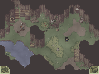
By RaZ & Shaman
My favorite lately, a unique style.
by Simonbarbarie
Not really my cup of tea but it's definitely original.
by sriden
Takes place during WW2 if I recall correctly.
By Al Ea
Huge fan of the graphic style, perhaps a bit too dark
By RoioftheSuisse
Bit of a graphical clash here but nice none the less.
By RaZ & Shaman
My favorite lately, a unique style.


Creation the most charming thing about those screenshots is that I have no idea what those games are about, they look like games that don't really exist = dreams, and everybody knows that dreams > reality.


