


THE SCREENSHOT TOPIC RETURNS
Posts

Man the graphical style of that last one is so kiwintpuo. Right down to the shading.
@Iddalai that is really cute haha.
@Iddalai that is really cute haha.

I changed my faces again... looks better ..i think

Original battle char animations, need more practice

The battle char animation looks nice, but I'm not a fan of her blonde hair. It's too bright imo, the highlights especially.
The eyes on her faceset look too spaced out, too.
The eyes on her faceset look too spaced out, too.

@Archeia_Nessiah thanks! It was one of my first attempts at animated sprites, so I went with pacman since it's only 2 frames. Noticed the teeth in the 16bit one? :D
I'm planning a game where the player is an actual force in the world, the game changes gameplay and art style 4 times (zx, 8bit, in between, 16bit) through the story, these are 2 test screens for my chipset and chars for the ZX phase:


With this game I also hope to gain more pixel drawing skills.
I'm planning a game where the player is an actual force in the world, the game changes gameplay and art style 4 times (zx, 8bit, in between, 16bit) through the story, these are 2 test screens for my chipset and chars for the ZX phase:
With this game I also hope to gain more pixel drawing skills.
Yippe Ki Ya, mothereffer.
I'm back with another investigation into my graphical (sub)standards. It's been brought to my attention that my monitor is set fairly dark compared to other monitors, or maybe the other monitor I tested on was actually just really bright.
My question is, when you look at the generally black areas of the map like sprite shadows or the jailcell holes, do you see a dark enough color to call black? Or is it noticeably navy blue?


Not noticeably navy blue but not black either, rather darkish grey, yeah, it needs to be seriously darkened.
Thanks you two. I cranked my monitor's brightness and experimented a bit. How's this replacement look by comparison?

Now my eyes hurt ;-;
Now my eyes hurt ;-;
LockeZ

I'd really like to get rid of LockeZ. His play style is way too unpredictable. He's always like this too. If he ran a country, he'd just kill and imprison people at random until crime stopped.
5958
Better
LockeZ
I'd really like to get rid of LockeZ. His play style is way too unpredictable. He's always like this too. If he ran a country, he'd just kill and imprison people at random until crime stopped.
5958
The light entering the bottom of the grates makes them look like windows rather than floor grates.
Consider just getting rid of the shadows around the characters...
To be honest I find your entire style of graphics blinding and intolerable.
Consider just getting rid of the shadows around the characters...
To be honest I find your entire style of graphics blinding and intolerable.

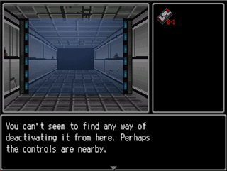
Shrank this down because it's kind of bland to be so big. It shows off the transparent wall type for the forcefields (which was a major pain to get working correctly), the new muted gray console/system set for when the player isn't in immediate danger, and what is sort of a progress meter on the right.
You requires items, usually keycards, to advance through the levels. I figure three required items per dungeon level, with five levels. That way the player gets visual feedback about how far along they are in a given floor, and level. Theoretically.
LockeZ
I'd really like to get rid of LockeZ. His play style is way too unpredictable. He's always like this too. If he ran a country, he'd just kill and imprison people at random until crime stopped.
5958
RPG Maker 95 wasn't 3D. It used chipsets and sprites like the newer RPG Maker programs.
Forcefield works well in that it lets you see what's past the door, tantalizing you.
Forcefield works well in that it lets you see what's past the door, tantalizing you.
author=LockeZ
RPG Maker 95 wasn't 3D. It used chipsets and sprites like the newer RPG Maker programs.
Forcefield works well in that it lets you see what's past the door, tantalizing you.
I was actually referring to Dyhalto's screenshot; Killer Wolf happened to post two minutes before I did.
Anyway, I'm loving the screenshot Killer Wolf. It creates a nice claustrophobic atmosphere, imo.
@ iddalai: superhuge fan of the 1bit aesthetic. vvcool
consider increasing the per-tile average value contrast between water and land
consider increasing the per-tile average value contrast between water and land
@sixe hmmm, there's no water there, so I'm guessing one the tiles looks like water, oh no. Is it the one with the small circles (lower right corner for both images)?
Thanks for the imput, I'll definitely consider it when I actually make water (overworld and such).
Thanks for the imput, I'll definitely consider it when I actually make water (overworld and such).

My recommendation would be to make any ground tile solid black, smattering a few blades of grass aperiodically to imply the texture you want. You definitely want your sprites and impassable tiles to contrast against the passable ones, otherwise the graphics are cluttered and confusing.

