


THE SCREENSHOT TOPIC RETURNS
Posts

I like how some praise NOACCEPTANCE772s quite honestly horrible looking screenshots (others have pointed out most of the flaws), while somebody who made a actual effort besides ctrl+c ctrl+v get nitpicked over fireplaces and open windows and other super small stuff (in comparison).
Don't take this the wrong way, I'm not upset about it or anything like that, I just find it amusing.
I wonder what the psychology behind that is? "It's so shitty it's good"?
I also find it amusing how NOACCEPTANCE772 only takes positive criticism to heart and completely ignores or rationalizes negative criticism. You go girl! (I'm hoping that last line will make the subject more receptive to this post)

author=SnowOwlDifferent people like different stuff.You find my stuff shitty,you're welcome.
I like how some praise NOACCEPTANCE772s quite honestly horrible looking screenshots (others have pointed out most of the flaws), while somebody who made a actual effort besides ctrl+c ctrl+v get nitpicked over fireplaces and open windows and other super small stuff (in comparison).
Don't take this the wrong way, I'm not upset about it or anything like that, I just find it amusing.
I wonder what the psychology behind that is? "It's so shitty it's good"?
I also find it amusing how NOACCEPTANCE772 only takes positive criticism to heart and completely ignores or rationalizes negative criticism. You go girl! (I'm hoping that last line will make the subject more receptive to this post)
Others find it good,they're also welcome.
;)
+ I'm not a girl.

author=SnowOwlThat's the thing though, I don't find it shitty. I find it rough and flawed, but it's obvious a lot of work has gone into it with some kind of logical style choice in mind.
I wonder what the psychology behind that is? "It's so shitty it's good"?
It's just different, y'know? It's like Space Funeral or the ilk, not comparing his game with those games but it has a charm over the other generic fantasy RTP rpgs out there.


I like the very cartoony-old school graphics you got there, itrombe.
But the system graphics are alittle hard to look at, kinda sickening ._.
But the system graphics are alittle hard to look at, kinda sickening ._.
author=itrombe
=D What about it looks off to you?
It would definitely be the pink letters/numbers. That's probably just it, otherwise the colors flow nicely with the rest of the battle scene.
Good clean screenshot obsorber, I like XP RTP a lot. :)
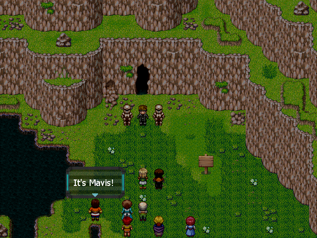
What are you up to with this new fantasy project?
What are you up to with this new fantasy project?

author=NOACCEPTANCE772
Different people like different stuff.You find my stuff shitty,you're welcome.
Others find it good,they're also welcome.
;)
+ I'm not a girl.
Disregarding the mismatching resources and lack of cohesive design, your screens ARE suffering. Look at the negative space to positive space ratio, everything is scaled way too big, and is confusing.
i realize these are battle pics but christ, they hurt to look at. Try making the backs of the heros smaller, move them down more, scale down your enemies, clean up the graphics in general. i dont know what the text is on the lefthand side, but should probably remove that, or at least change that blackletter font. System set looks ugly too. try something cleaner.
Trying to help
author=Dookieauthor=NOACCEPTANCE772Disregarding the mismatching resources and lack of cohesive design, your screens ARE suffering. Look at the negative space to positive space ratio, everything is scaled way too big, and is confusing.
Different people like different stuff.You find my stuff shitty,you're welcome.
Others find it good,they're also welcome.
;)
+ I'm not a girl.
i realize these are battle pics but christ, they hurt to look at. Try making the backs of the heros smaller, move them down more, scale down your enemies, clean up the graphics in general. i dont know what the text is on the lefthand side, but should probably remove that, or at least change that blackletter font. System set looks ugly too. try something cleaner.
Trying to help
Ok.I'll try to fix these problems.Thnx for your feedback.
So I watched your battle video. Aside from what Dookie said, there's one other issue I didn't quite like.
What is the text below the monster that is being obscured by the party? Is it the monster's name? Regardless, it is unreadable down there and I think you should move it above, to the side, or just anywhere where it can be read by the player.
What is the text below the monster that is being obscured by the party? Is it the monster's name? Regardless, it is unreadable down there and I think you should move it above, to the side, or just anywhere where it can be read by the player.

author=SnowOwl
I like how some praise NOACCEPTANCE772s quite honestly horrible looking screenshots (others have pointed out most of the flaws), while somebody who made a actual effort besides ctrl+c ctrl+v get nitpicked over fireplaces and open windows and other super small stuff (in comparison).
Hi. To answer your question, I try to avoid redundancy in my criticism by not bringing up critques that other people have already made, instead opting to point out details that are easy to miss. There is no point in not 'nitpicking' in this thread; it is understood that we are all engaged in peer review and that we criticize only with the best of intentions. :)
Just another side project I'm going to work on this summer. It's currently unnamed. My exams end this week so I'm buzzing for RPG making and looking for something inspirational to get my creativeness flowing. Thanks for the complement. :)

@ Noacceptance
I think the blood is okay if it only happens after they die, it really does look ridiculous since it happens every time you hit them.
I think the blood is okay if it only happens after they die, it really does look ridiculous since it happens every time you hit them.

Just a town using Mack's tiles. Tell me what you think. I was working on different roof types, since I'm tired of plain roofed houses. =)
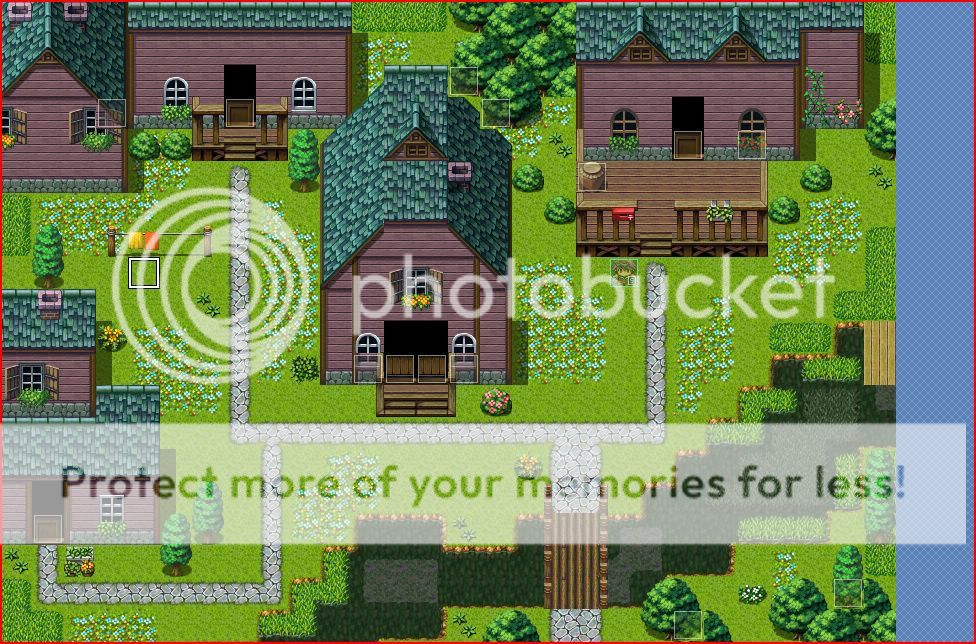
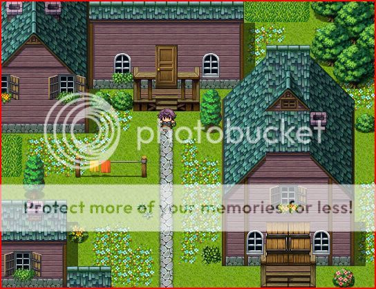
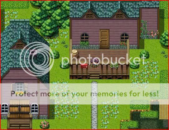

The porch railings are way too tall for the visual effect you're after. They could probably be easily edited though with MS Paint.
Also, something just doesn't seem right with the top of the roofs (the attic sections). The non-conformity between the sloped sides and flat top just sticks out sorely.
Also, something just doesn't seem right with the top of the roofs (the attic sections). The non-conformity between the sloped sides and flat top just sticks out sorely.

