


THE SCREENSHOT TOPIC RETURNS
Posts
LockeZ

I'd really like to get rid of LockeZ. His play style is way too unpredictable. He's always like this too. If he ran a country, he'd just kill and imprison people at random until crime stopped.
5958
Place cursor one tile down from the uppermost end of the sidewalk, shift-rightclick
Place cursor on the uppermost end of the sidewalk, shift-leftclick
YAY
I like the porches but agree the rails are not designed for chibi sprites. The rails are taller than the clothesline! They seem to be for RMXP sprites. The doors have the same problem. I like the tileset you're using waaaaaay better than unadulterated VX RTP, but it doesn't work with that sprite, unless he's three years old. Consider using XP sprites (or something else) if you're using those mack tilesets.
Plain is still the word I'd use to describe those rooftops, honestly. It seems less like you're doing something unusual and more like you just finally figured out how to use the tileset. Not that that's a bad thing. It looks good, and it looks better than people who don't know how to use the tileset.

Mack tilesets are kinda design for mack sprites, dude ;c
LockeZ
I'd really like to get rid of LockeZ. His play style is way too unpredictable. He's always like this too. If he ran a country, he'd just kill and imprison people at random until crime stopped.
5958
YES THAT. That makes seeeeense.

Thank you for all the feedback and criticism.
Lol, I know that they are designed for bigger sprites, I just didn't have one on hand. xD
And, I see what you mean about the porches not being to size. If I were to put the house on the stilts as well, do you guys think it would look better?
I know, I just can't figure out how to use the roof tiles. I'll keep trying.
@Link No, I didn't draw anything. This tileset is by Mack, and the sprite is RTP.
Personally I think VX is poor for the character-sets appealing with some of the tile-sets. I mean you get oober large doors for houses when your characterset is tiny. I think it's partially unavoidable too. Any-hows I still think the mapping is pretty good.
Here's another screenshot in Raynor Mines.
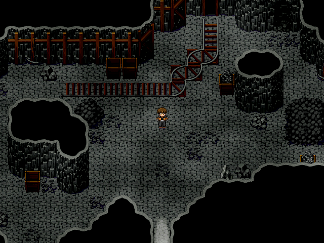
Here's another screenshot in Raynor Mines.


That looks really sexy Chaos, my only complaint are the two outer walls that appear should be isometric but are really not.

LockeZ
I'd really like to get rid of LockeZ. His play style is way too unpredictable. He's always like this too. If he ran a country, he'd just kill and imprison people at random until crime stopped.
5958
If you can see outer walls your screen is way better than the one I use at work. I can't tell where the floor ends and the black background begins.
You wouldn't have to it's not a train station. The Mine uses the boxes to make it easier to shift boxes of mined minerals around, that's all.
author=Largeauthor=obsorberI wouldn't want to ride in the curved sections of the tracks.
author=alwaysivy
@Link No, I didn't draw anything. This tileset is by Mack, and the sprite is RTP.
My comment was for itrombe ^.^;

@Link: Yep! My goal is to do all graphics and music from scratch, but tiles/charsets are a bit annoying to do without much energy .-. Battle stuff is funner and easier, haha.
author=obsorber
You wouldn't have to it's not a train station. The Mine uses the boxes to make it easier to shift boxes of mined minerals around, that's all.
author=Largeauthor=obsorberI wouldn't want to ride in the curved sections of the tracks.
All I meant is that the angles of the curves are impractical and unrealistic (Although I'm sure that is not what you're aiming for).


author=Largeauthor=obsorberAll I meant is that the angles of the curves are impractical and unrealistic (Although I'm sure that is not what you're aiming for).
You wouldn't have to it's not a train station. The Mine uses the boxes to make it easier to shift boxes of mined minerals around, that's all.author=Largeauthor=obsorberI wouldn't want to ride in the curved sections of the tracks.
Agreed, I feel like there would be one 90 degree turn as opposed to 5. Realistically, whoever was using it would spend less time/energy maneuvering a cart full of minerals or ore through one turn, so it would be more practical. Just one of those little details that a lot of people will pick up on.

C_Chris, your maps are both very strange and very interesting to look at. I don't know if I'd call them good, but I'd definitely say that they look fun.
LockeZ
I'd really like to get rid of LockeZ. His play style is way too unpredictable. He's always like this too. If he ran a country, he'd just kill and imprison people at random until crime stopped.
5958
author=LockeZ
If you can see outer walls your screen is way better than the one I use at work. I can't tell where the floor ends and the black background begins.
Just wanted to point out the image is completely visible - bright and friendly, even - on my home computer. Not sure if you fixed it or if my work monitor is really that shitty. (this is Chaos's screen I'm talking about by the way)
Okay, so I've been making custom Fire Emblem mugs for my SRPG over the years.
I've just noticed that, thoughout those years, I've been using a monitor that's darker than other monitors. On the other hand, this new computer I'm on has a lenovo stupidly-bright monitor which is way brighter than most. When I adjust color schemes (the black/grey parts, really), one set looks better on one monitor but blows on the other.
Where's the middle ground? I can't see it. I need second opinions.
Specifically, I want to know which row looks better to you as far as black/grey is concerned. Is the top row decidedly grey where it should be darker, or is the bottom row way off the deep end in shadow?


I'm aware that Duessel isn't a custom :p
I've just noticed that, thoughout those years, I've been using a monitor that's darker than other monitors. On the other hand, this new computer I'm on has a lenovo stupidly-bright monitor which is way brighter than most. When I adjust color schemes (the black/grey parts, really), one set looks better on one monitor but blows on the other.
Where's the middle ground? I can't see it. I need second opinions.
Specifically, I want to know which row looks better to you as far as black/grey is concerned. Is the top row decidedly grey where it should be darker, or is the bottom row way off the deep end in shadow?
I'm aware that Duessel isn't a custom :p
author=Dyhalto
Okay, so I've been making custom Fire Emblem mugs for my SRPG over the years.
I've just noticed that, thoughout those years, I've been using a monitor that's darker than other monitors. On the other hand, this new computer I'm on has a lenovo stupidly-bright monitor which is way brighter than most. When I adjust color schemes (the black/grey parts, really), one set looks better on one monitor but blows on the other.
Where's the middle ground? I can't see it. I need second opinions.
Specifically, I want to know which row looks better to you as far as black/grey is concerned. Is the top row decidedly grey where it should be darker, or is the bottom row way off the deep end in shadow?
I'm aware that Duessel isn't a custom :p
I like the bottom image better. The top one looks more washed out, at least to me.


